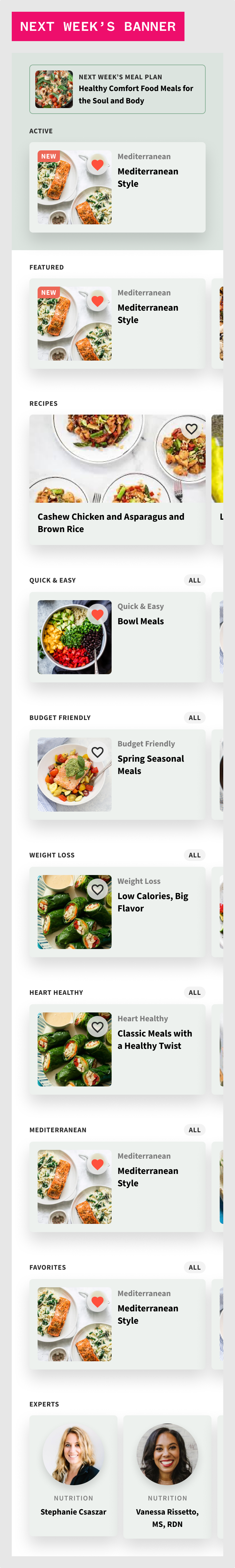
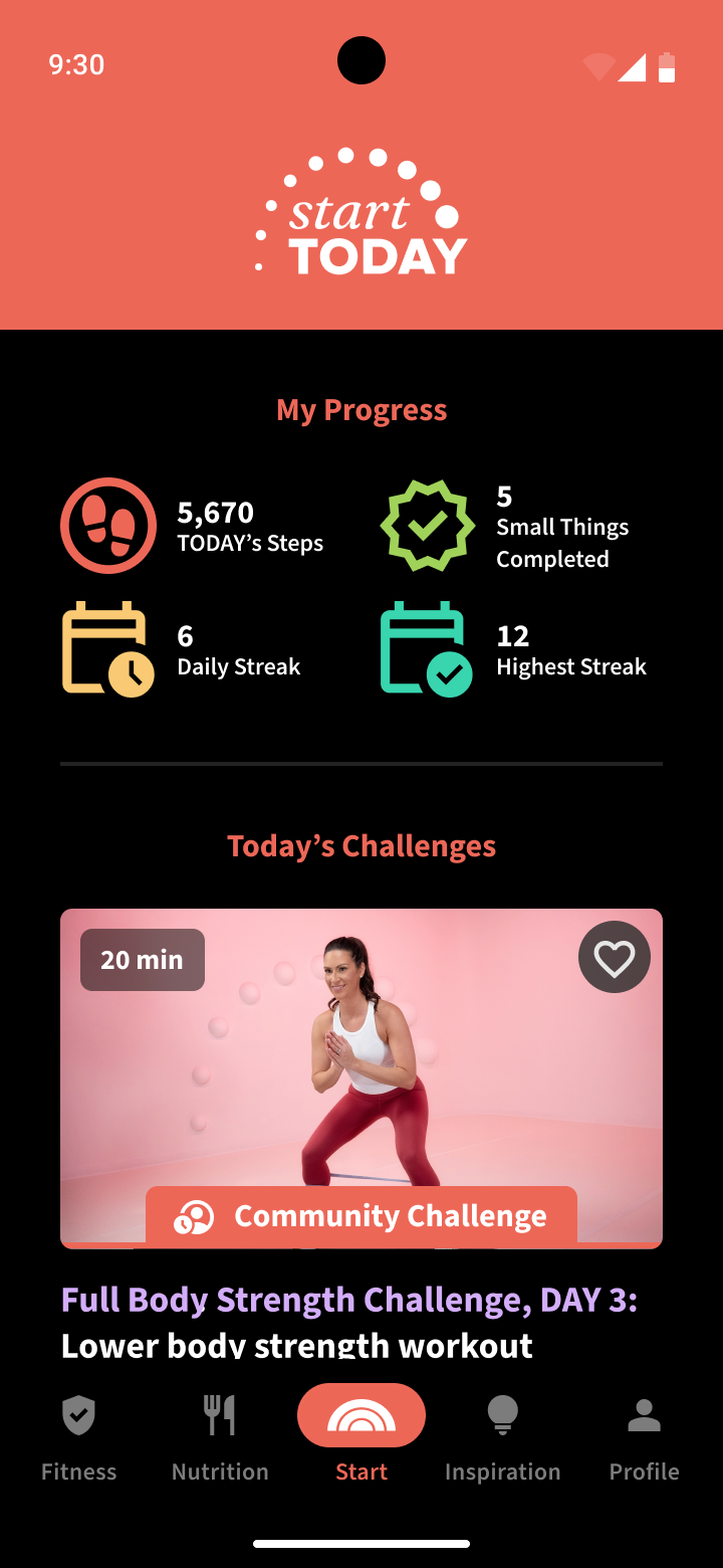
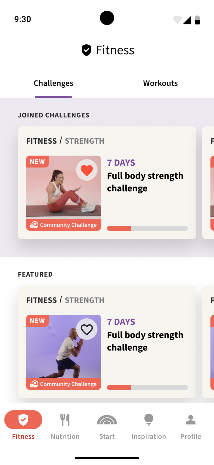

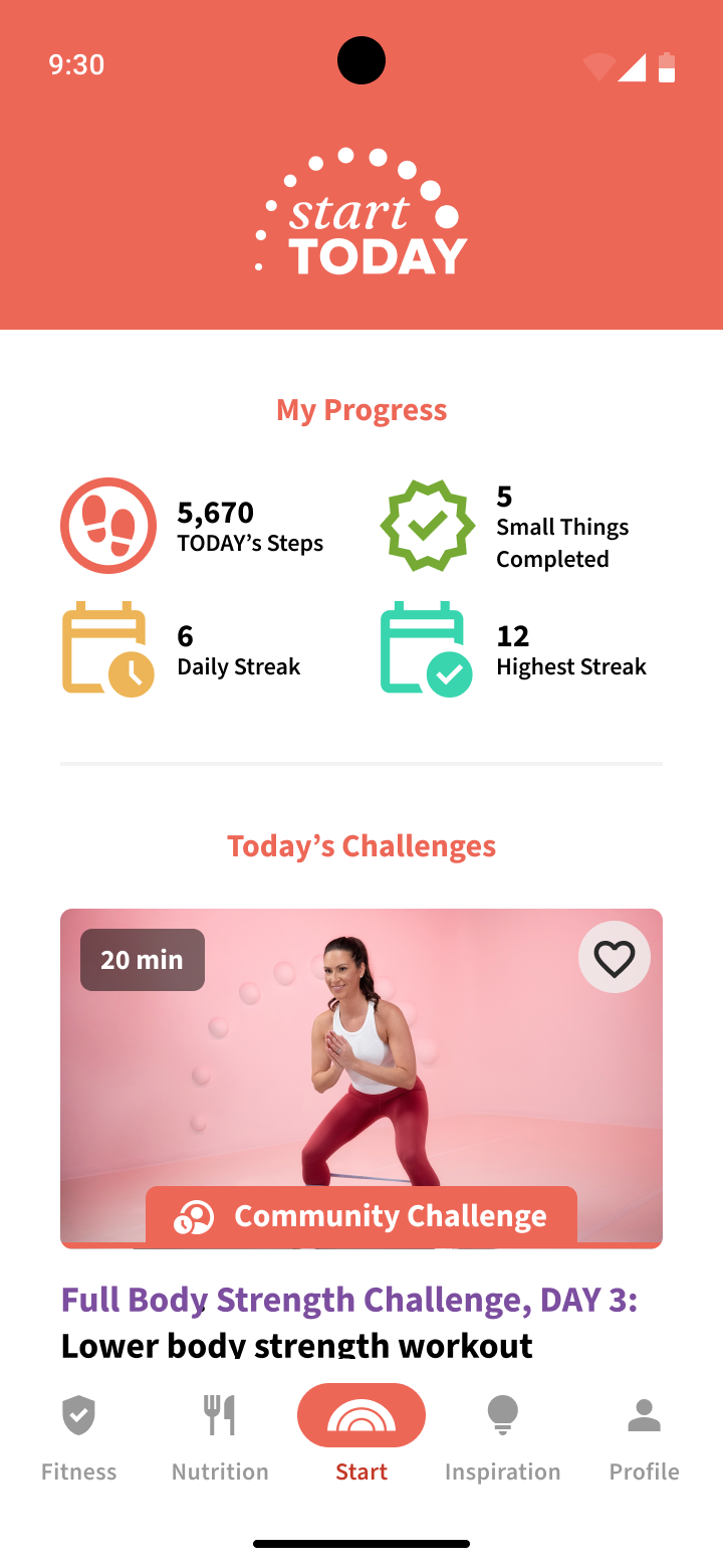

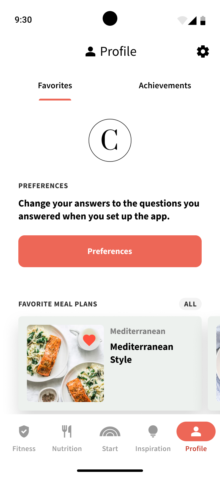
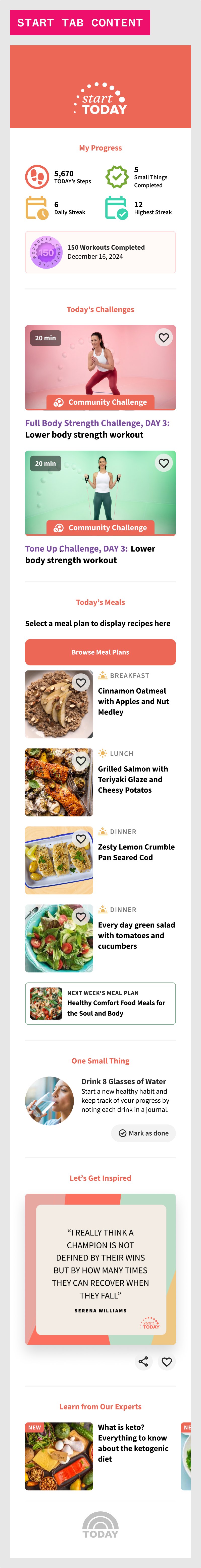
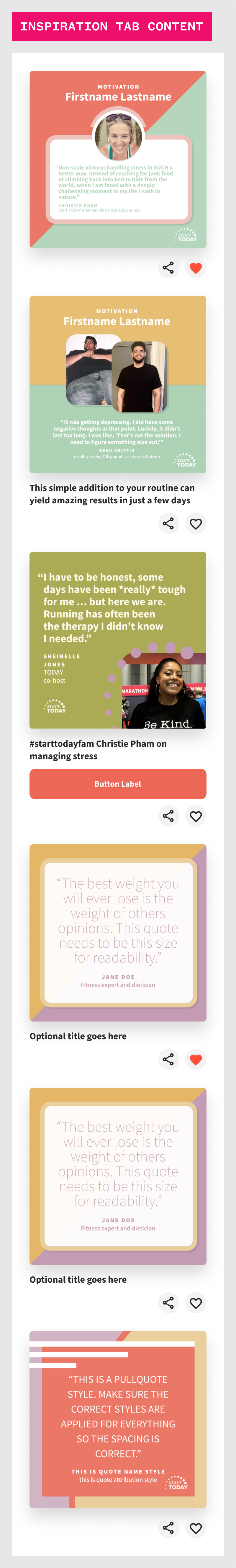
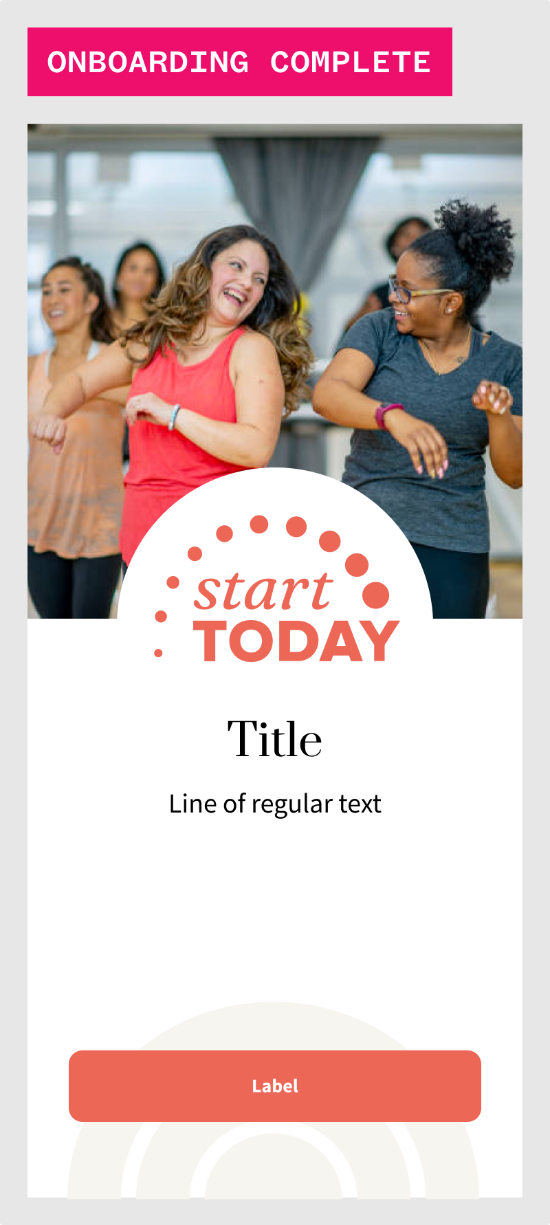
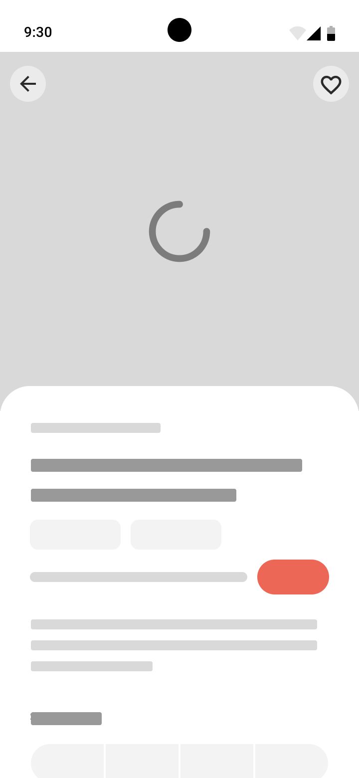
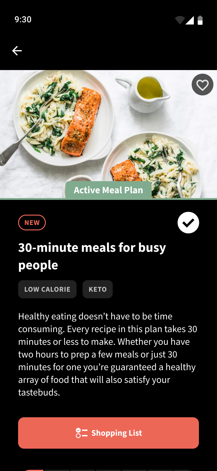
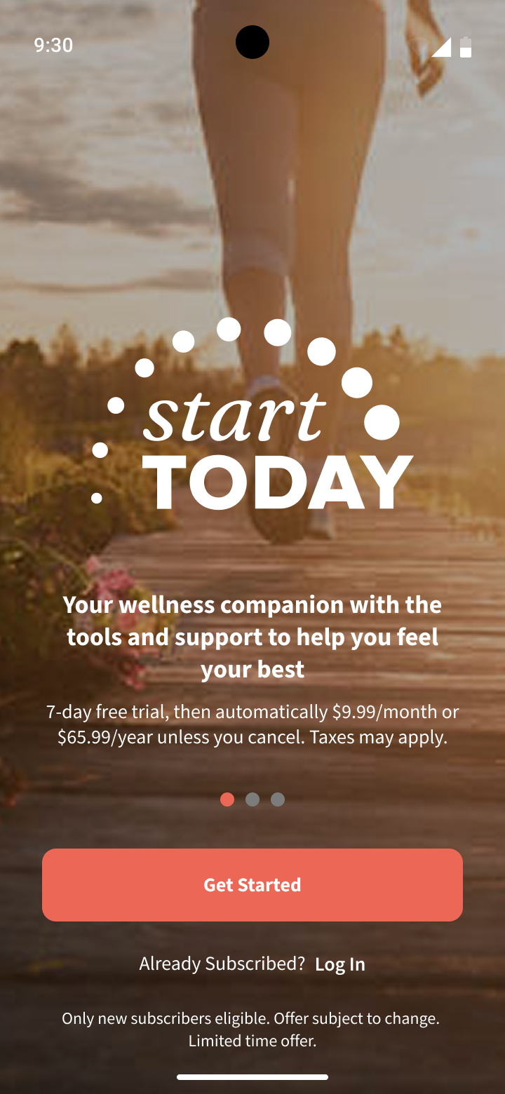
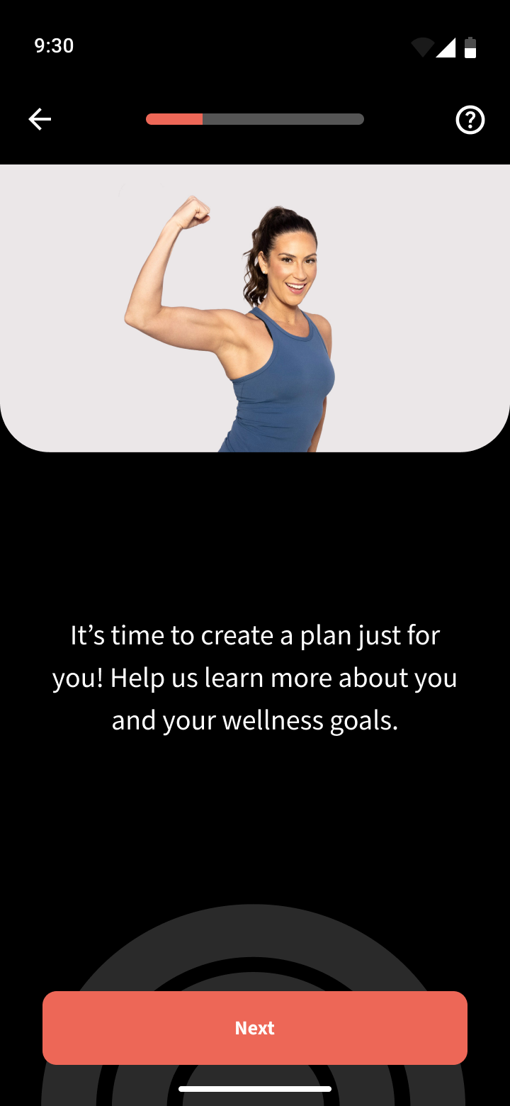
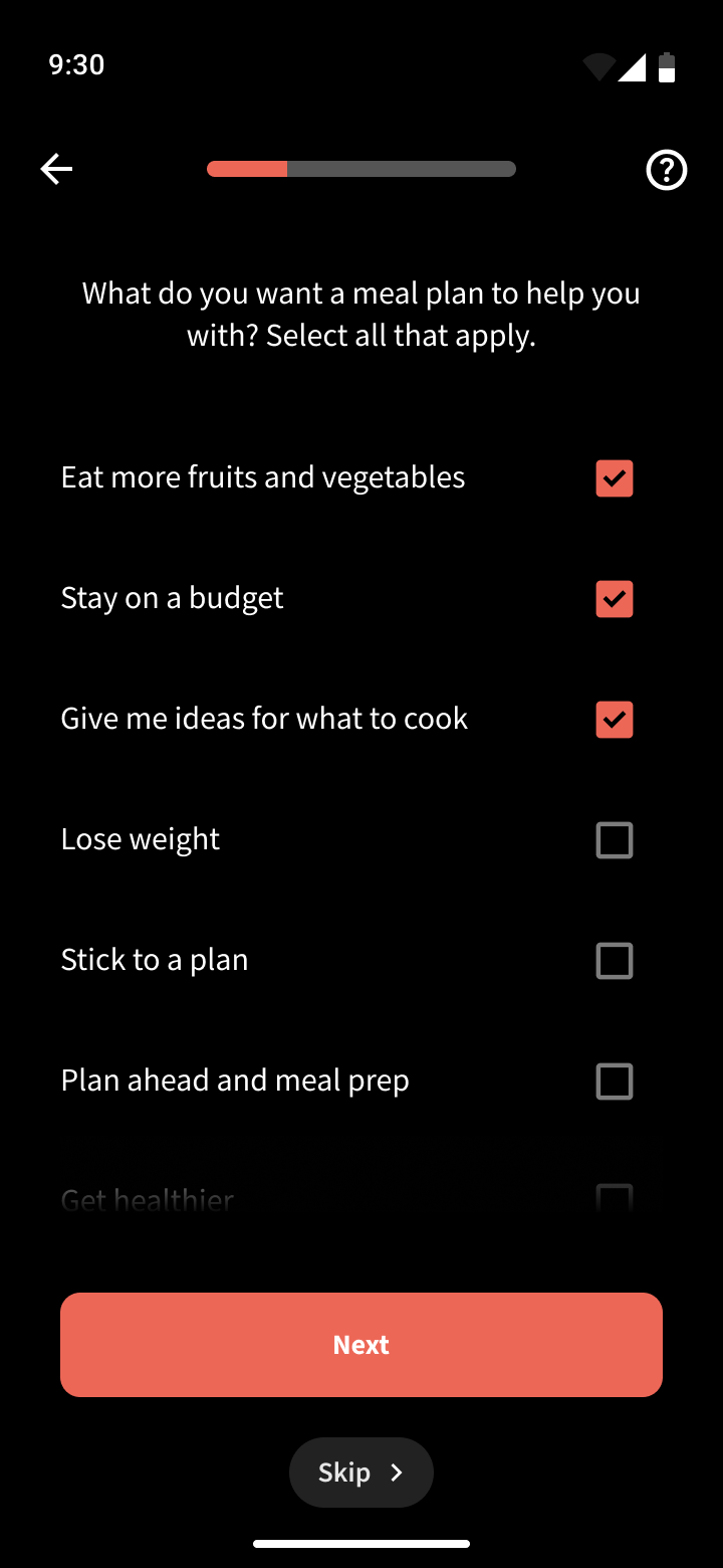
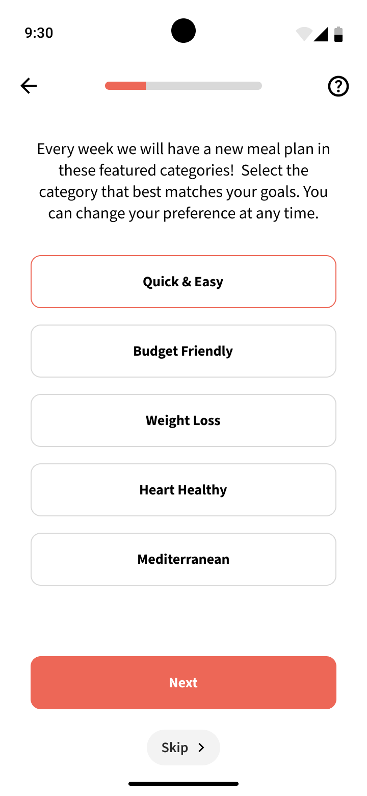
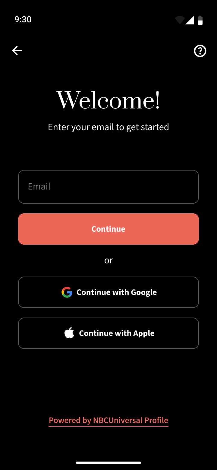
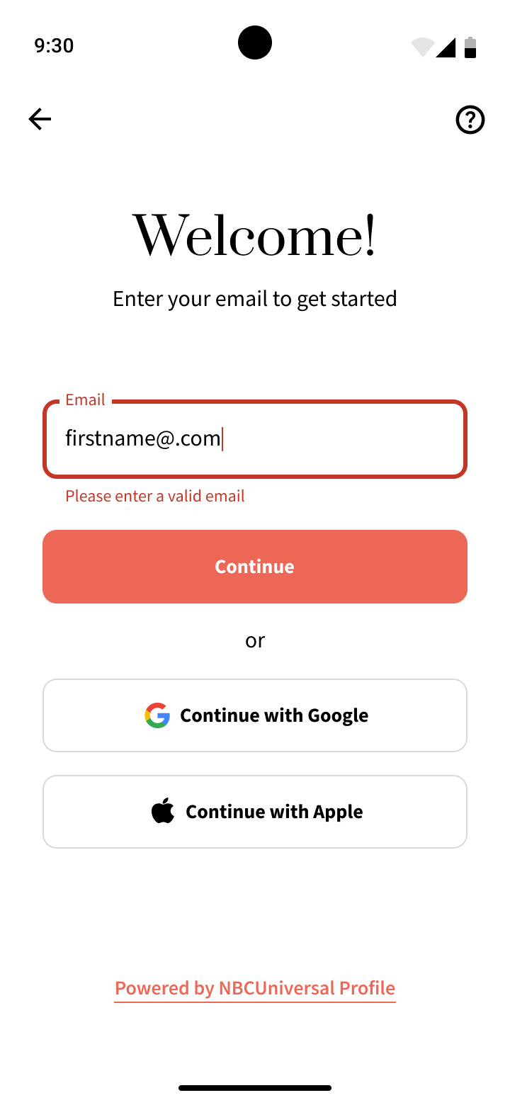
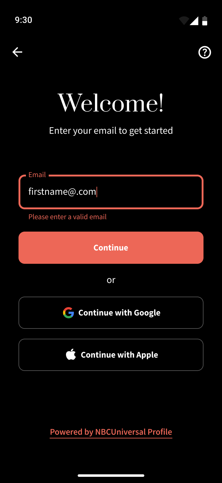
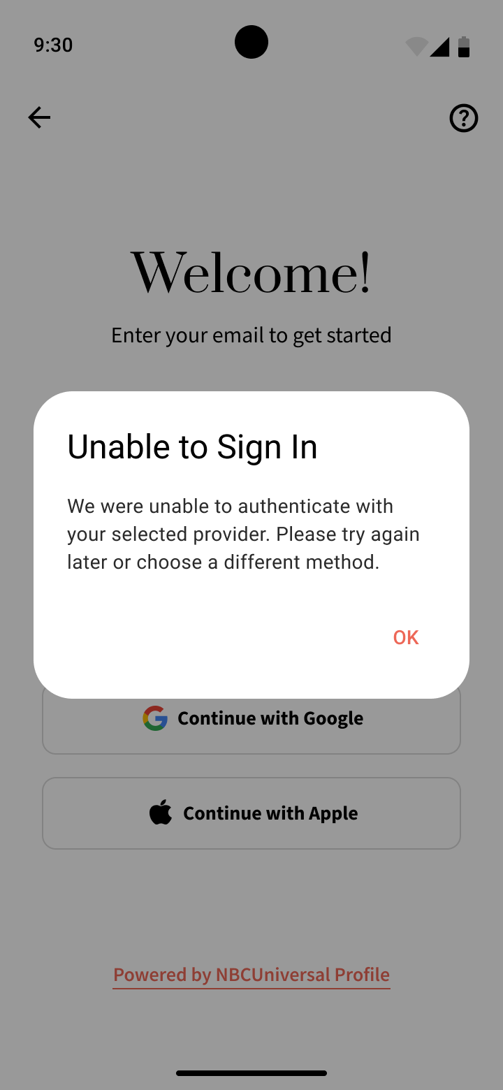
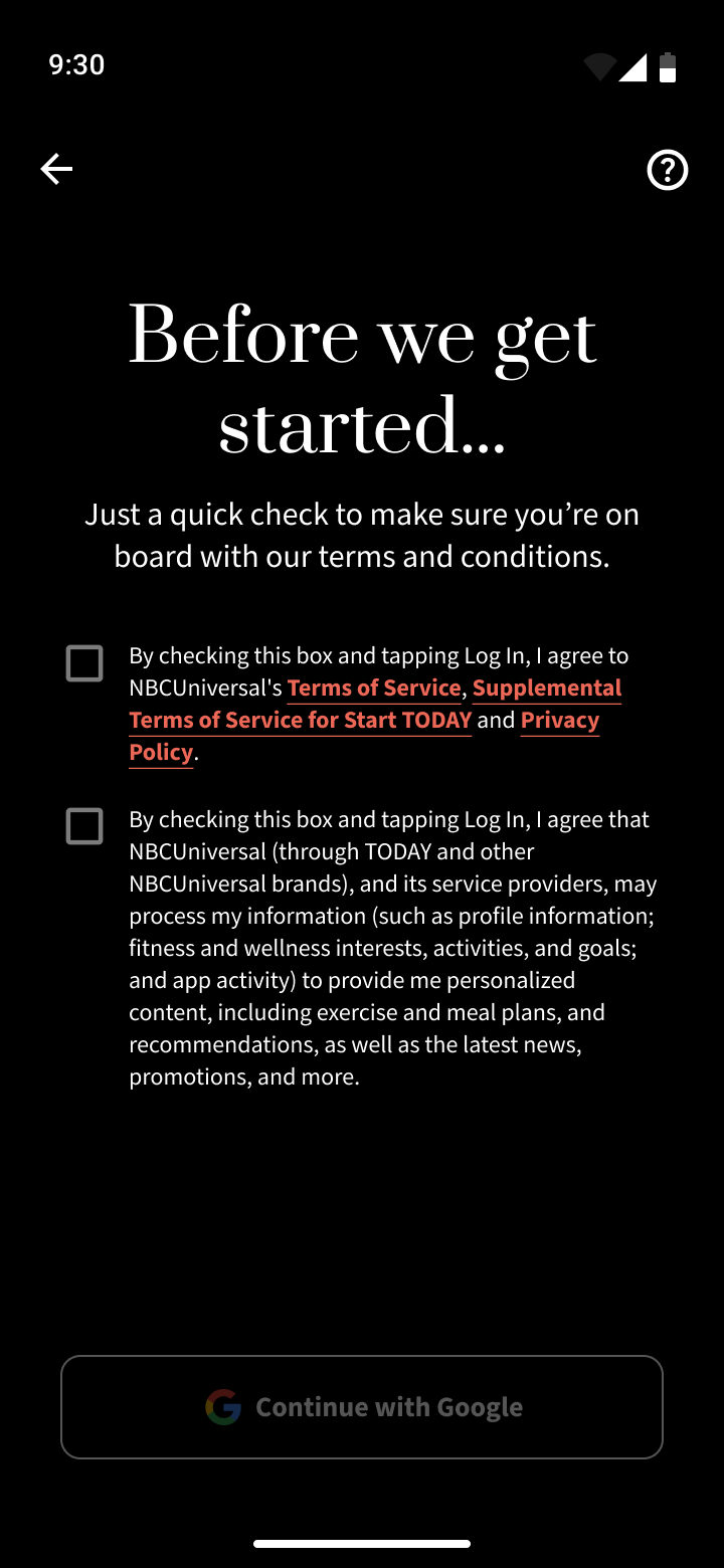
After the successful launch of the Start Today app on iOS in 2024, the Start Today team had also wanted to launch the app on Android as well. I was brought in to design the Start Today Android app based on the work that was done already for the iOS app.
While the overall designs and flows are heavily based on the work done previous for iOS, I very purposely wanted to build a stronger foundation from the ground up to feature a more robust and well defined design system of colors, typefaces, and patterns as well as taking advantage of certain Material Design components where possible.
Due to the iOS app designs going through many different iterations for a year before launch to find the perfect aesthetic and user experience, the existing design files were not optimized with color variables, modes, or components.
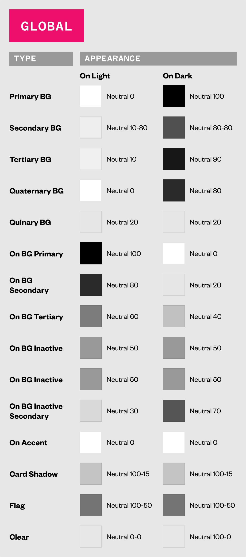
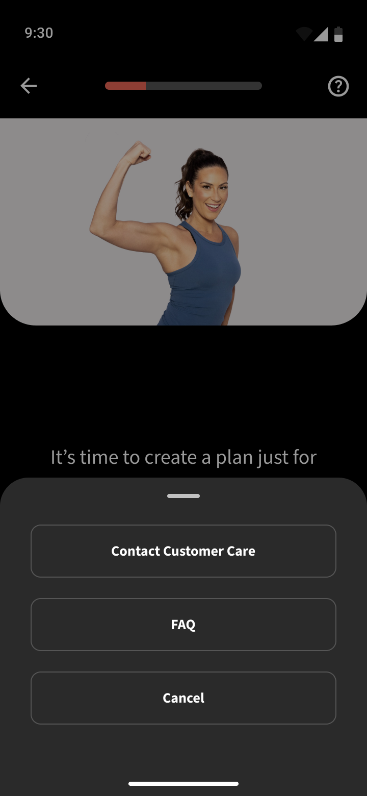
I planned out a structure for how to create a proper design system to ensure consistent and scalable use of patterns and easily integrate and switch between light and dark themes using Figma variables.
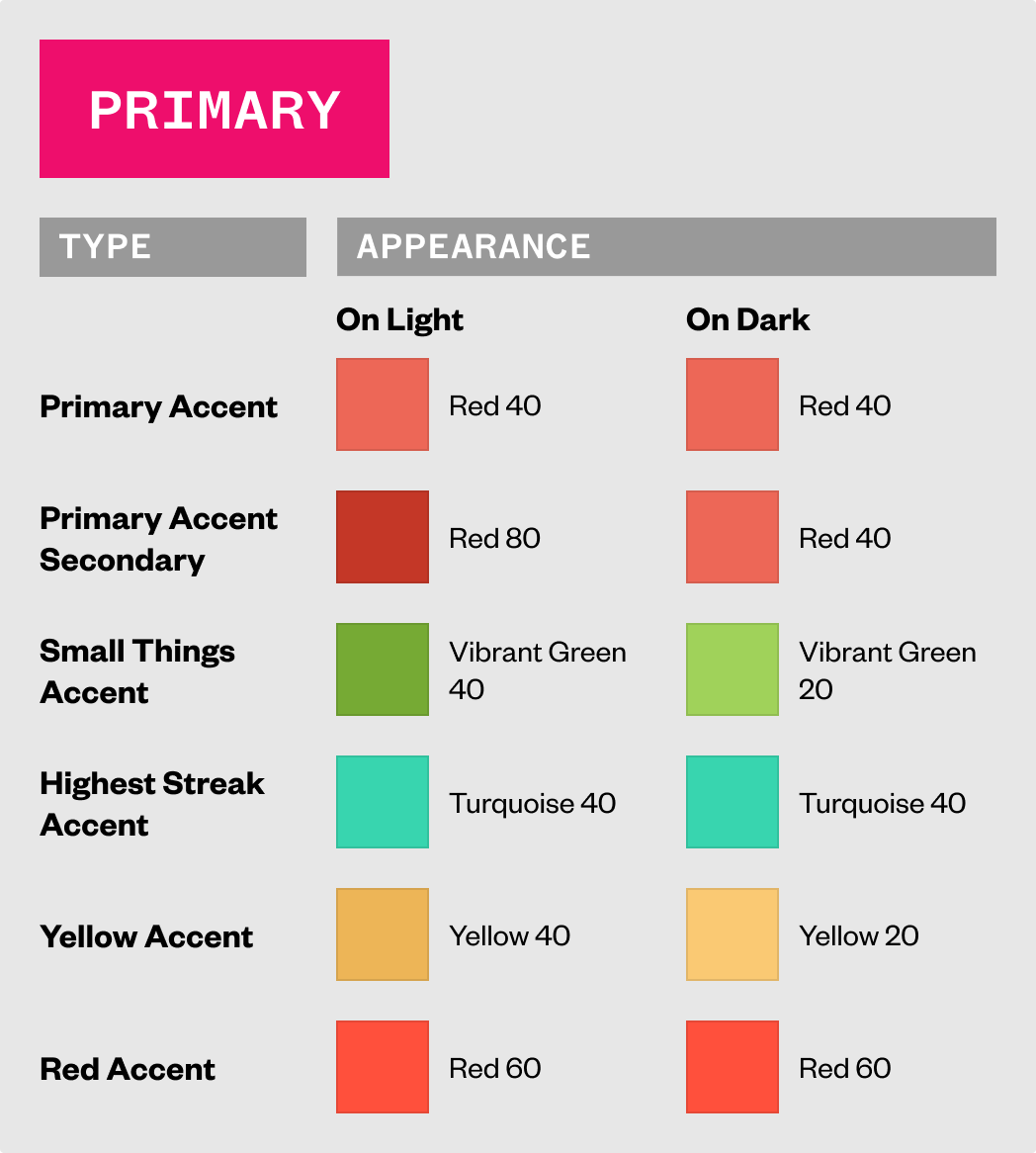
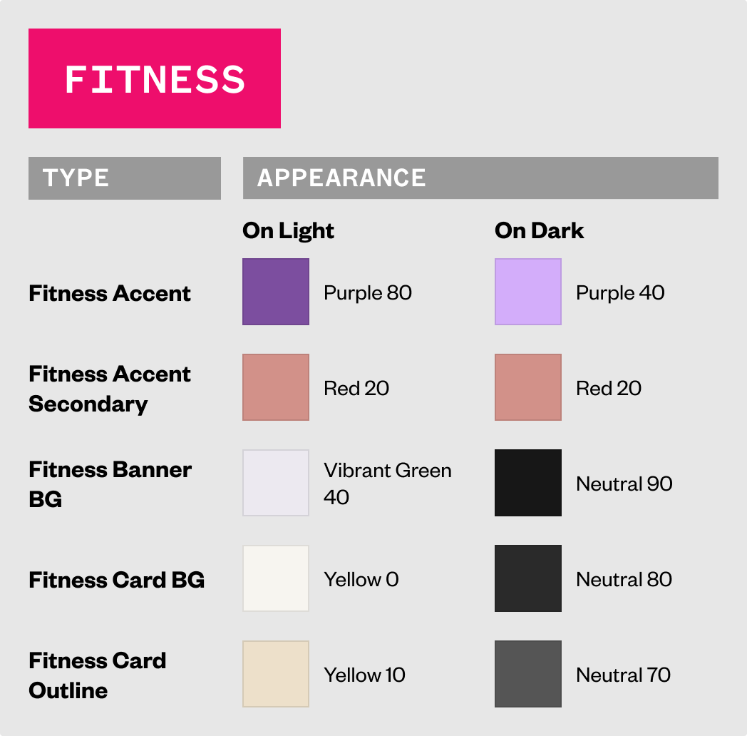
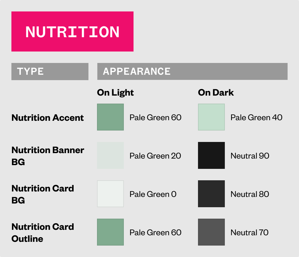
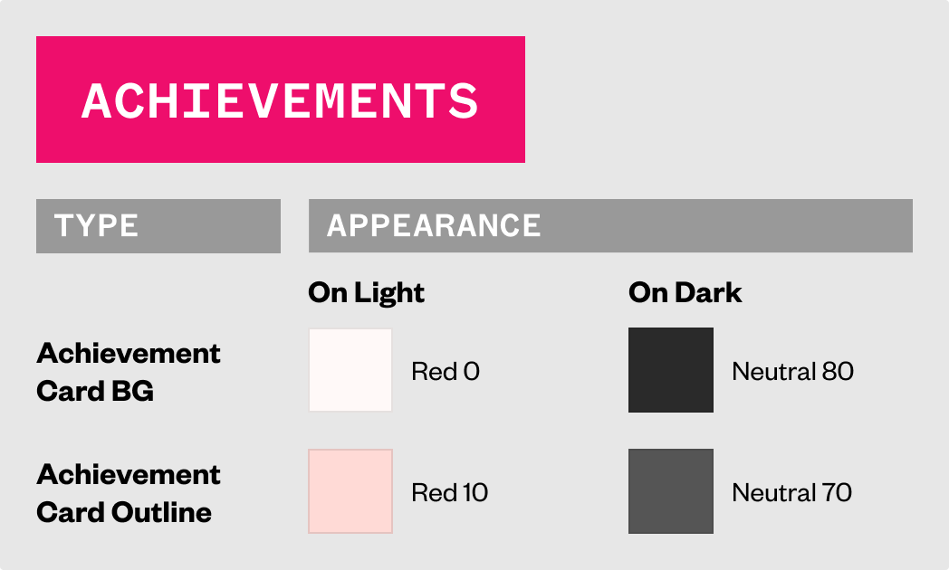
To start crafting the design system, I took the palette of colors used in the iOS app Figma file and iOS Xcode project (which numbered in the hundreds, had a lot of redundancy, with some colors not being used at all) extracted the most important and created a simplified set of core colors as tokens to be used as the founding color definition of the entire experience.
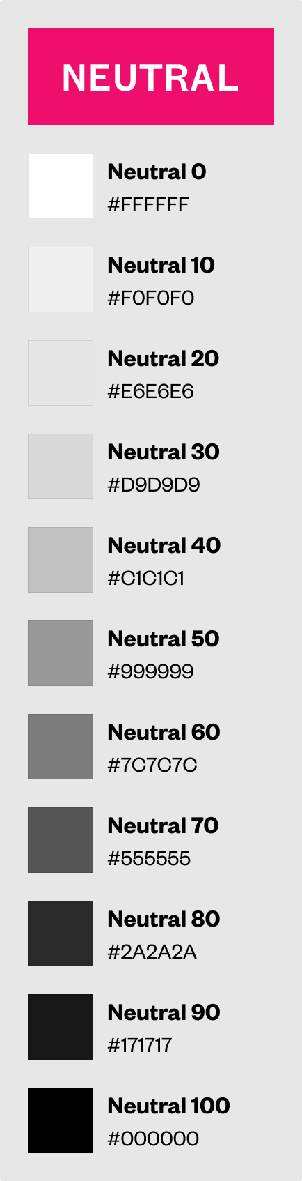
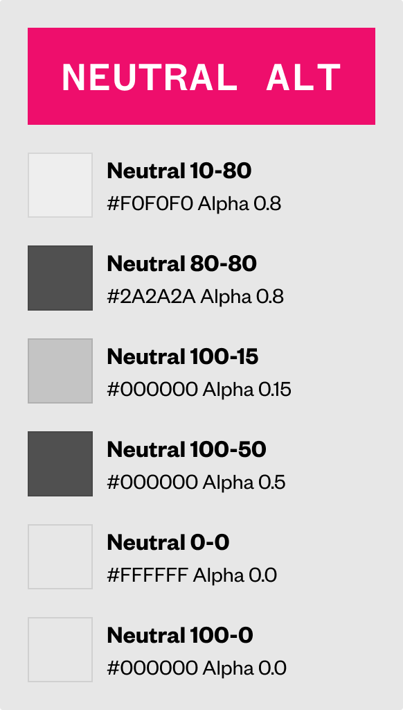
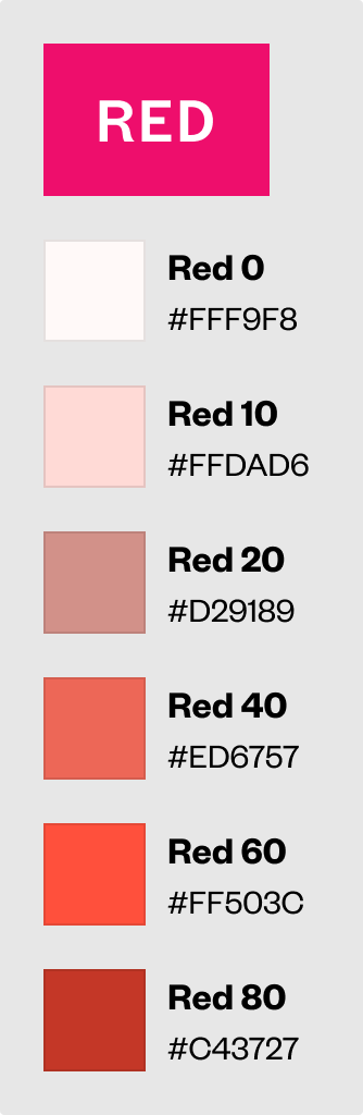
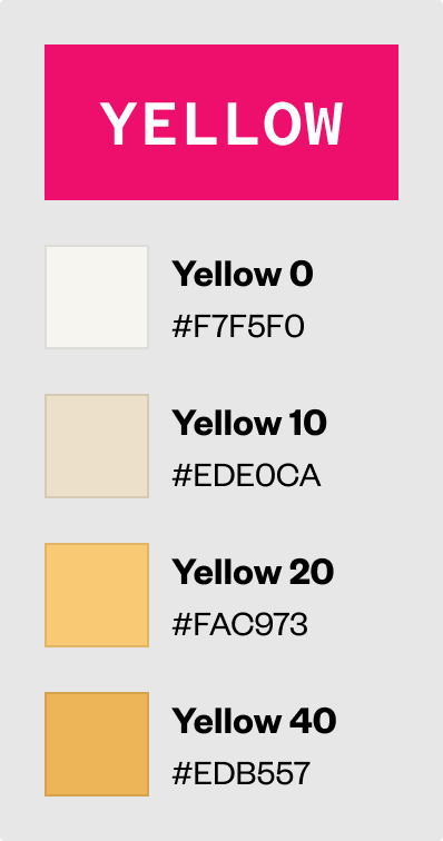
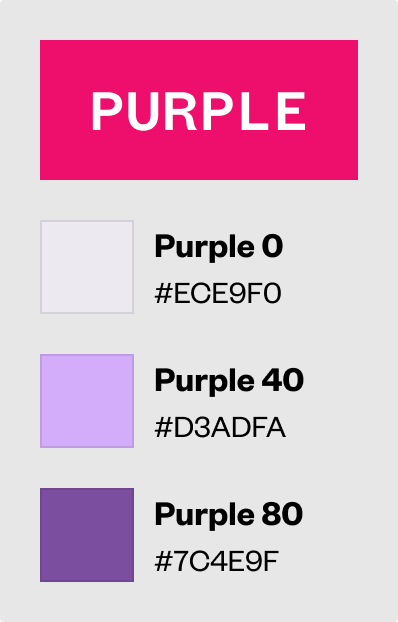
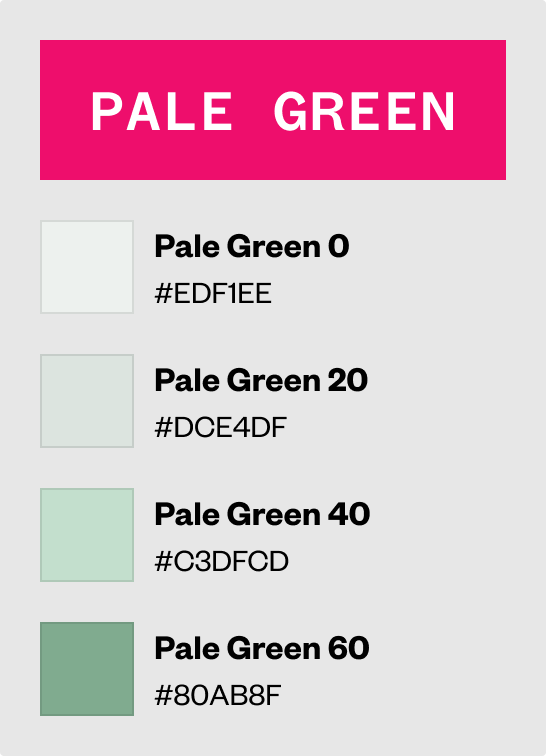
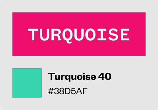
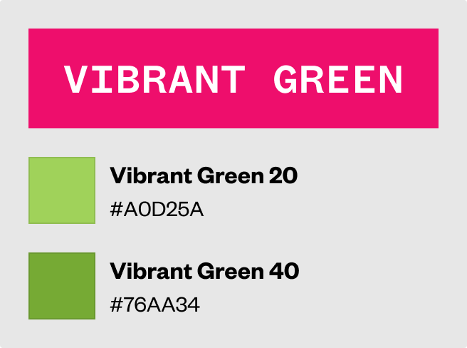
The semantic color tokens were then created based on the theming found in the iOS app as well as taking consideration into appropriate light and dark theming.
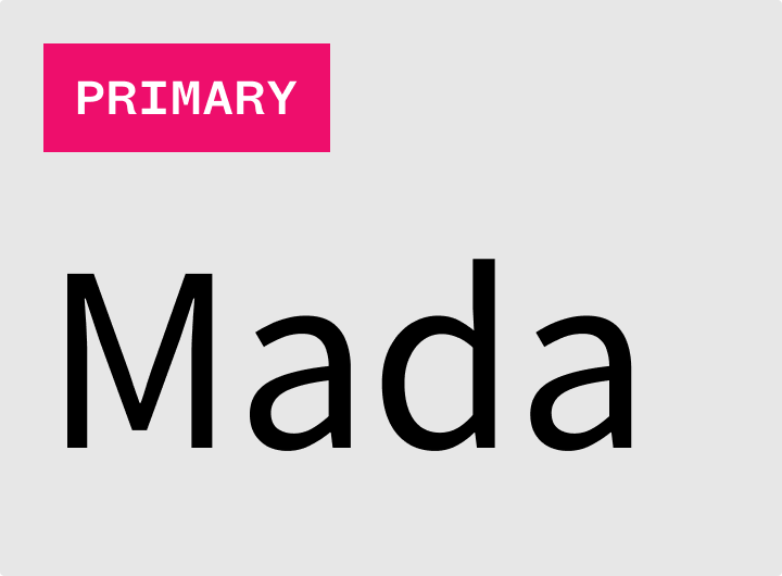
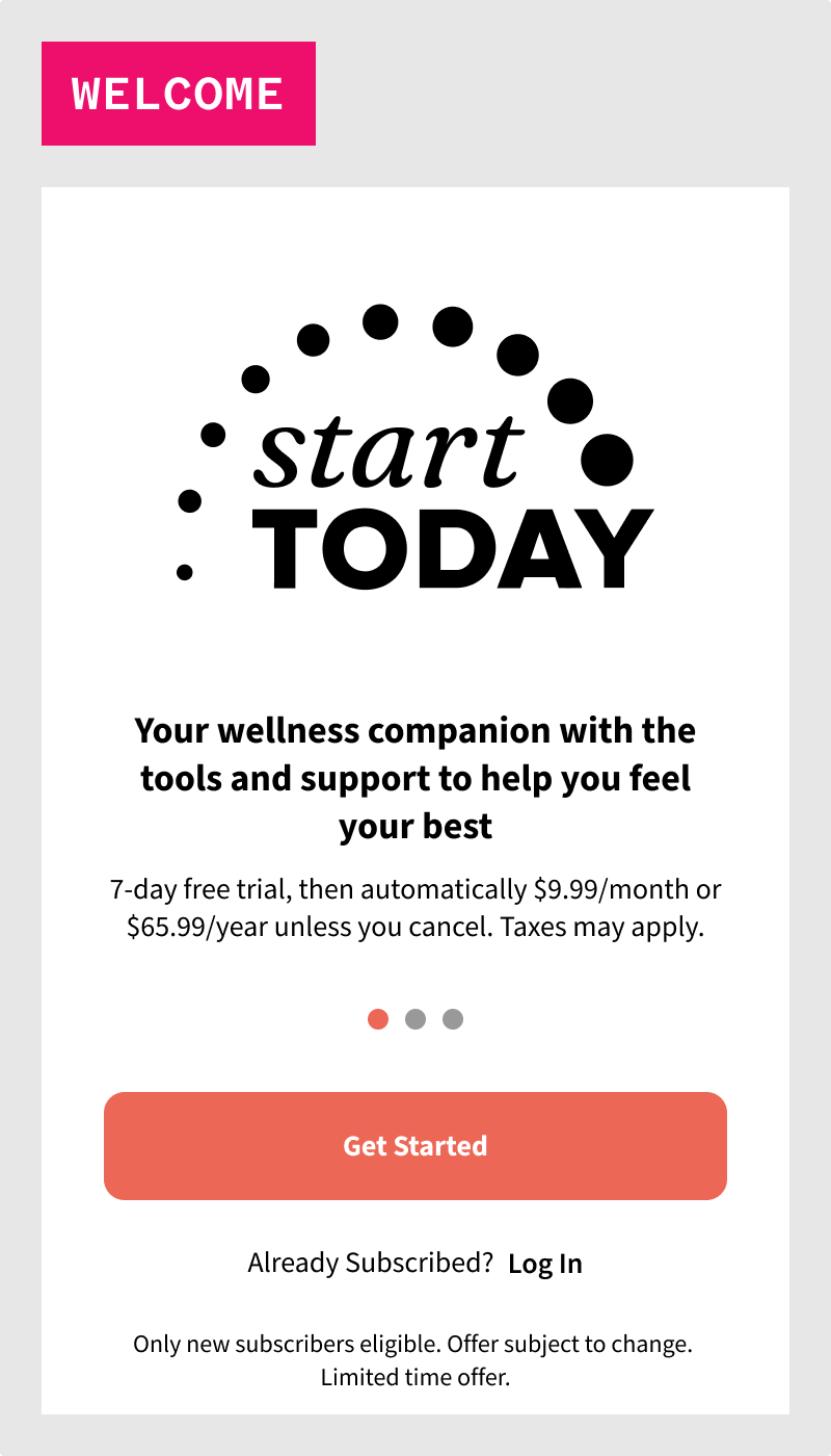
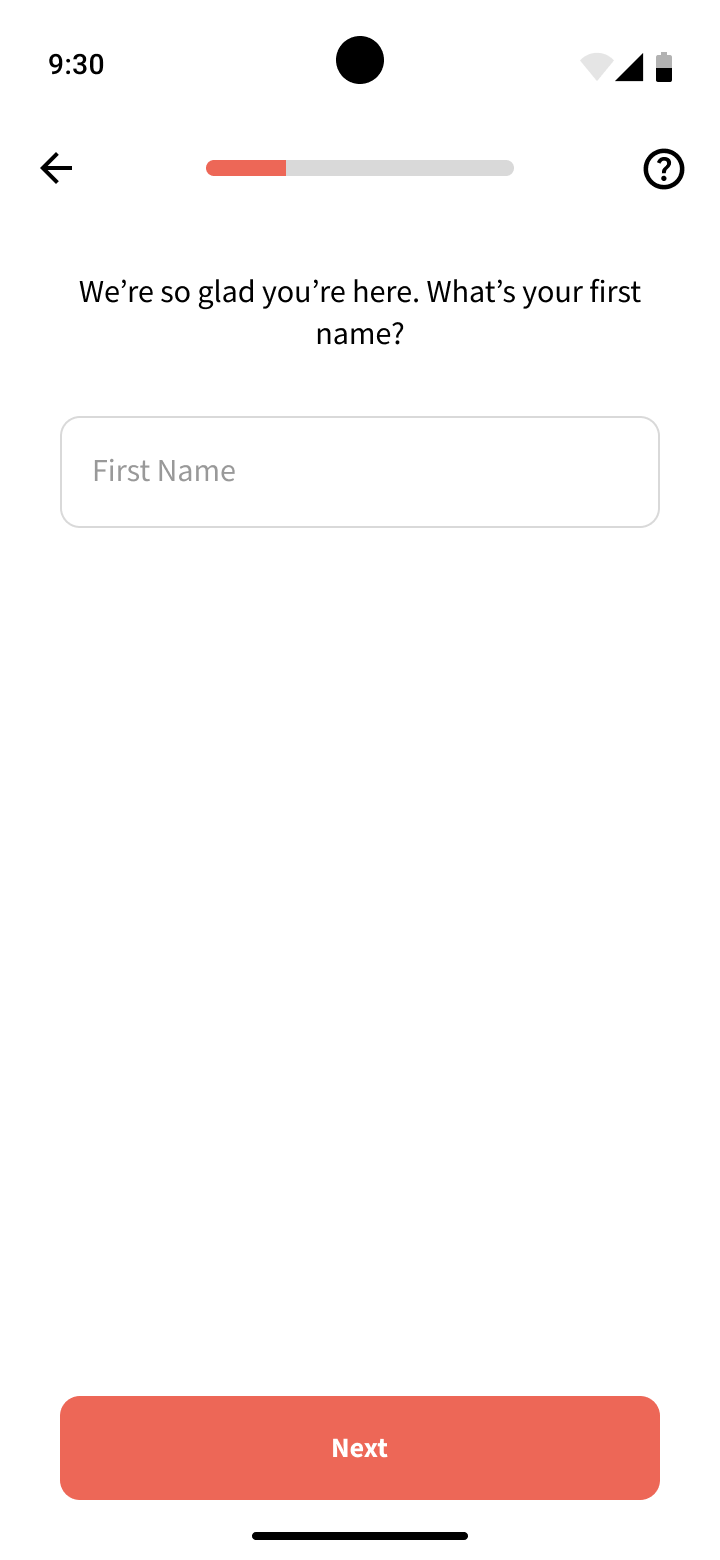
The fonts chosen for this project were based on the fonts already chosen and being used for the Start Today website as well as iOS app.
We used Mada as the primary font, used most throughout the experience.
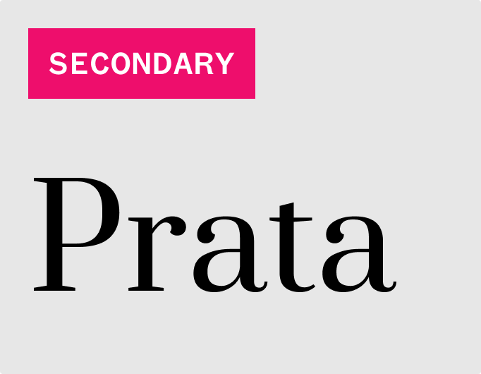
We used Prata as the secondary font, used very sparingly and only in special circumstances, mainly as a display font to highlight certain things.
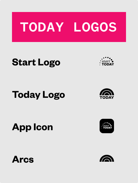
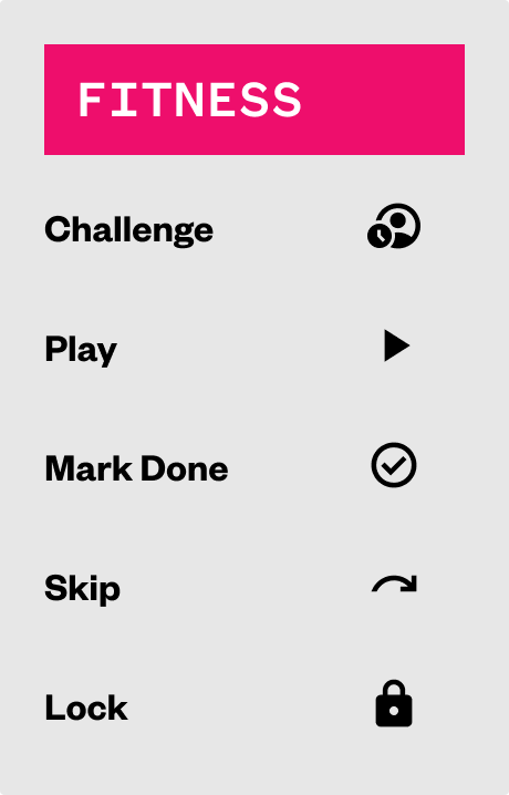
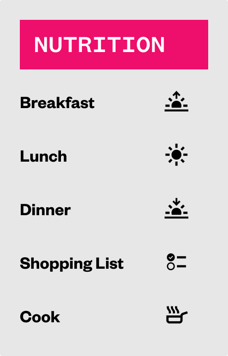
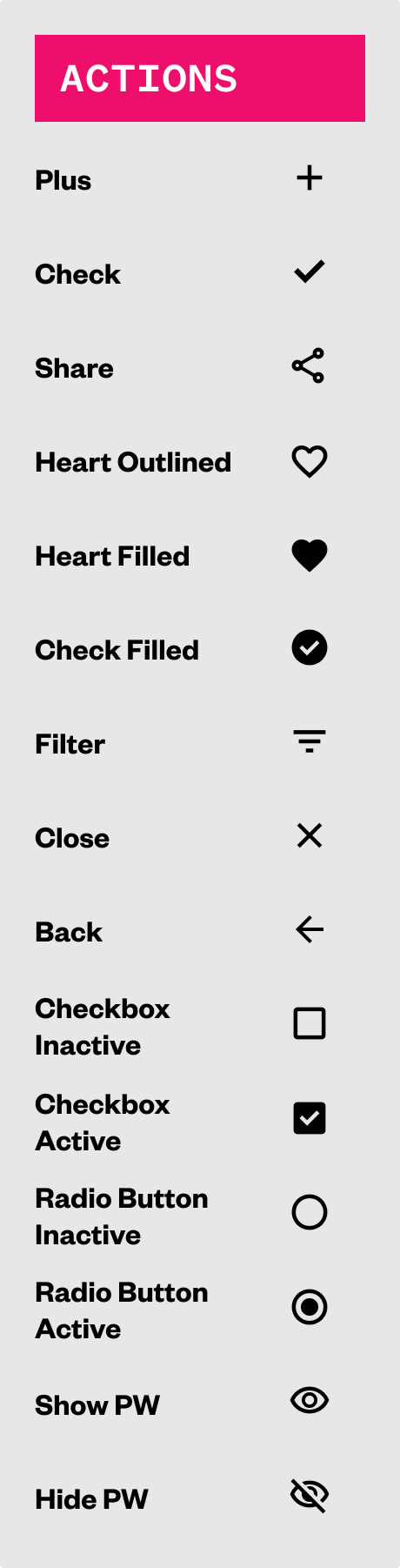
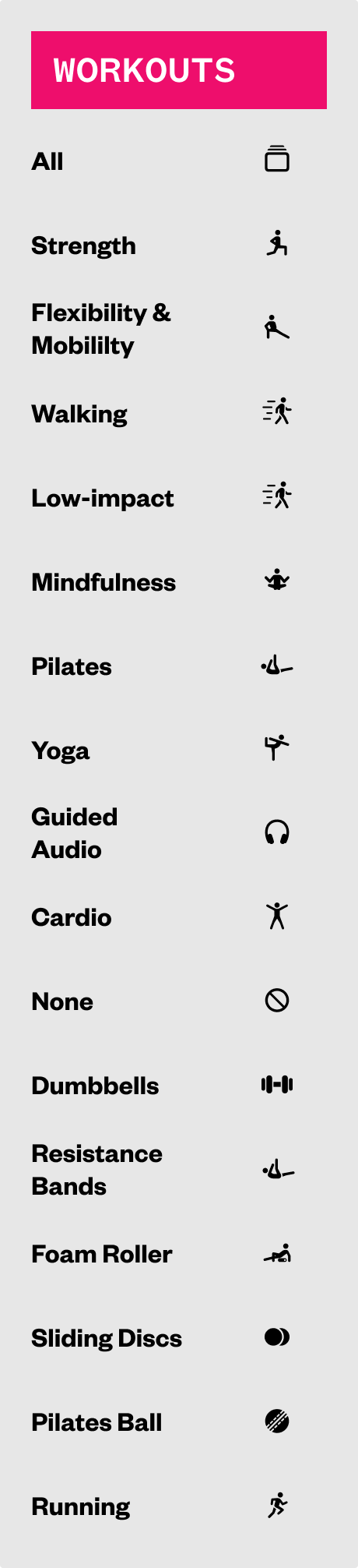
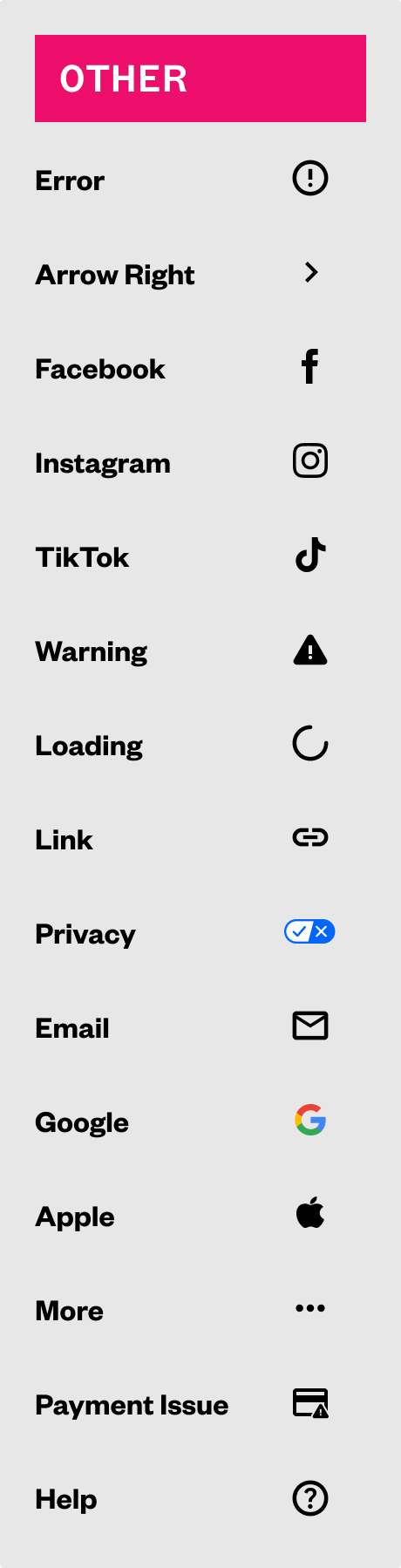
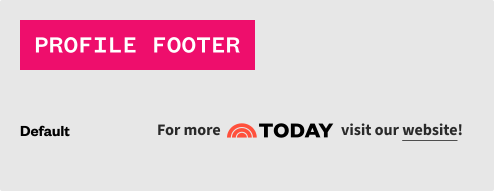
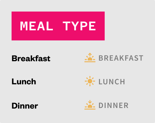
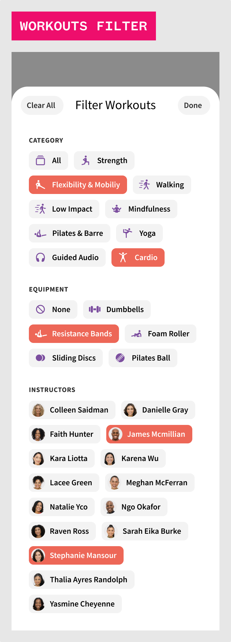
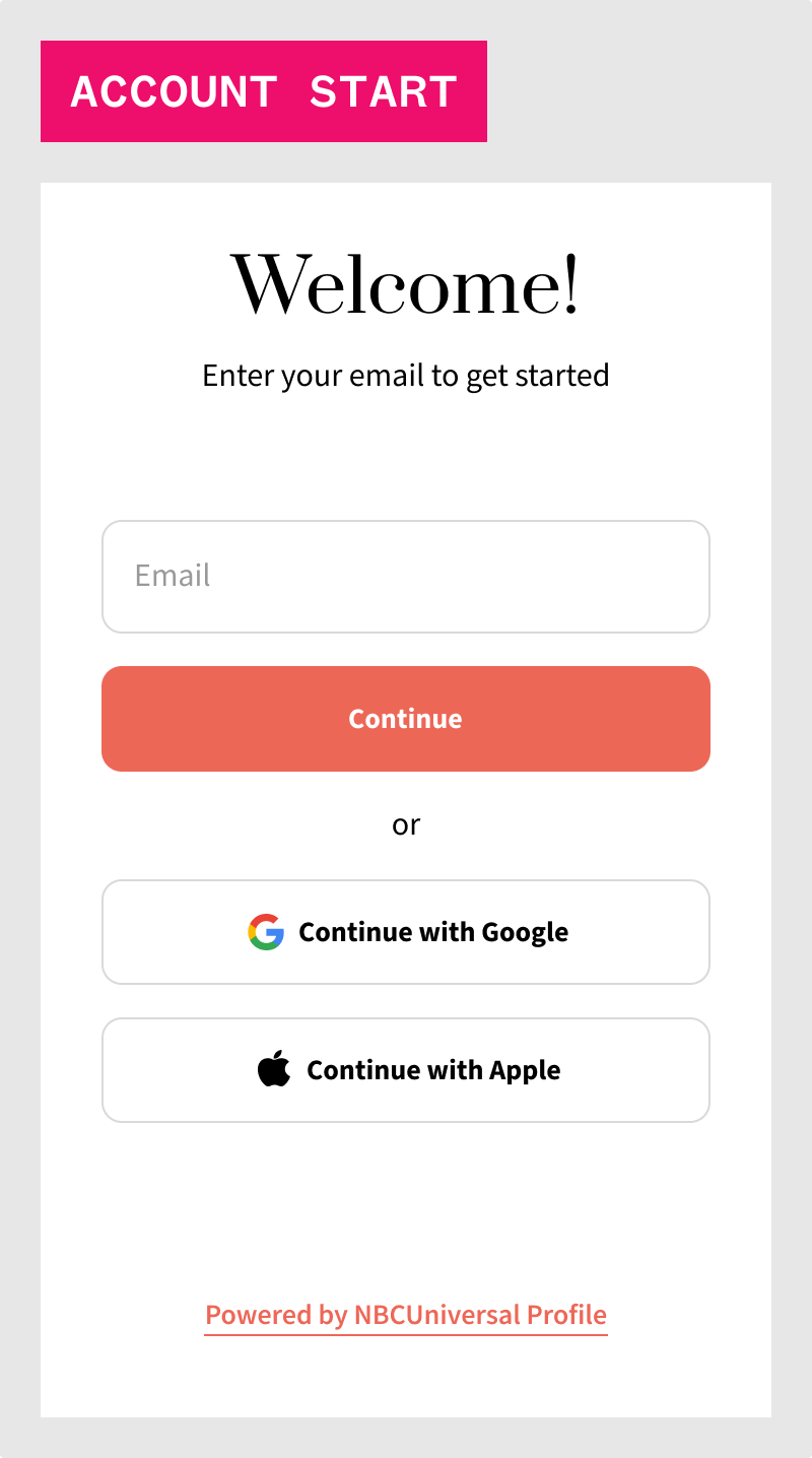
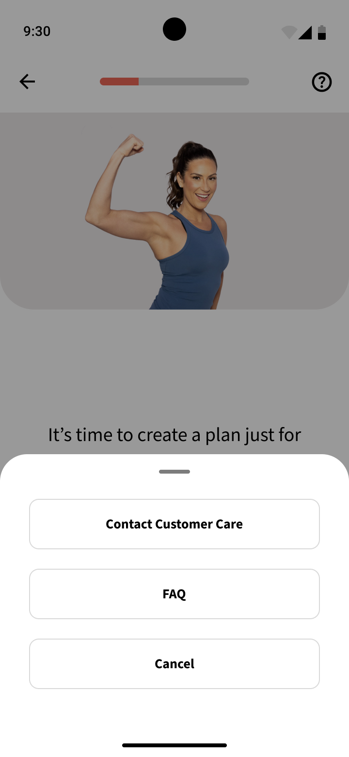
The icons used were based closely to what iconography was chosen for the iOS app, but sourced from Google's Material Design icon library.
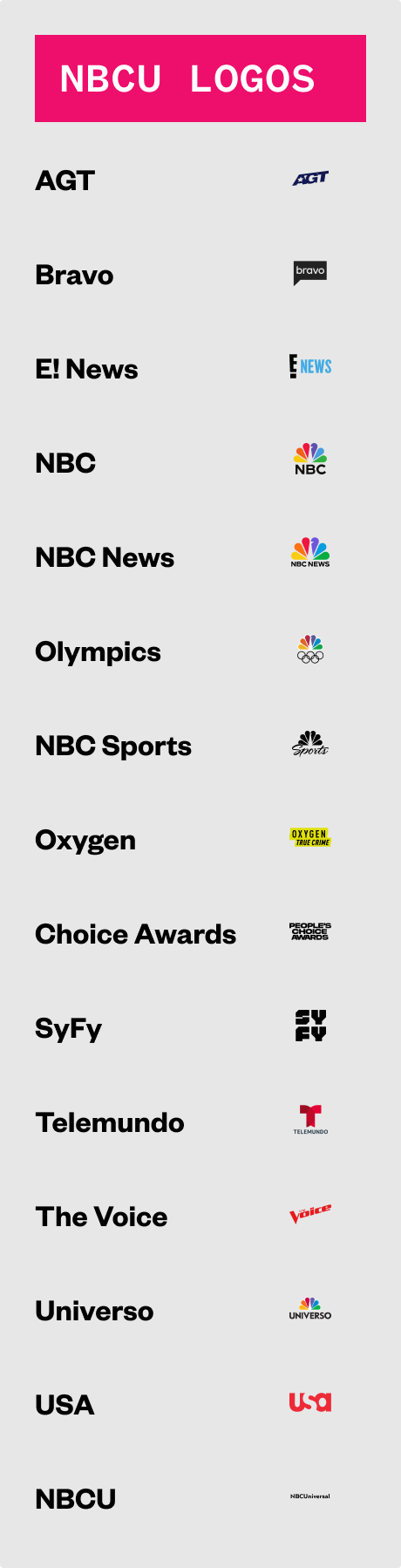
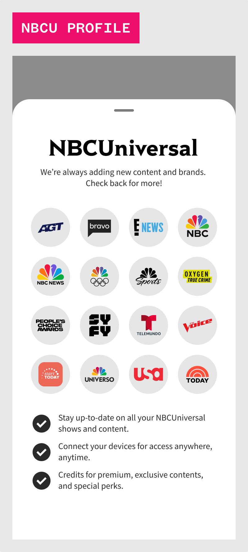
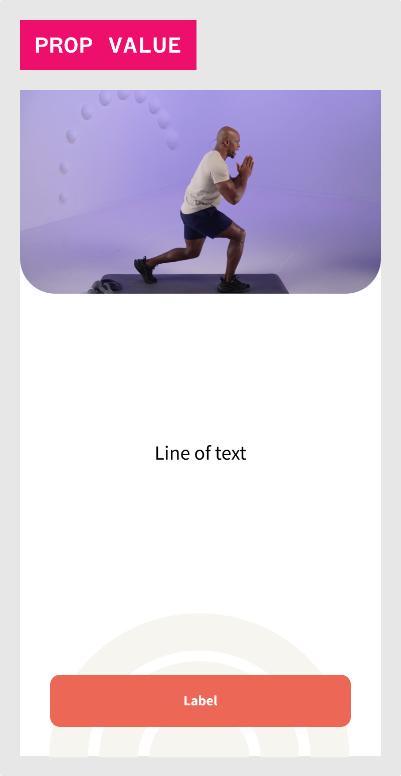
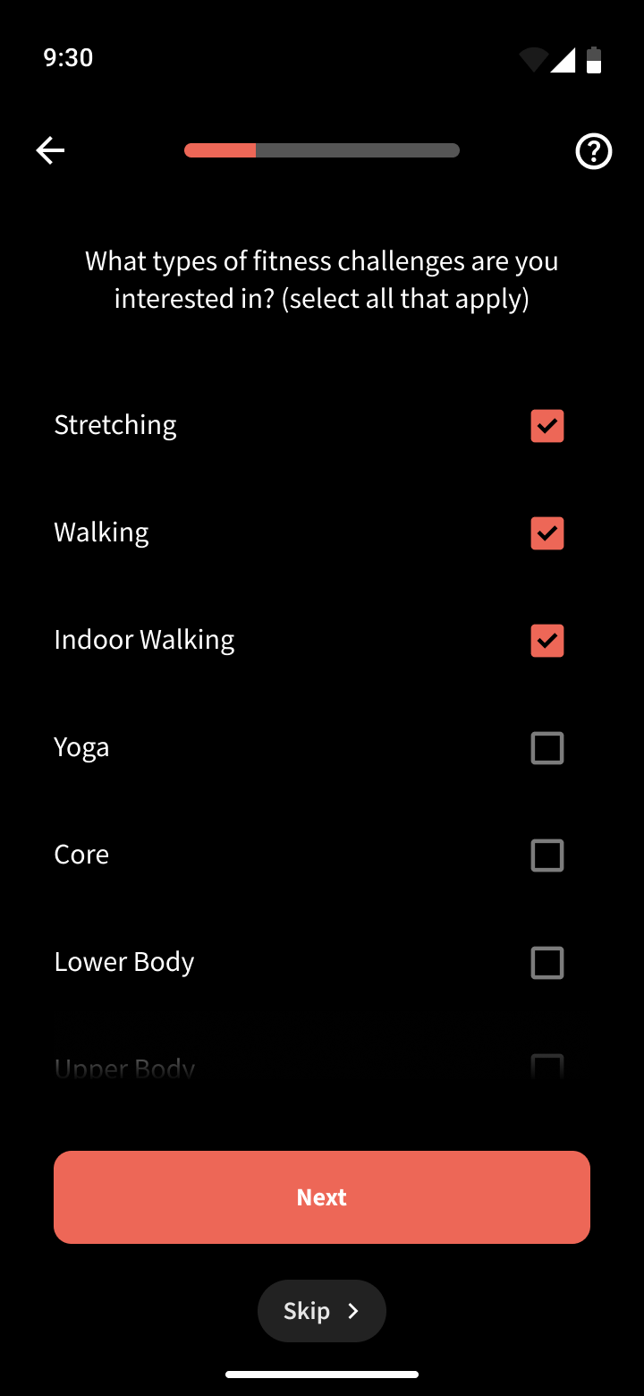
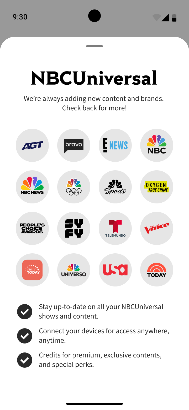
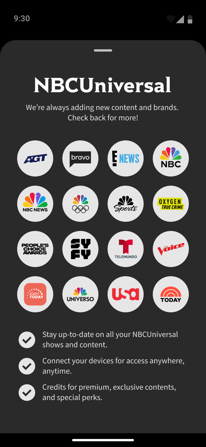
The only instance where we did not use Material Design icons was for all the different exercise types (which as of this project did not have all 1:1 equivalents and the various NBCU branded logos.
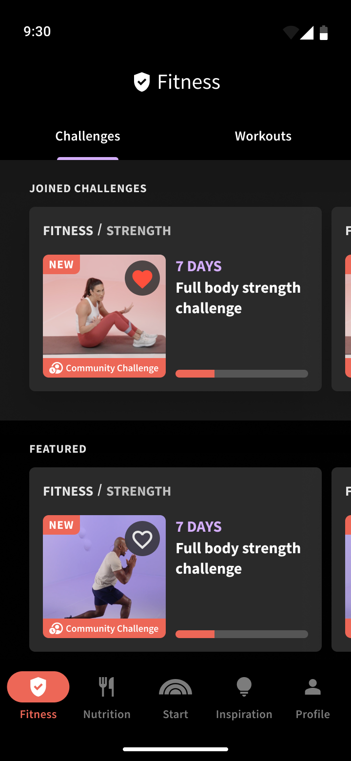
By using the foundations of our defined colors, fonts, and icons, I than began to craft the next level of building blocks for the design system, which are elements.
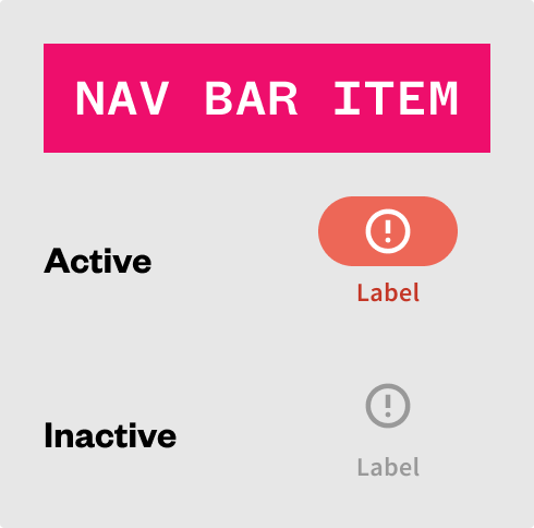
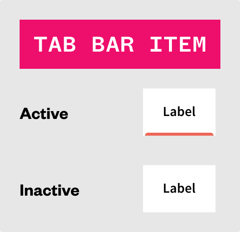
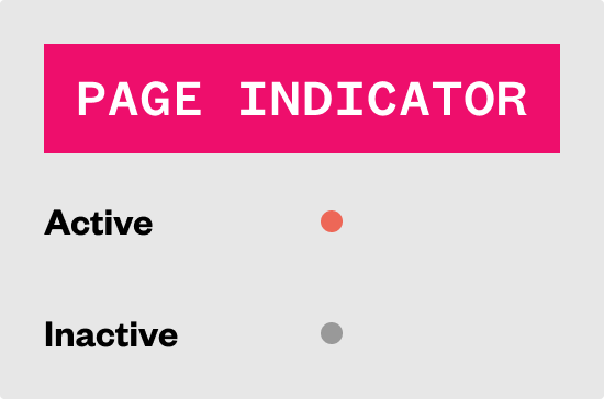
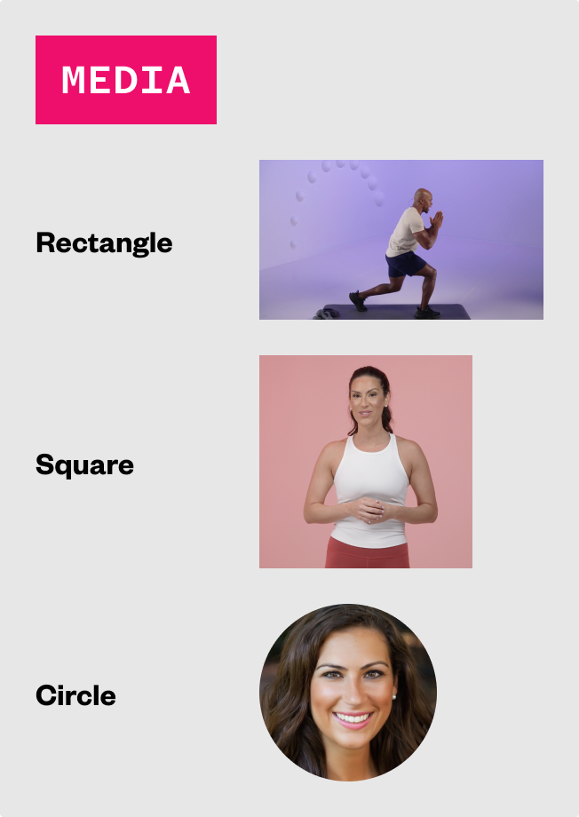
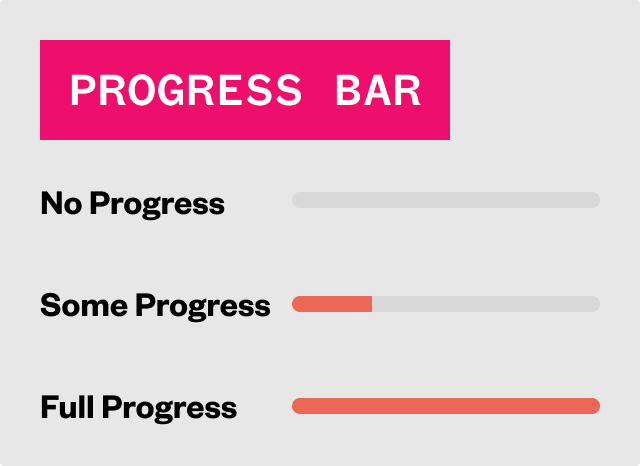
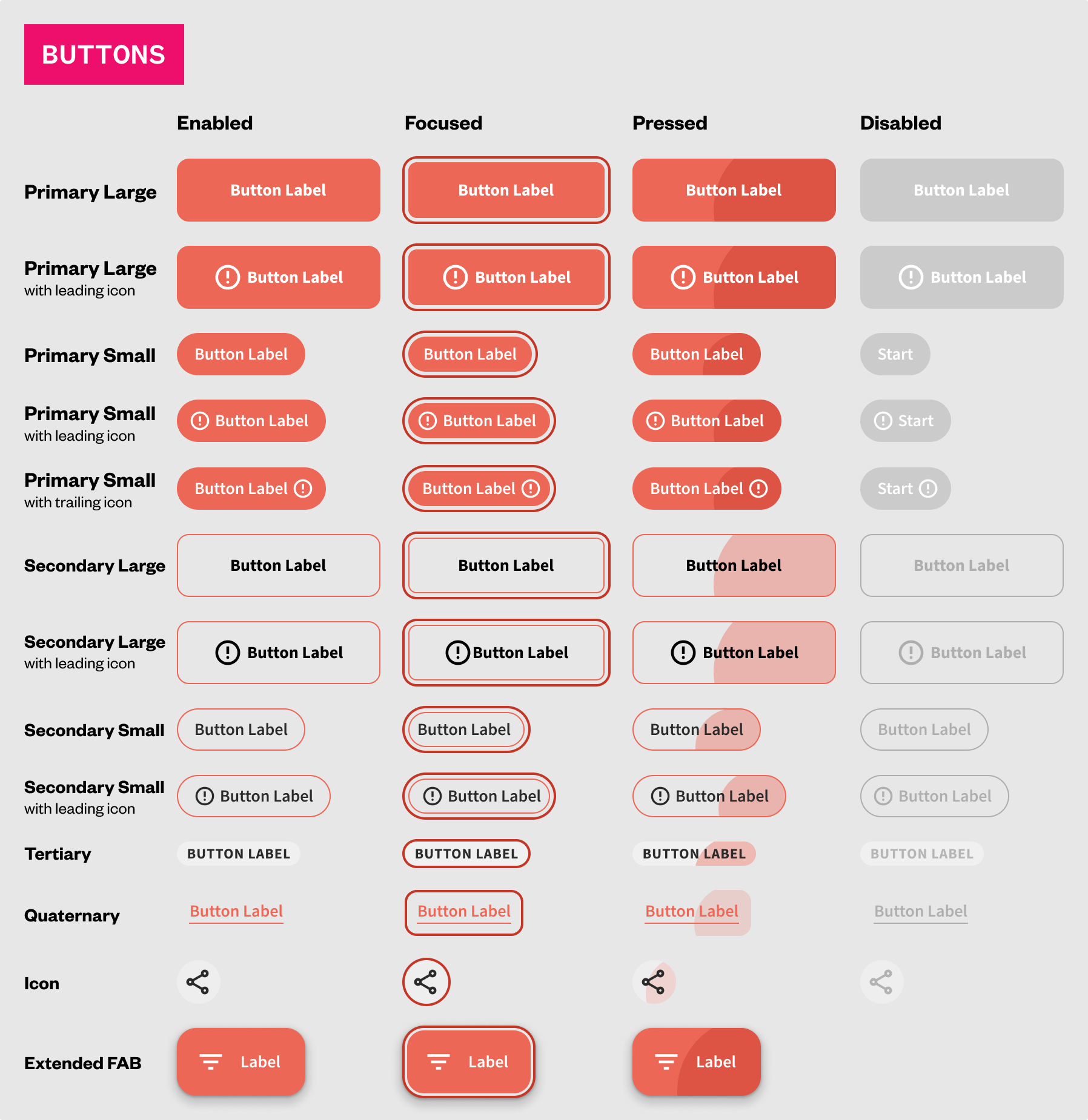
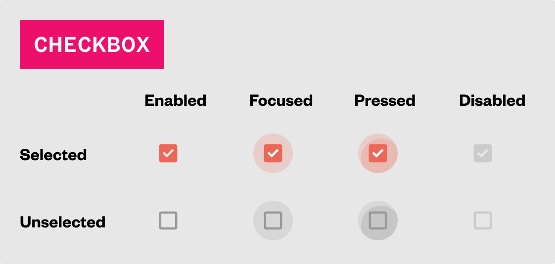
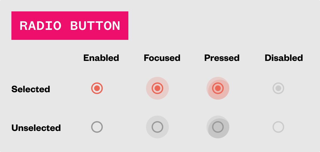
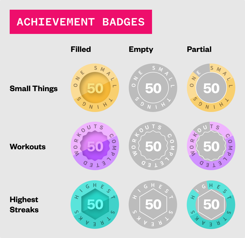
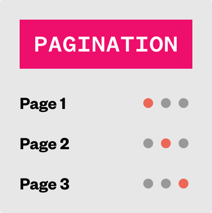
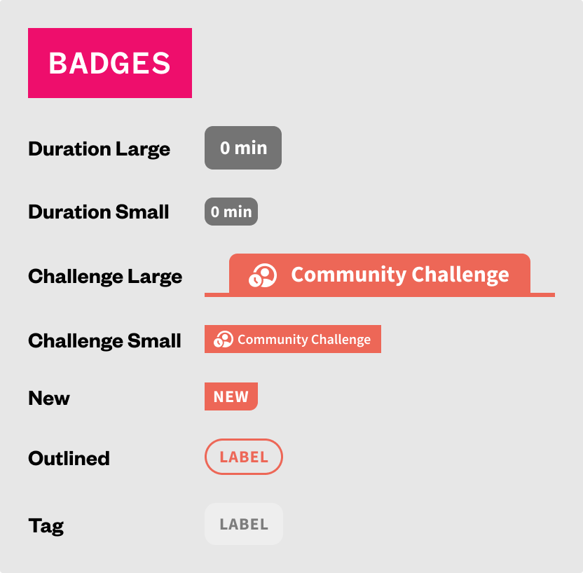
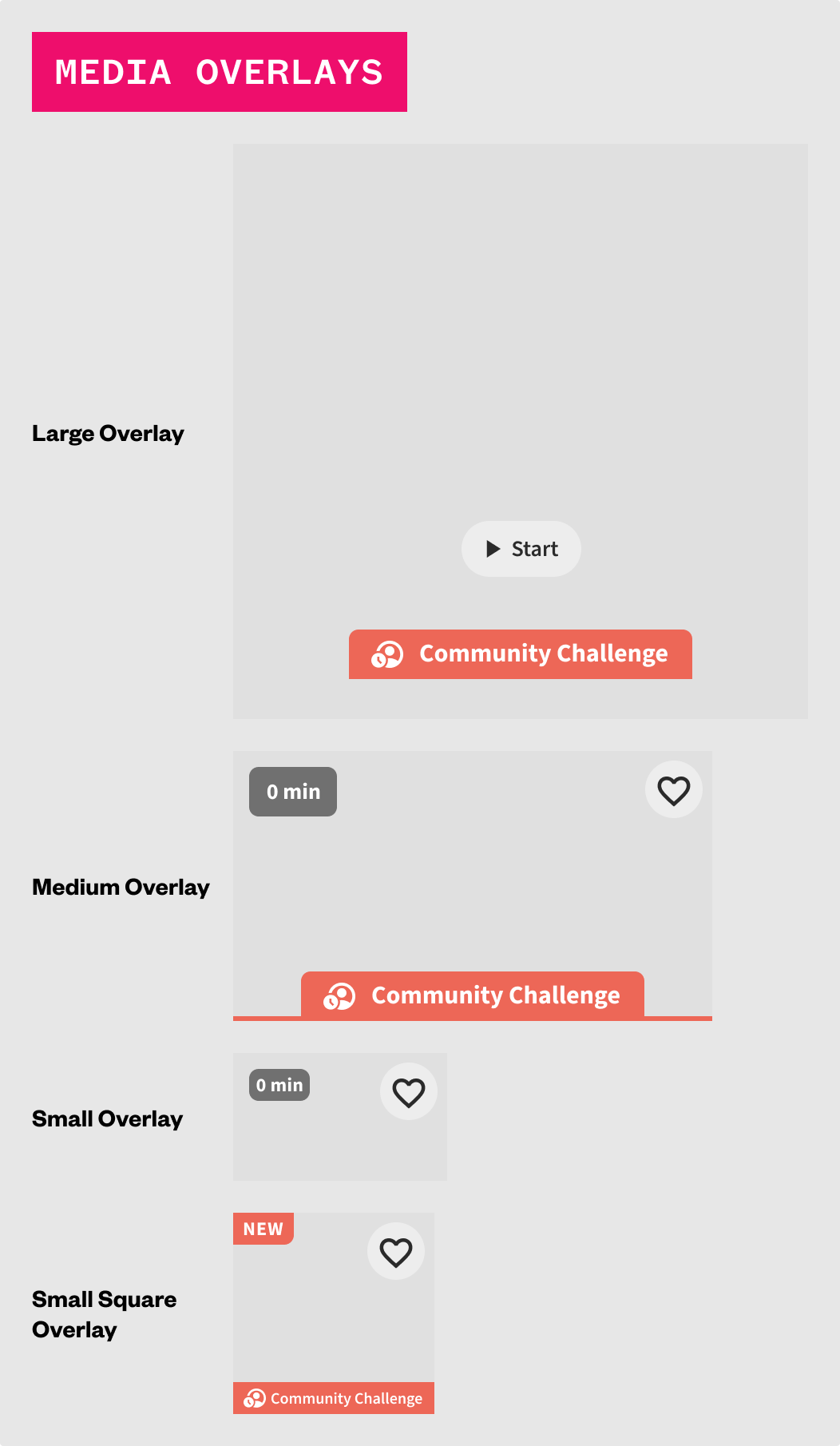
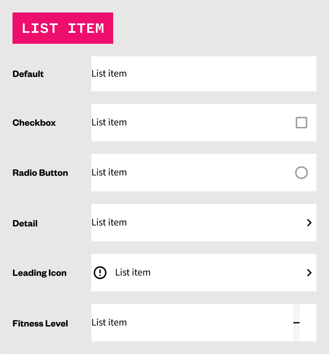
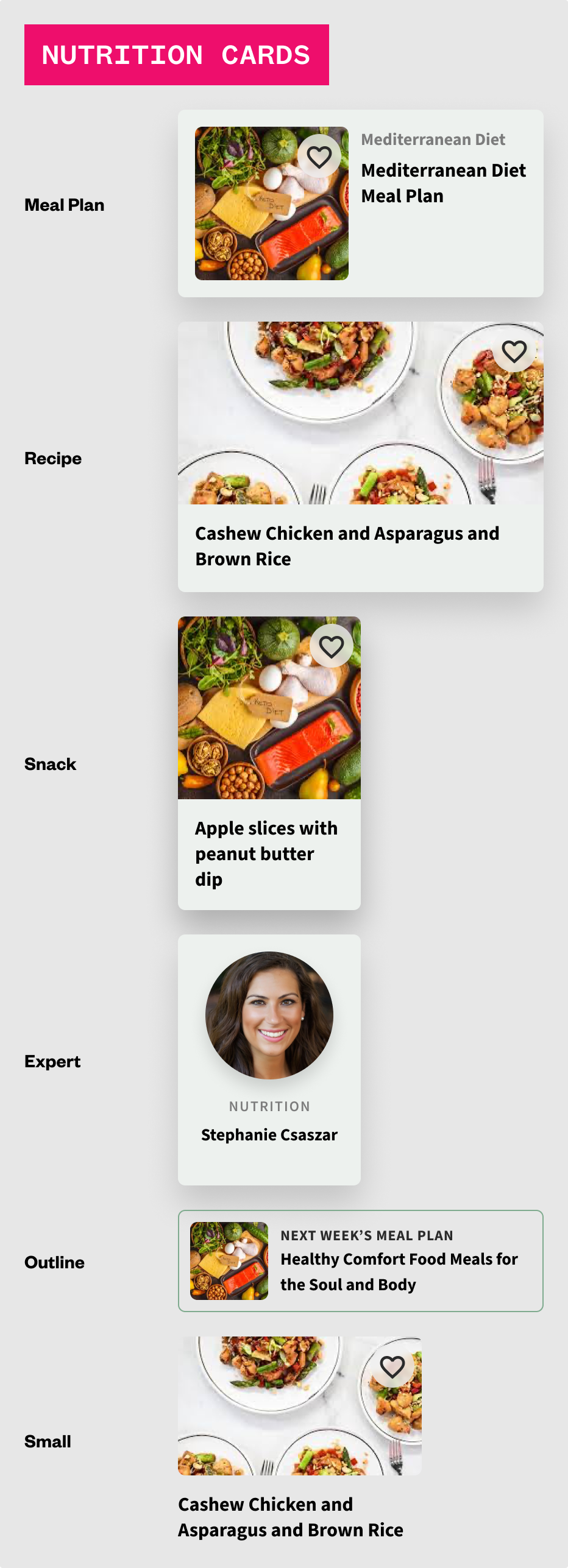
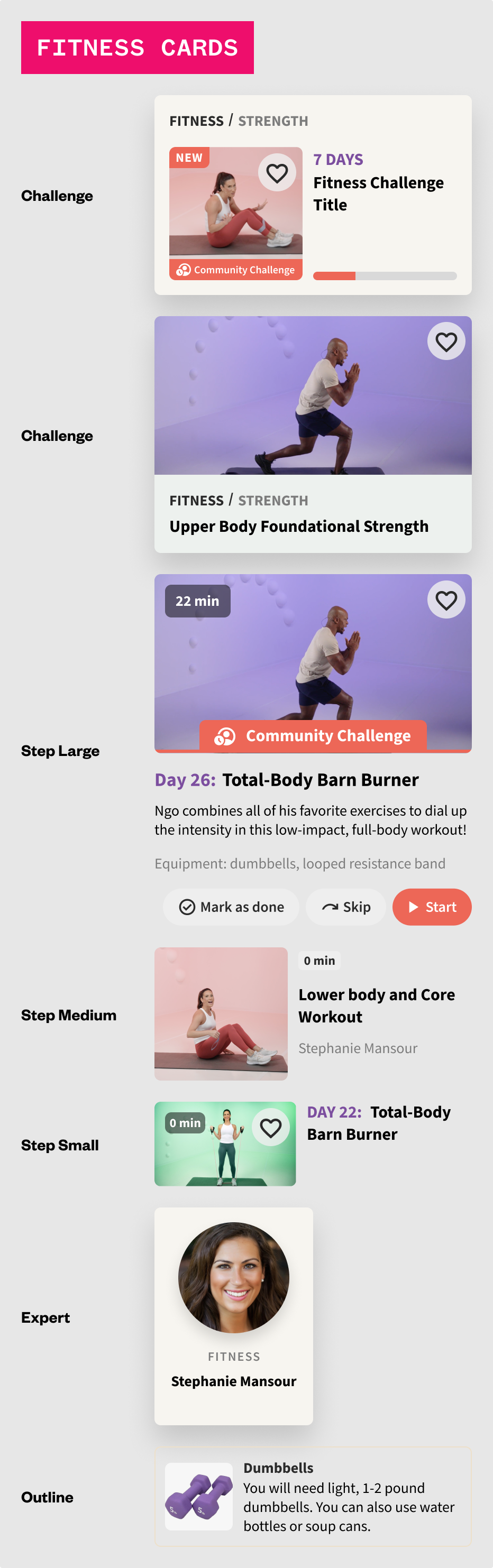
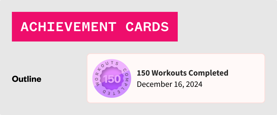
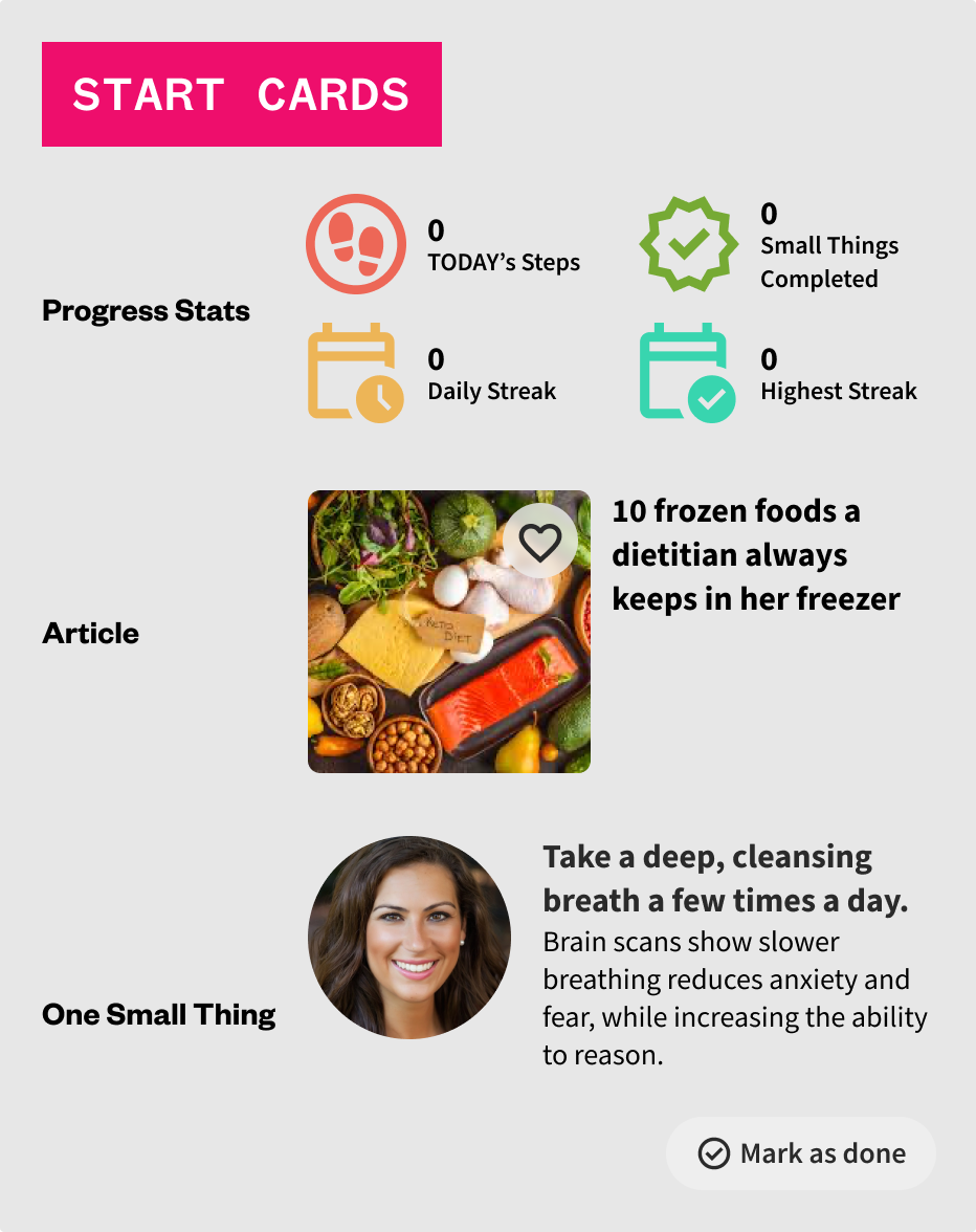
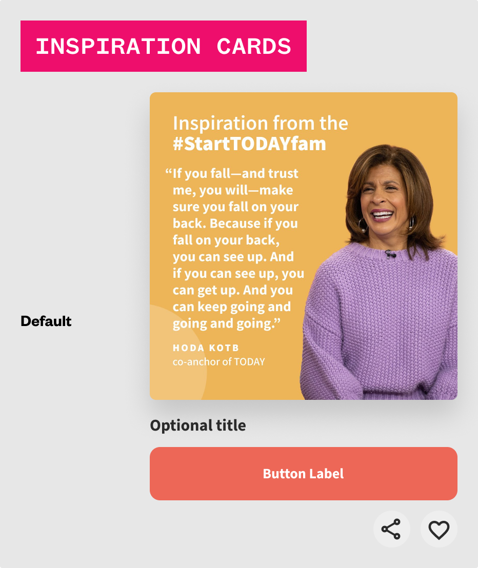
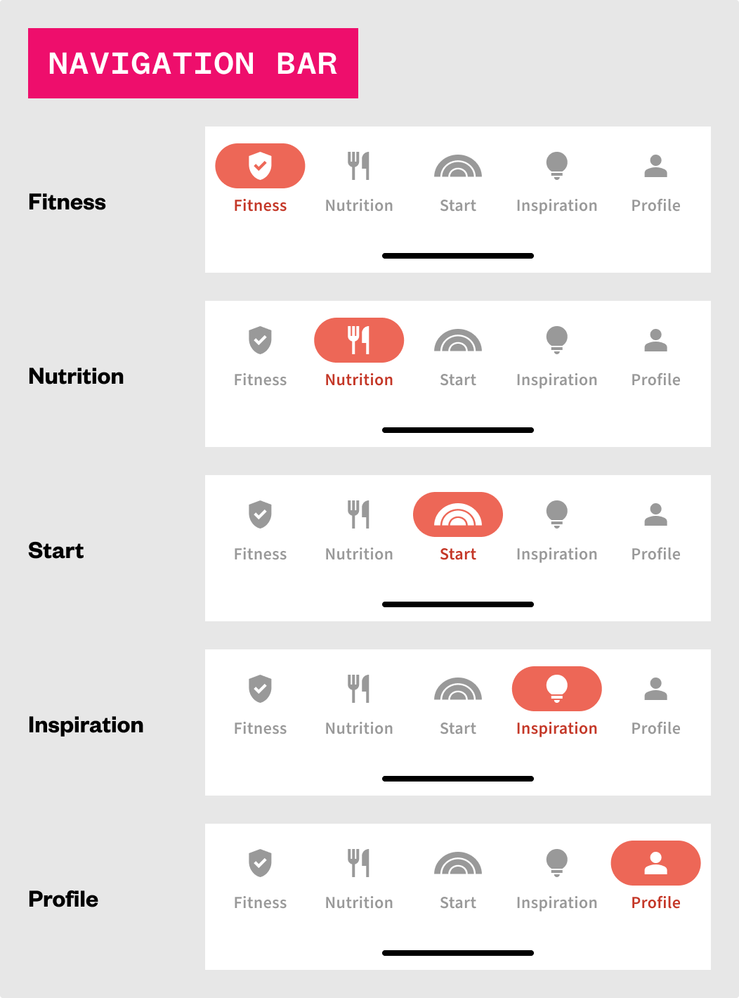
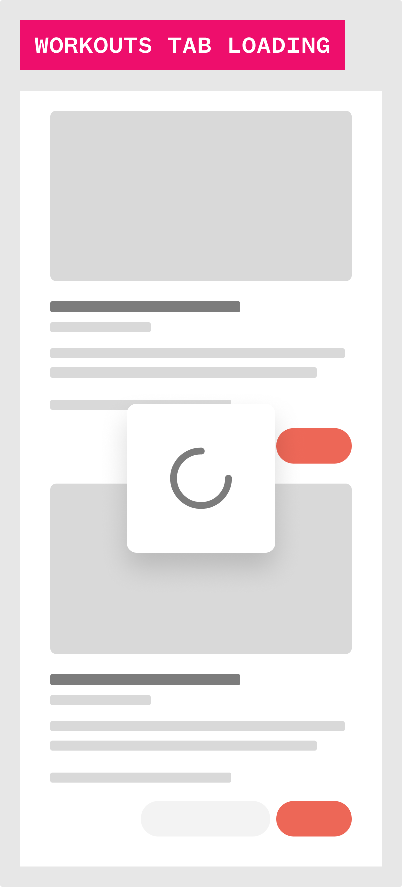
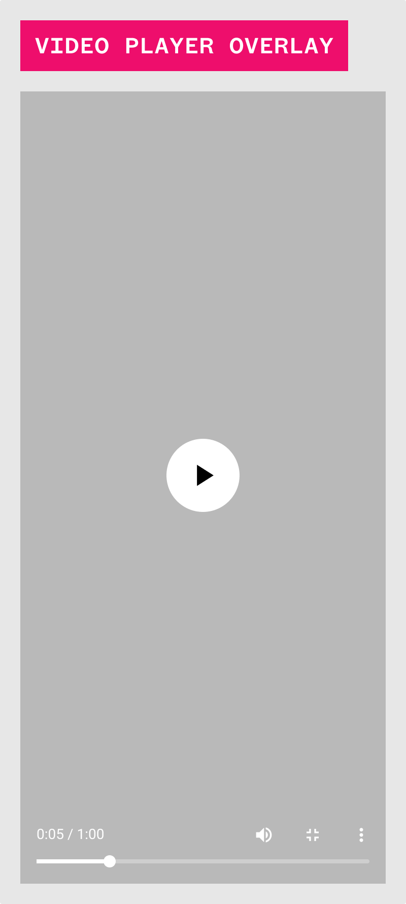
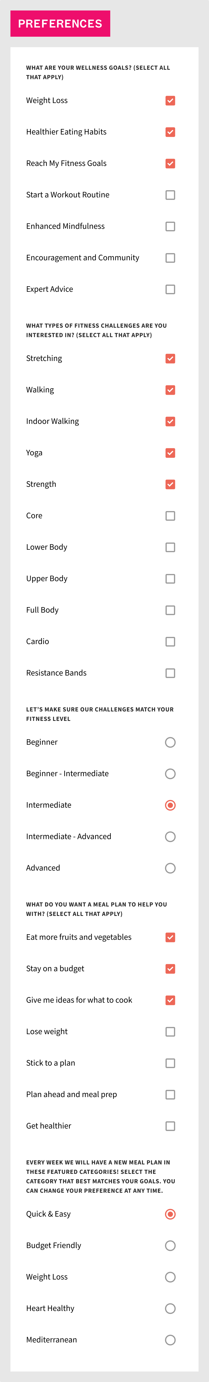
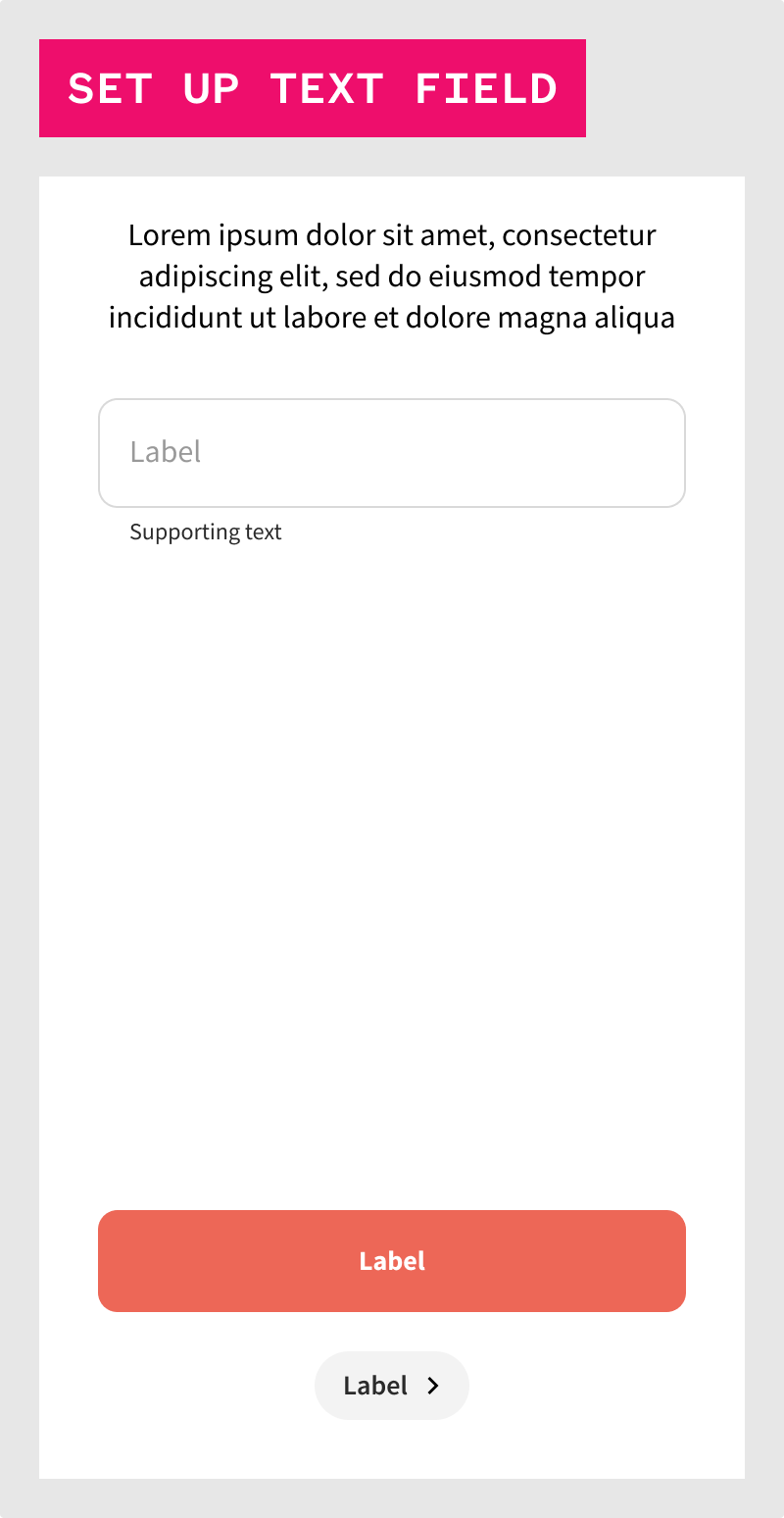
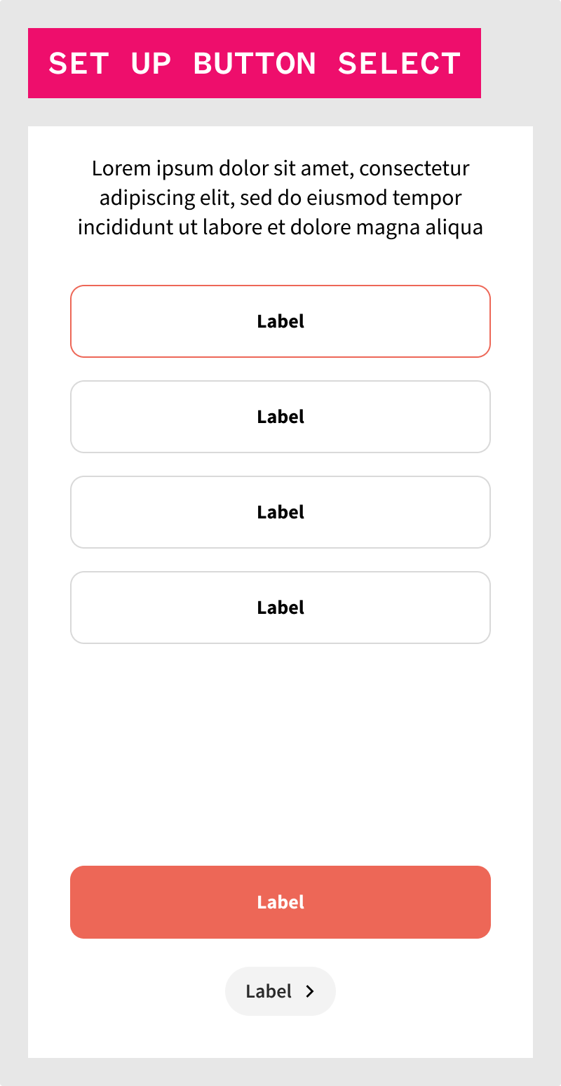
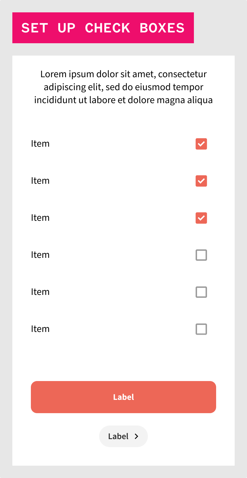
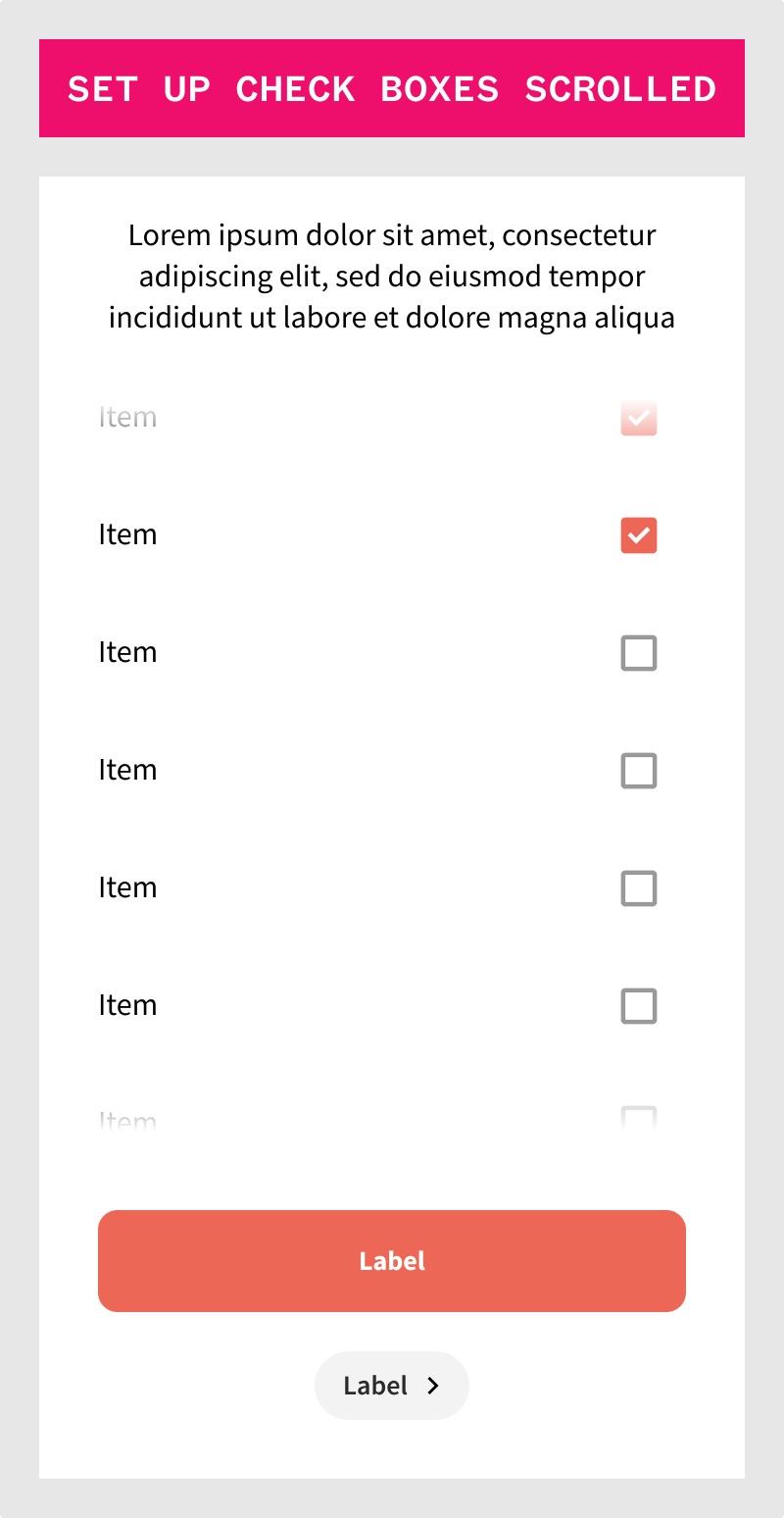
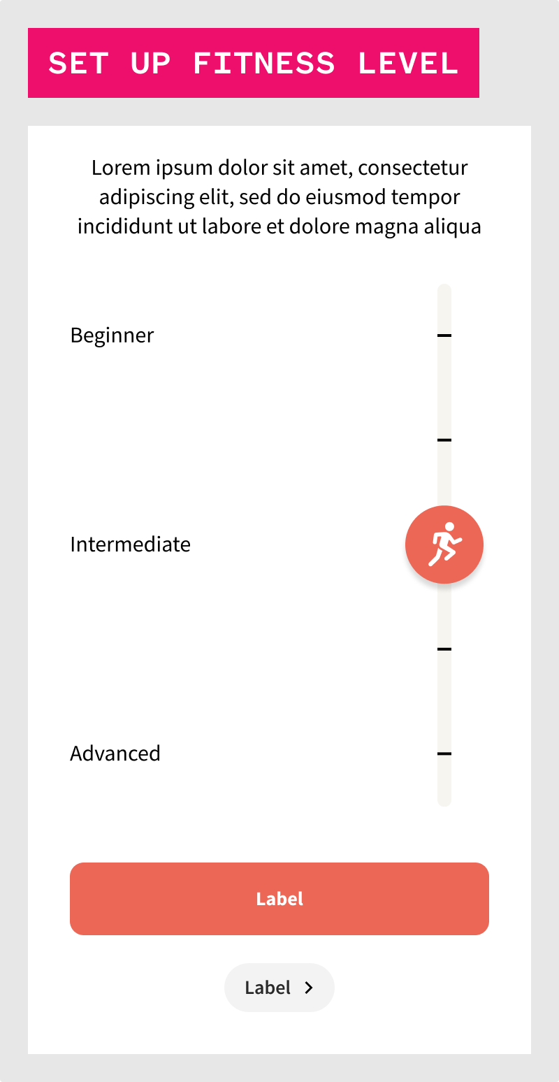
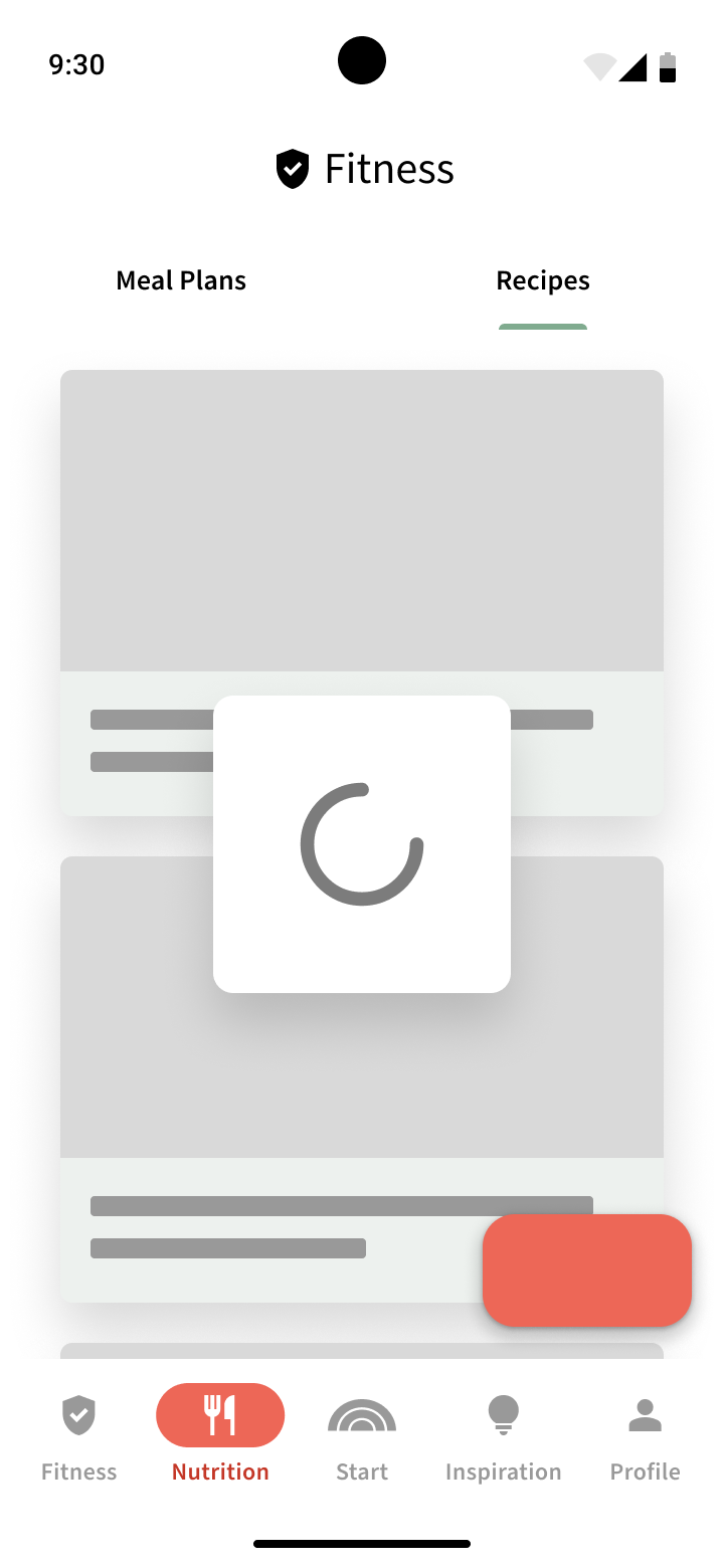
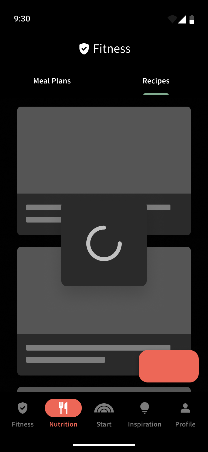
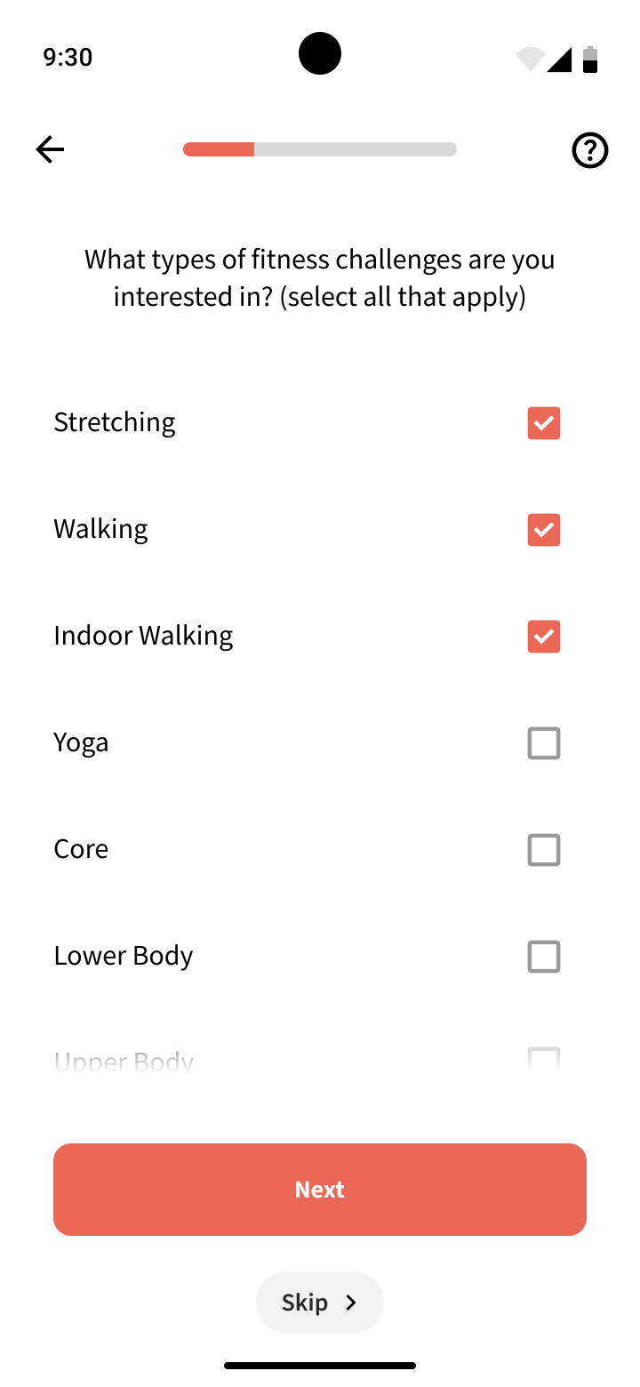
Elements in this case represent atoms, which are very basic pieces, such as individual navigation items, buttons, indicators, different media representations at different ratios, progress bars, checkboxes, radio buttons, and more.
From the elements we can them start building more complex components that may be comprised of one or more elements.
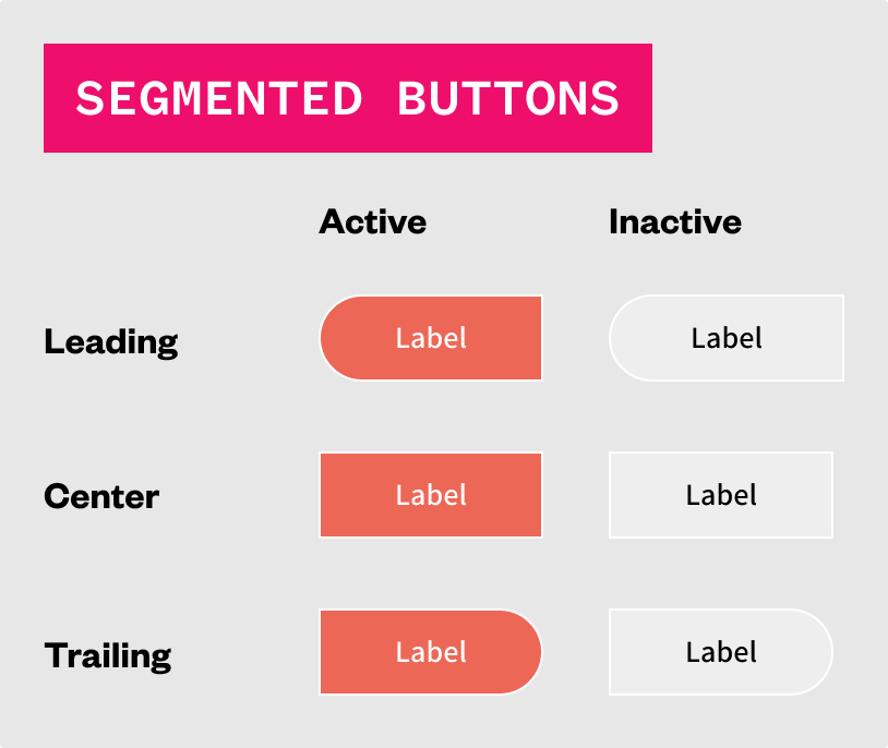
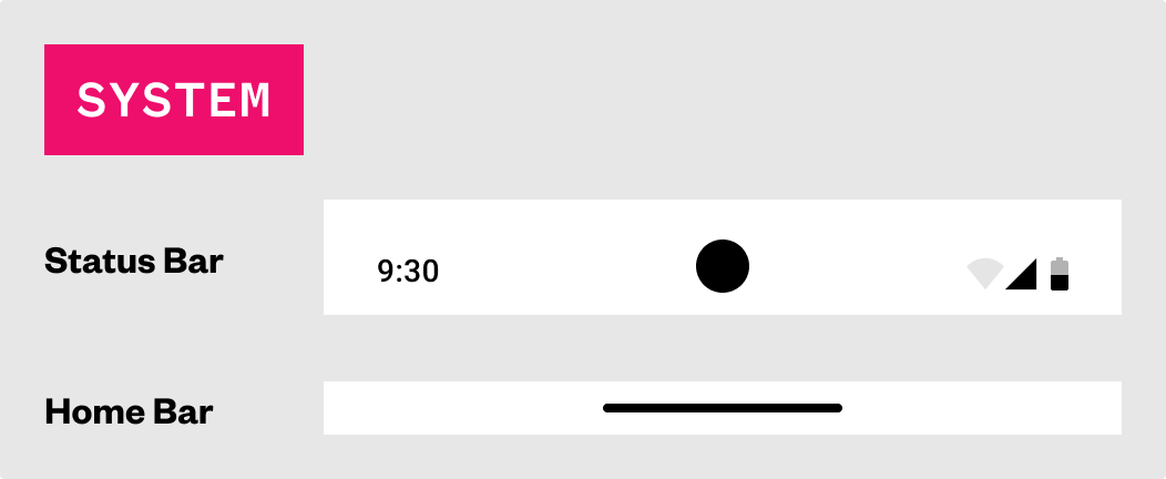
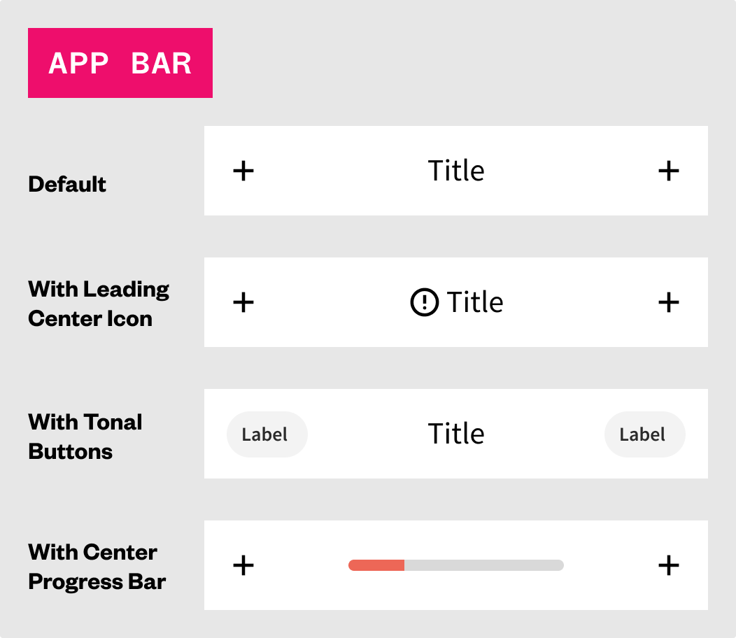
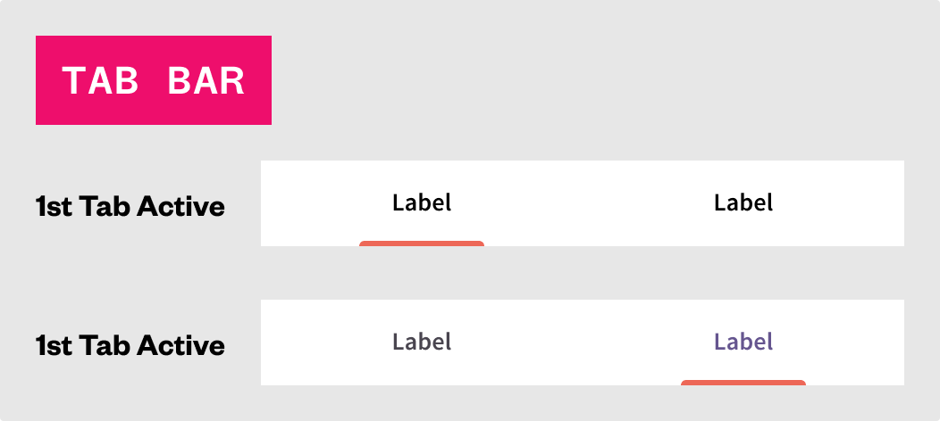
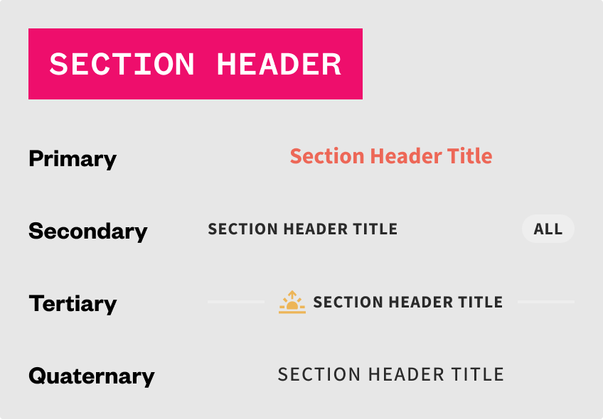
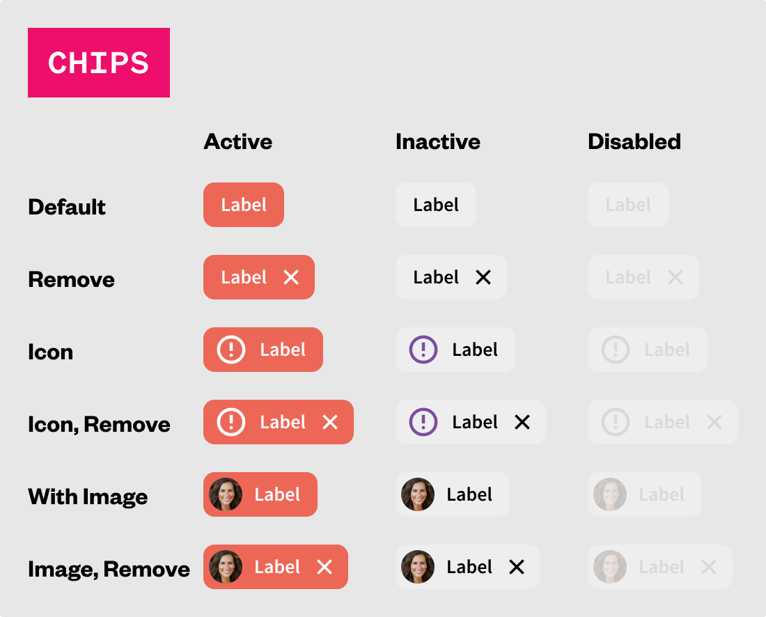
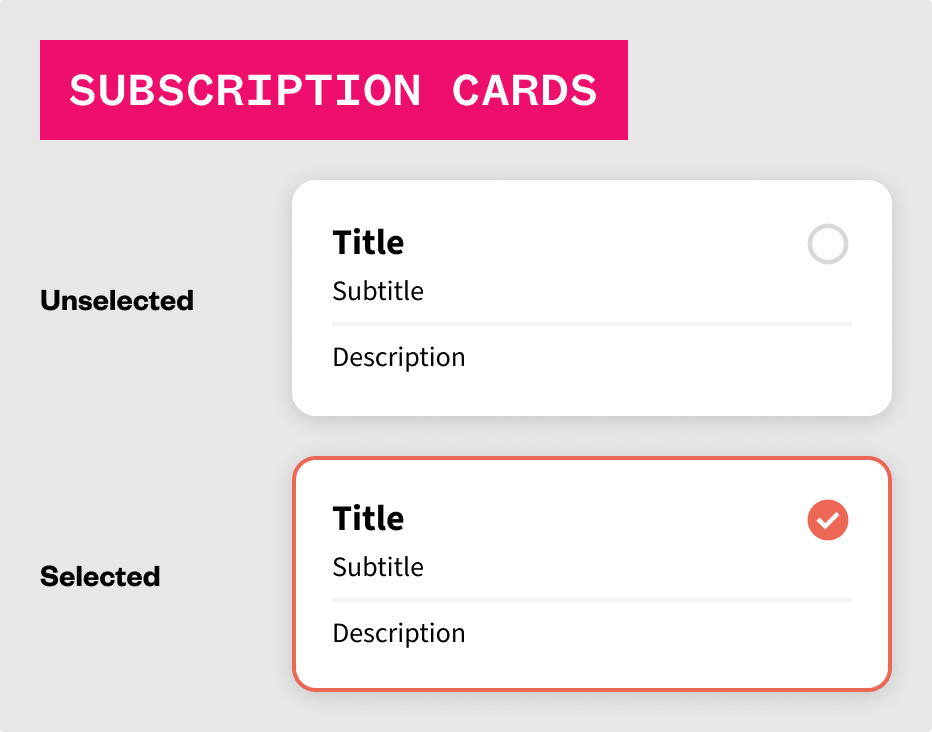
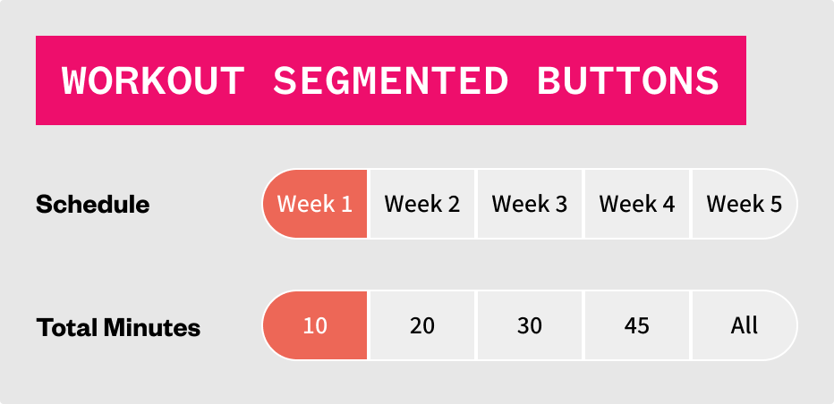
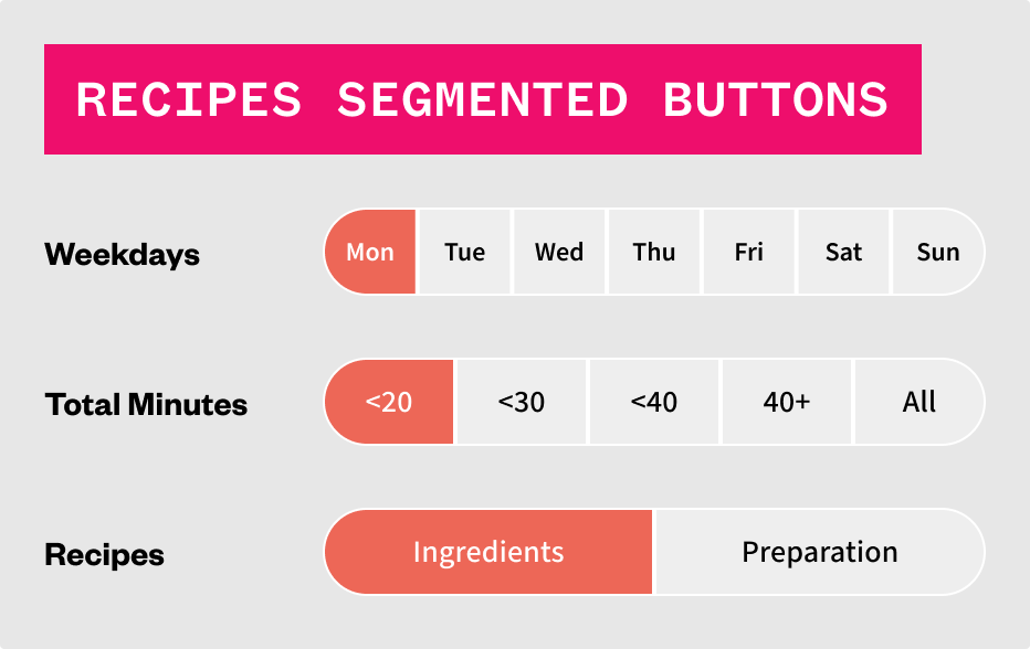
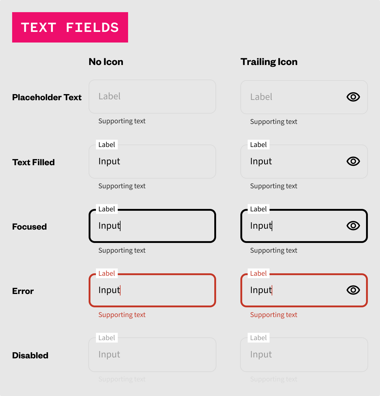
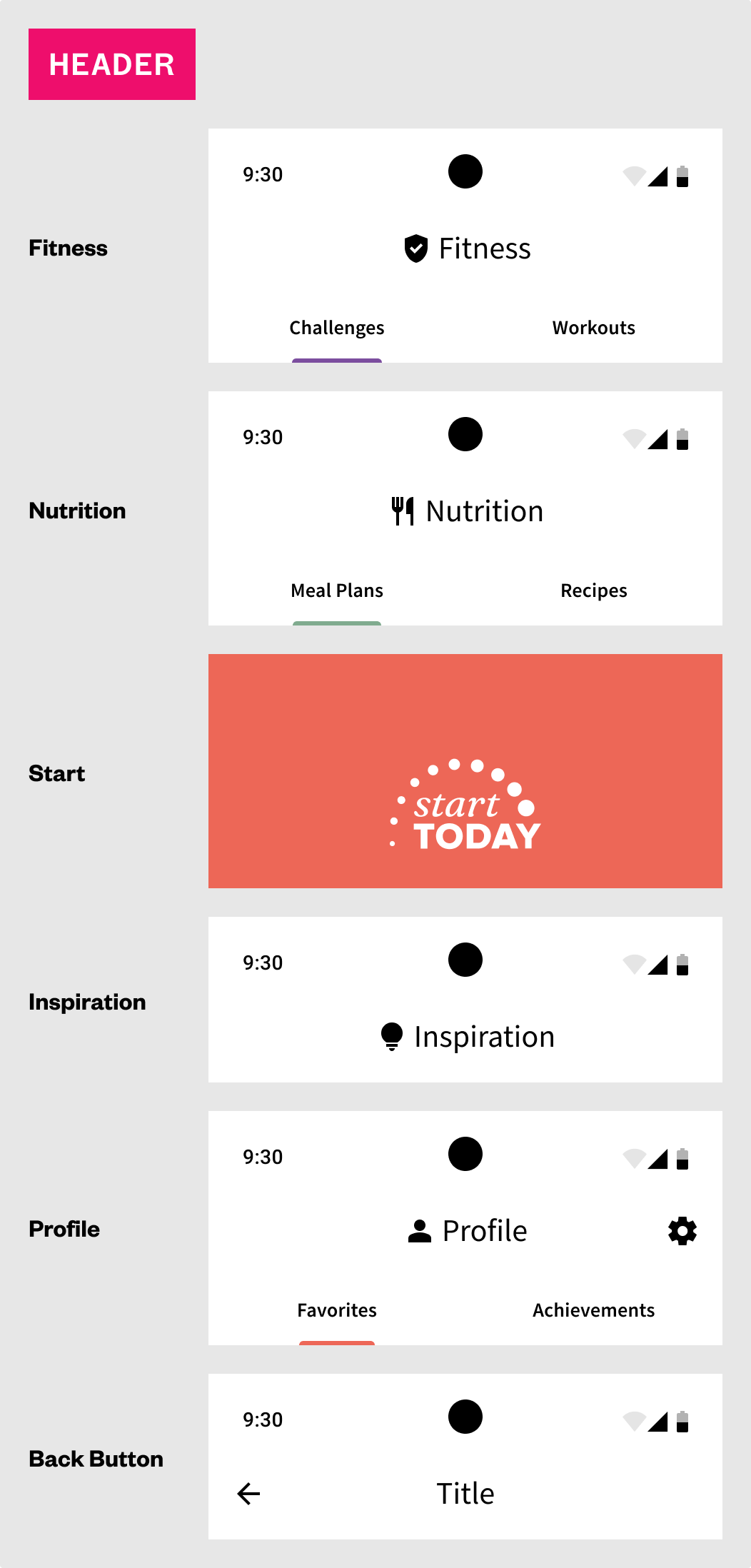
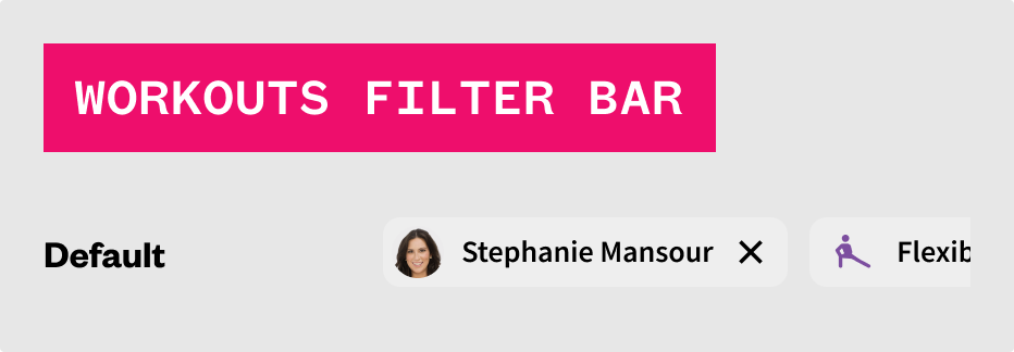
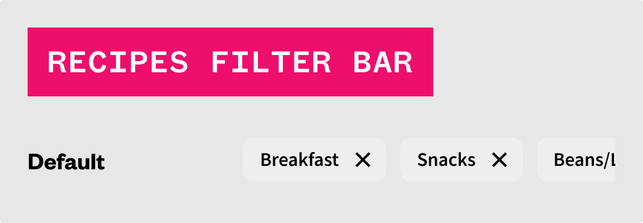
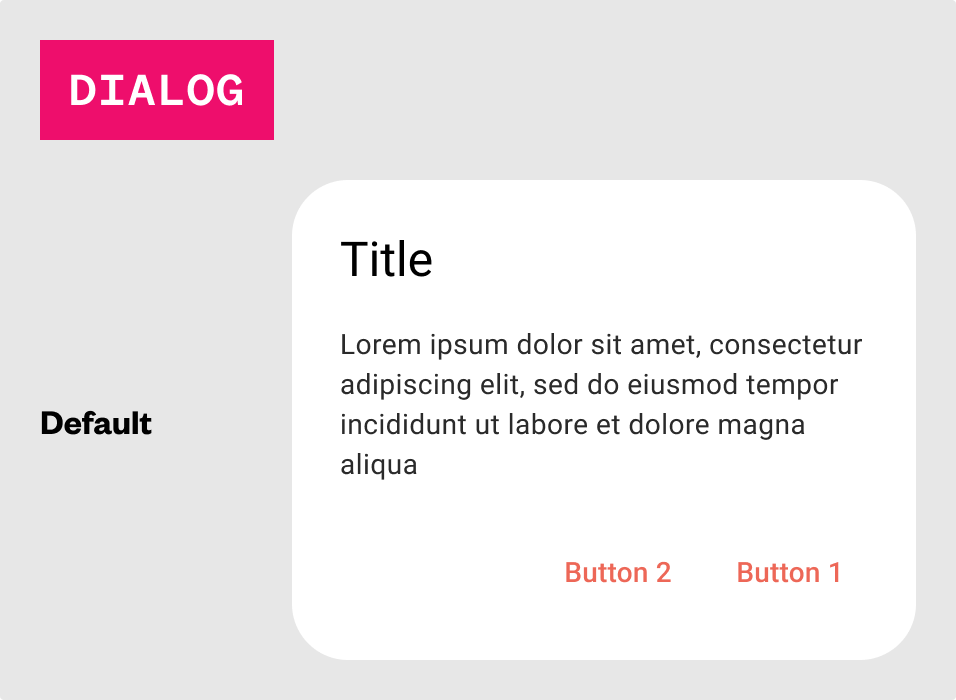
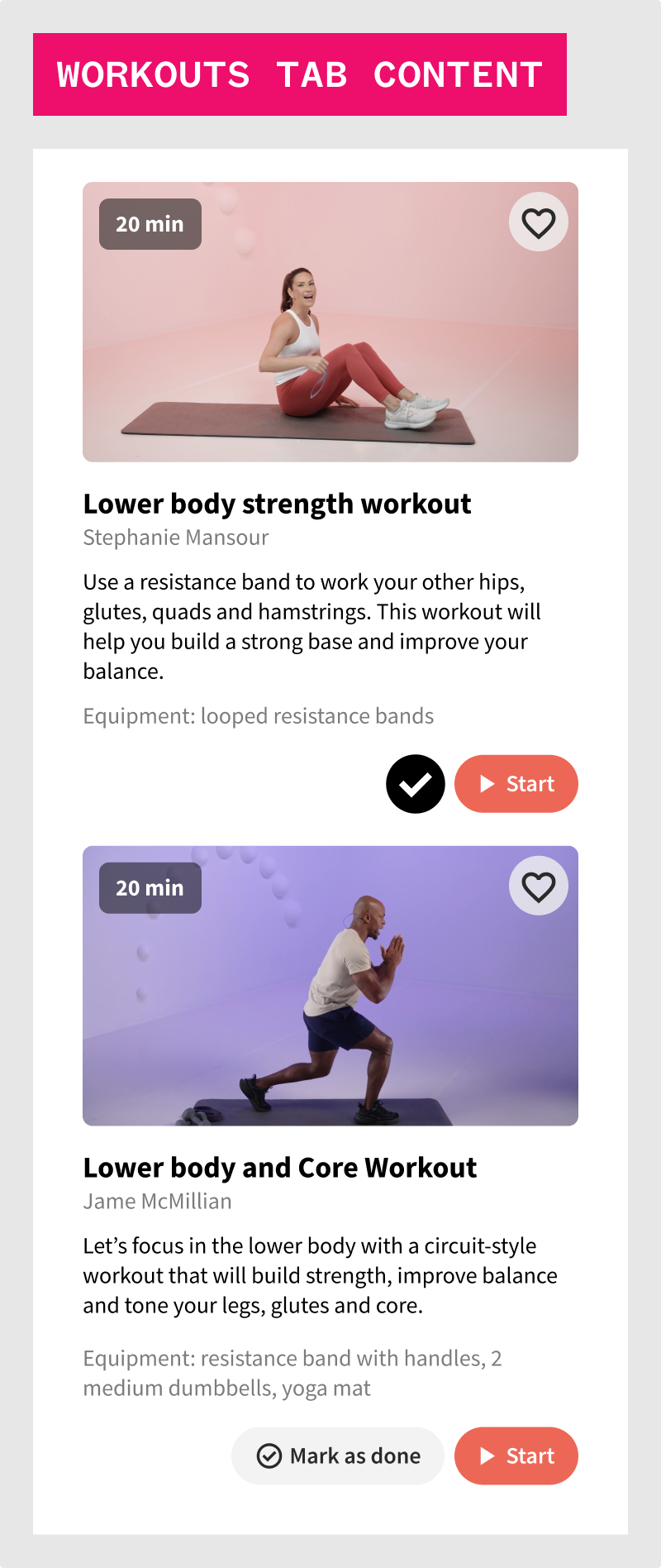
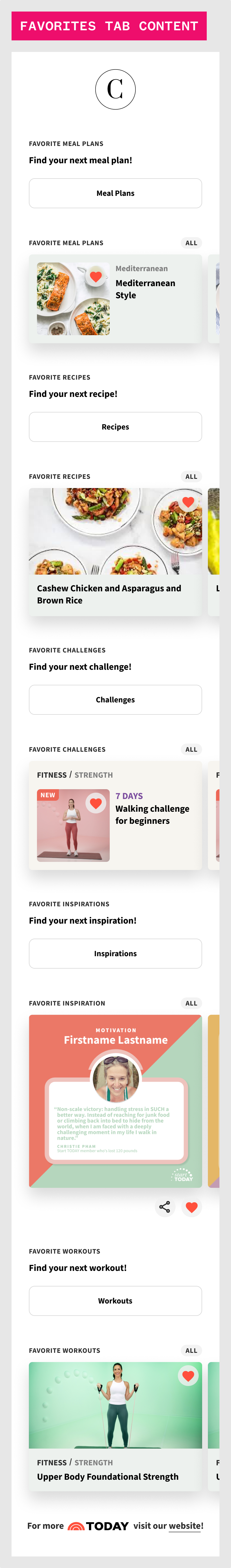
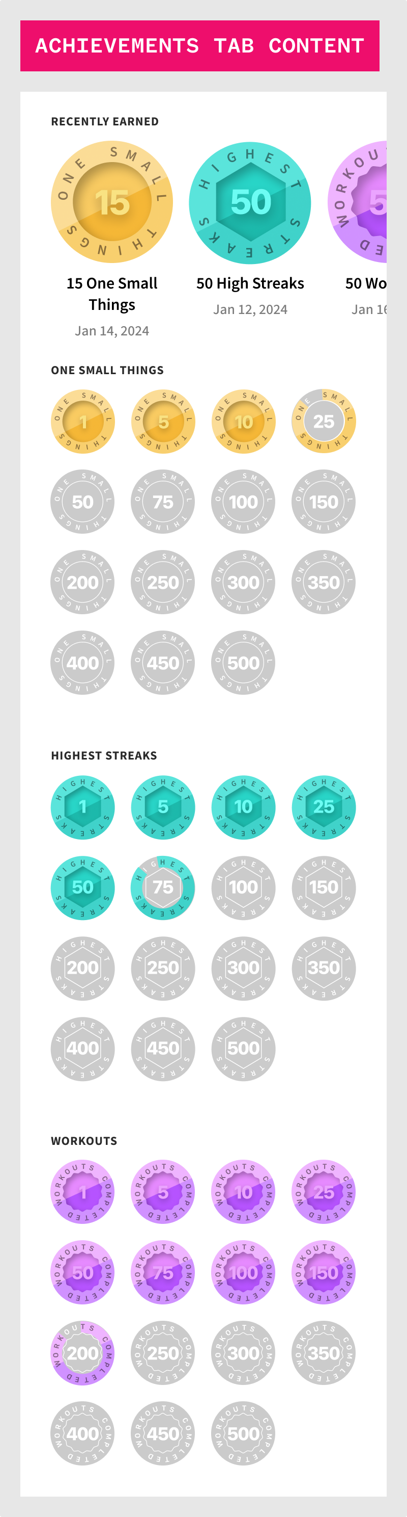
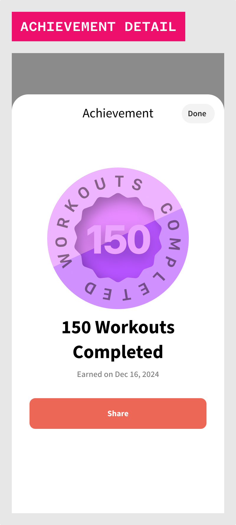
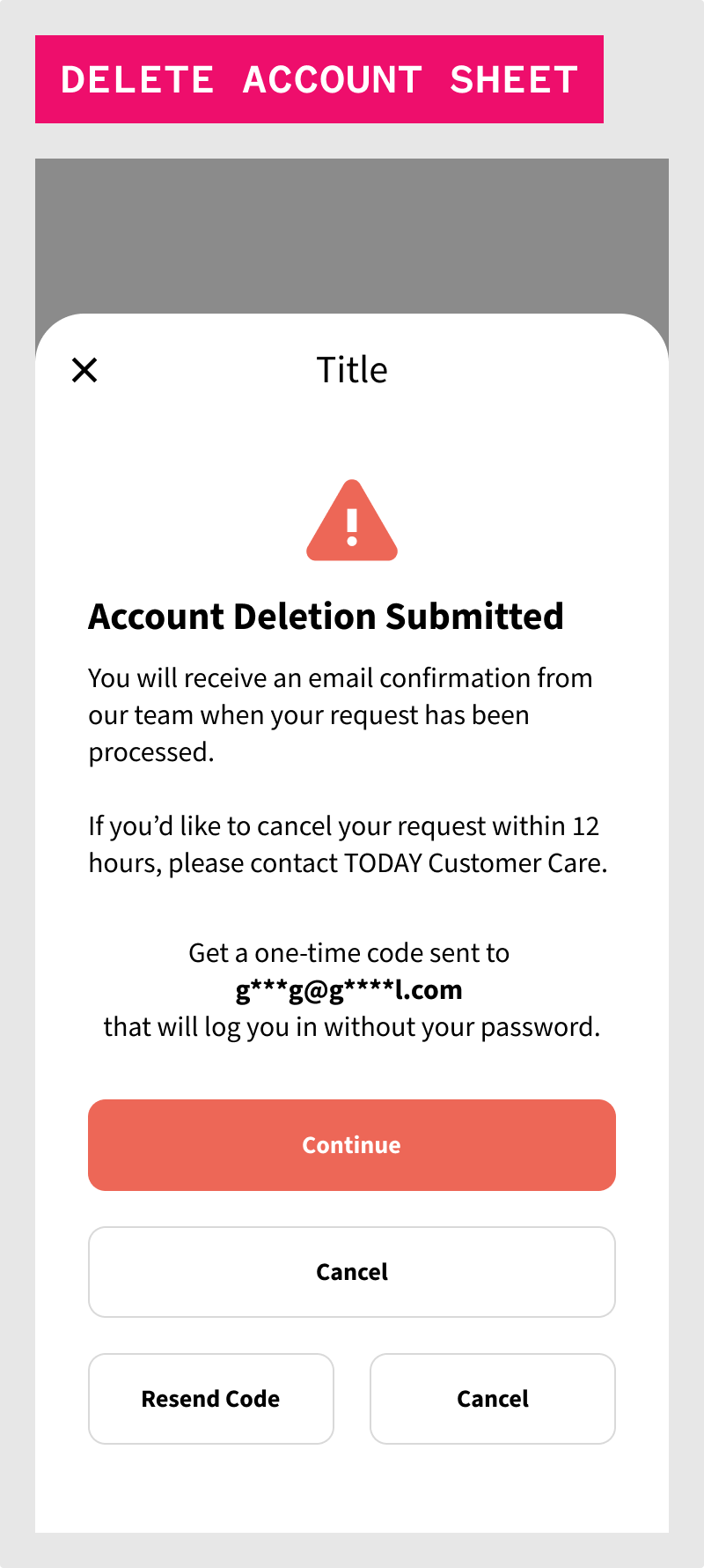
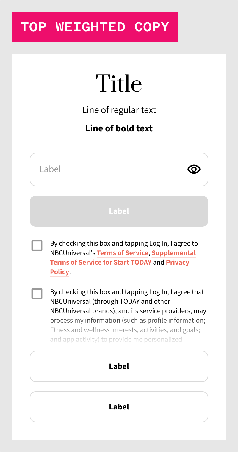
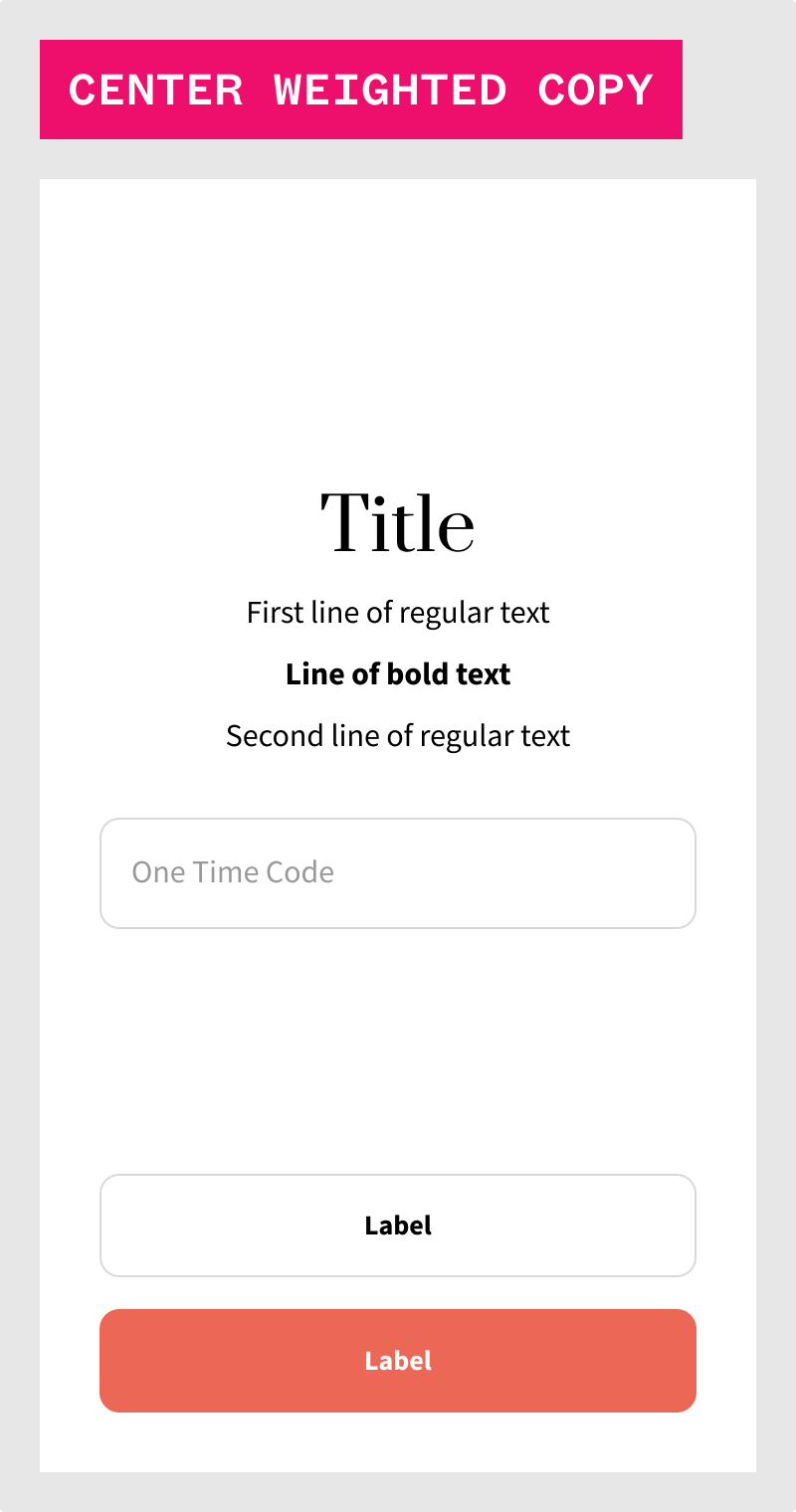
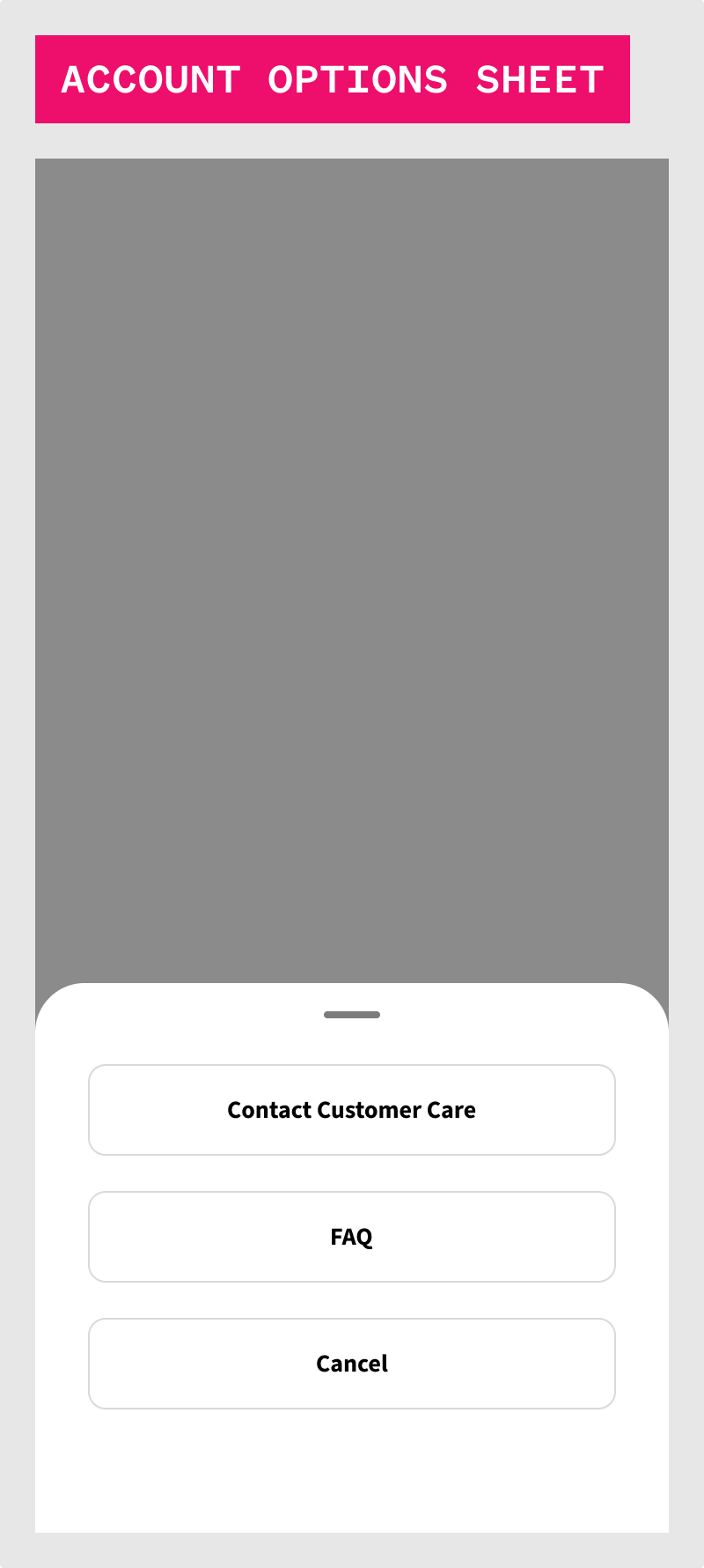
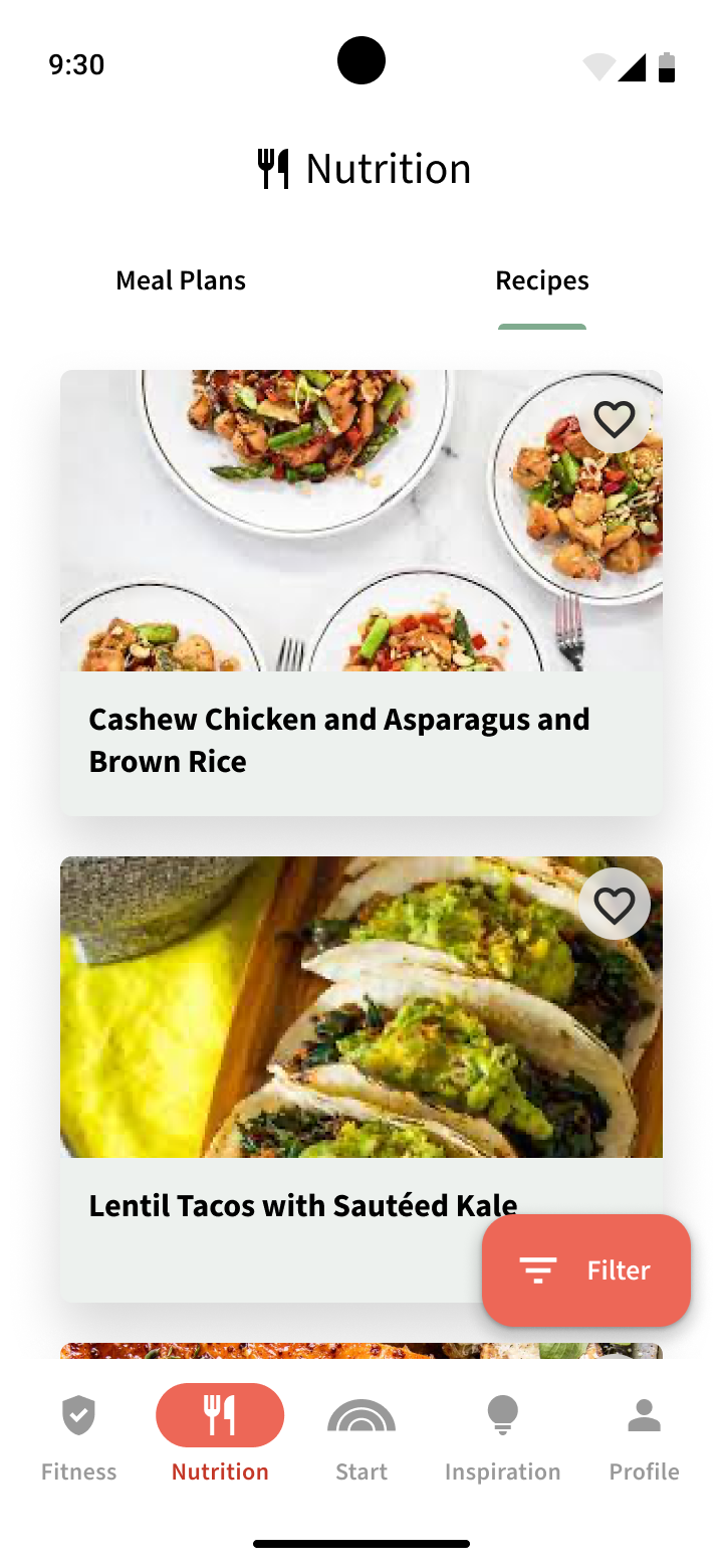
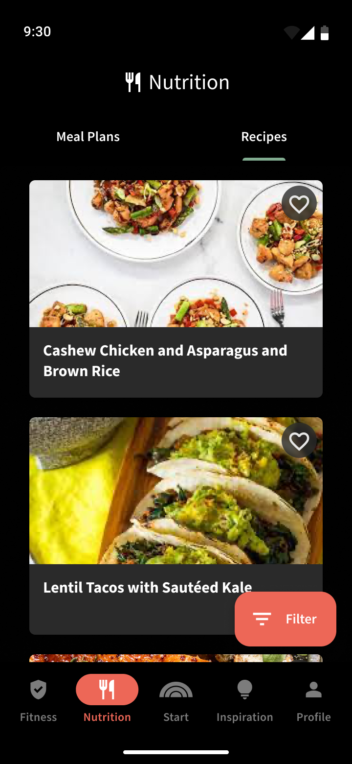
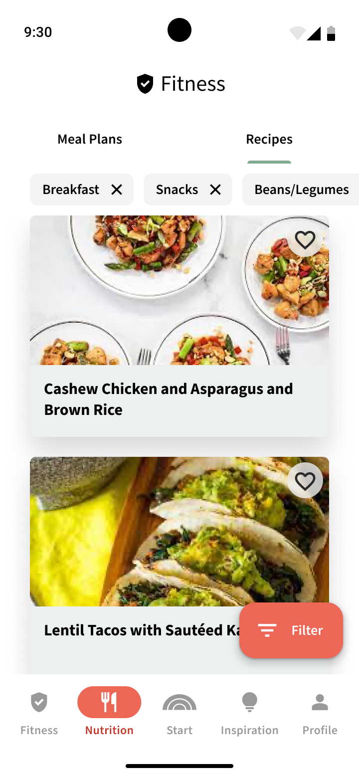
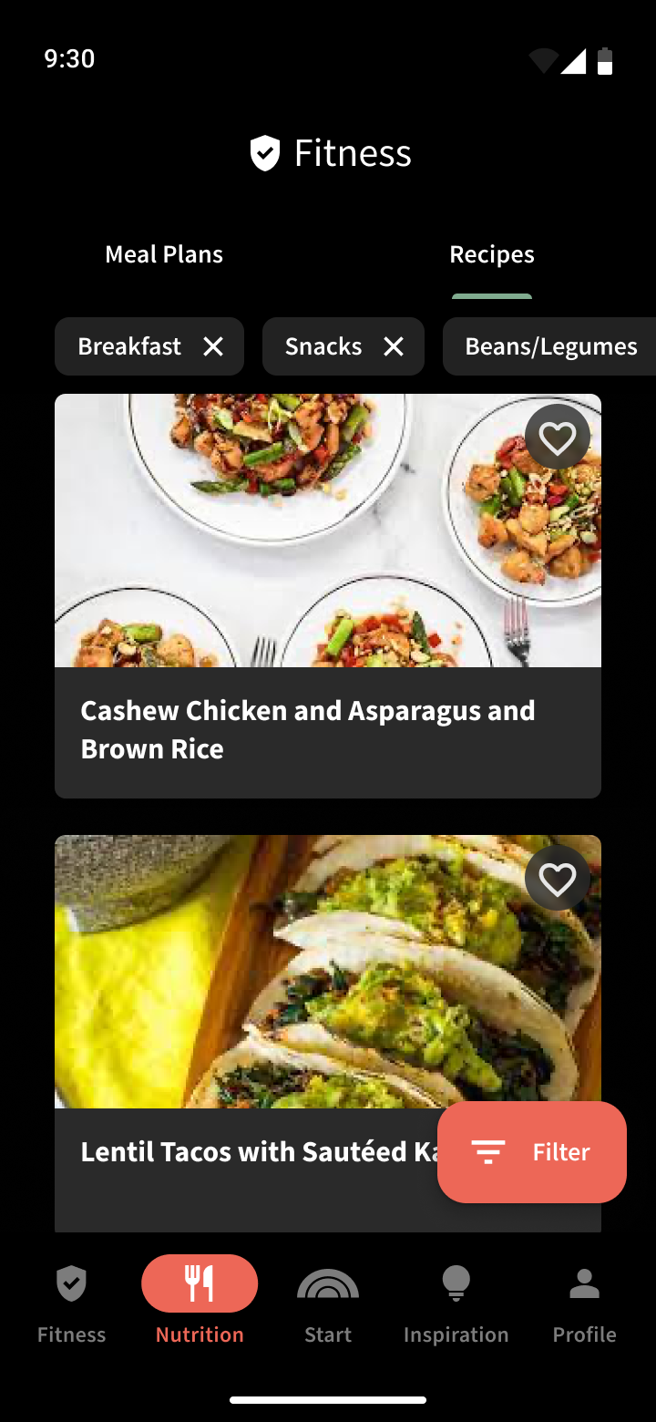
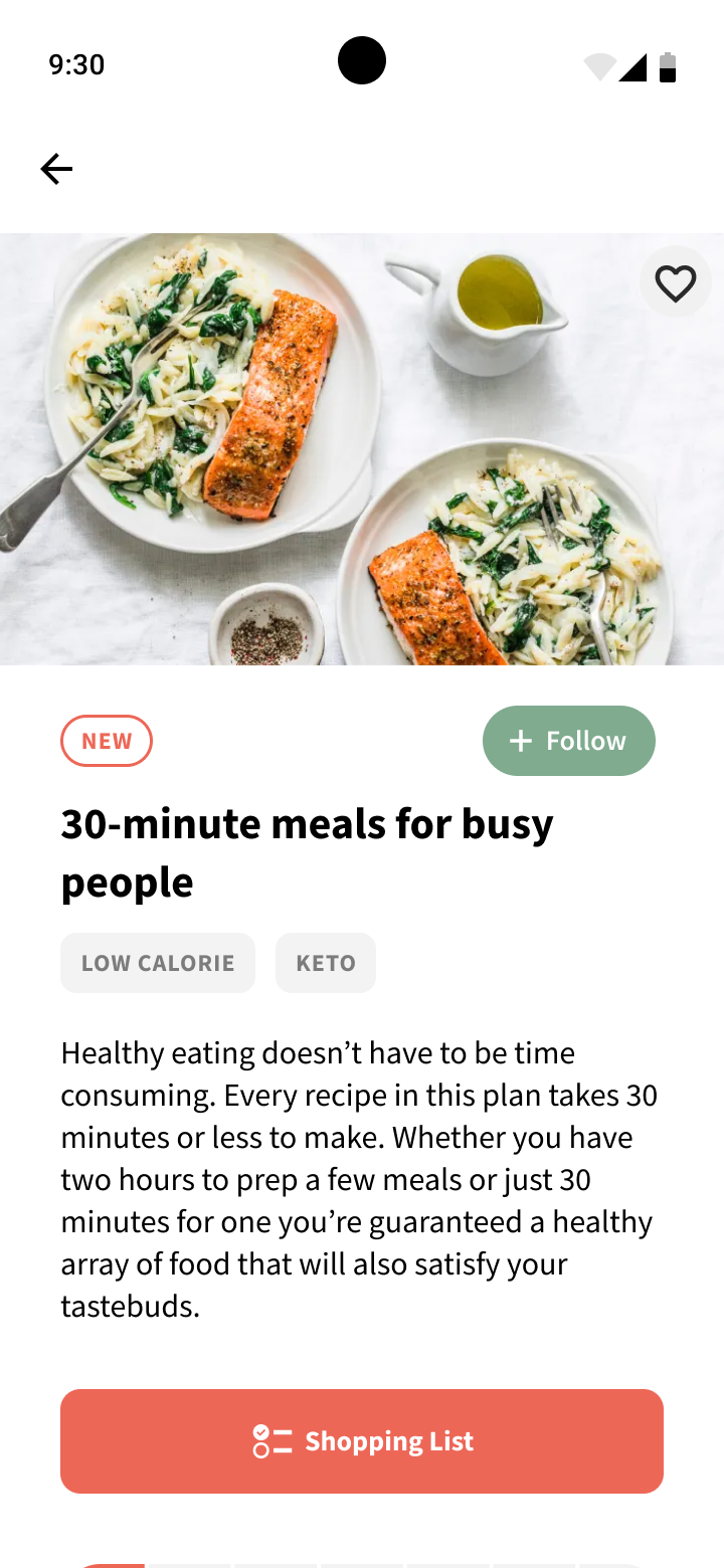
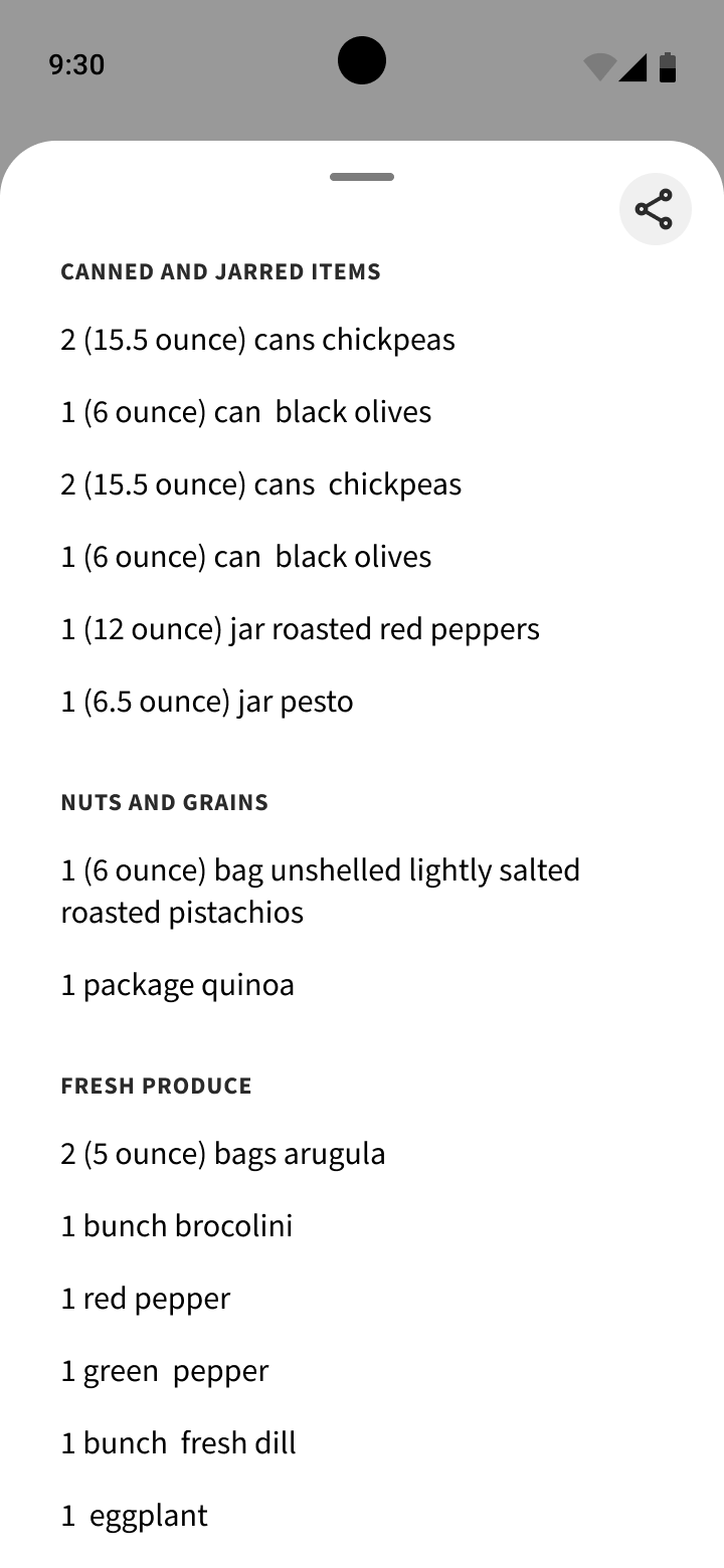
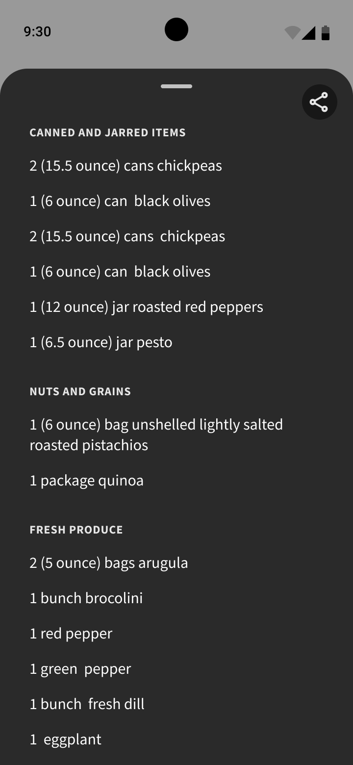
Components (otherwise known as molecules) can be seen as native system elements, such as status bars, and system navigation bars, app navigational elements such as app bars and tab bars, section headers, chips, text fields, media overlays, list items, various types of cards, and more complex buttons, such as segmented buttons.
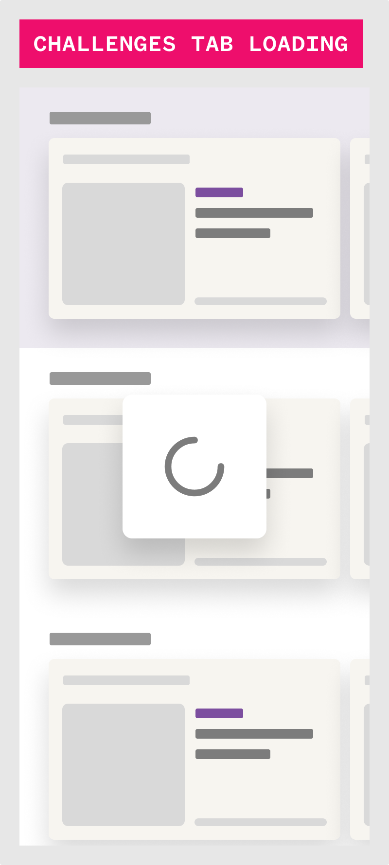
The next building phase of the design system are modules (otherwise known as organisms, which are made up one more components and elements.
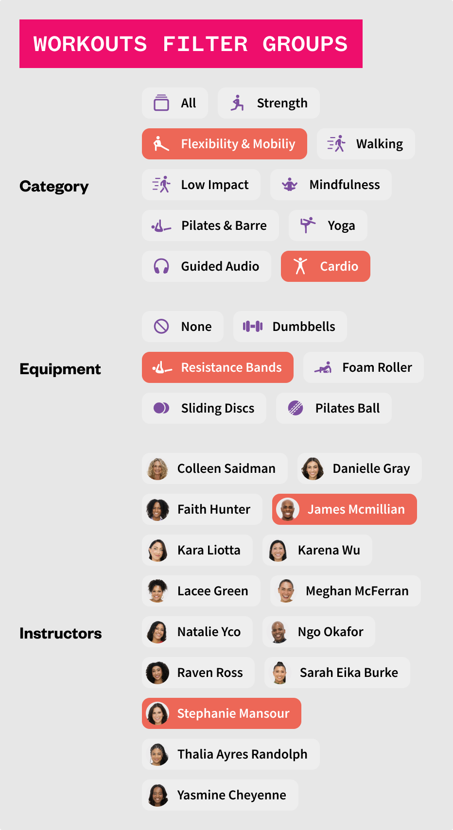
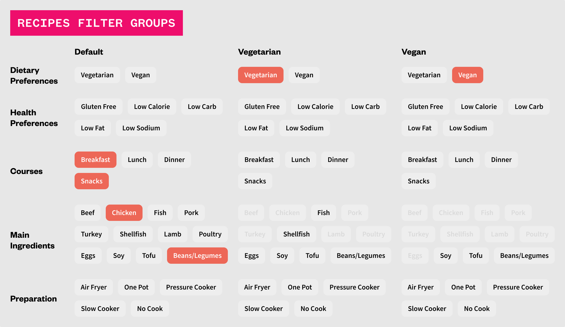
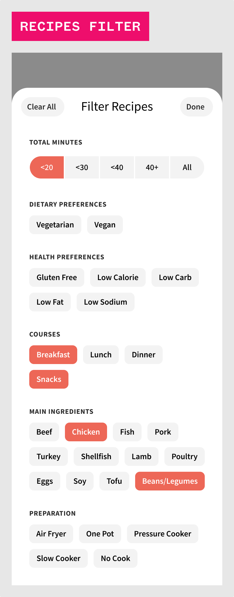
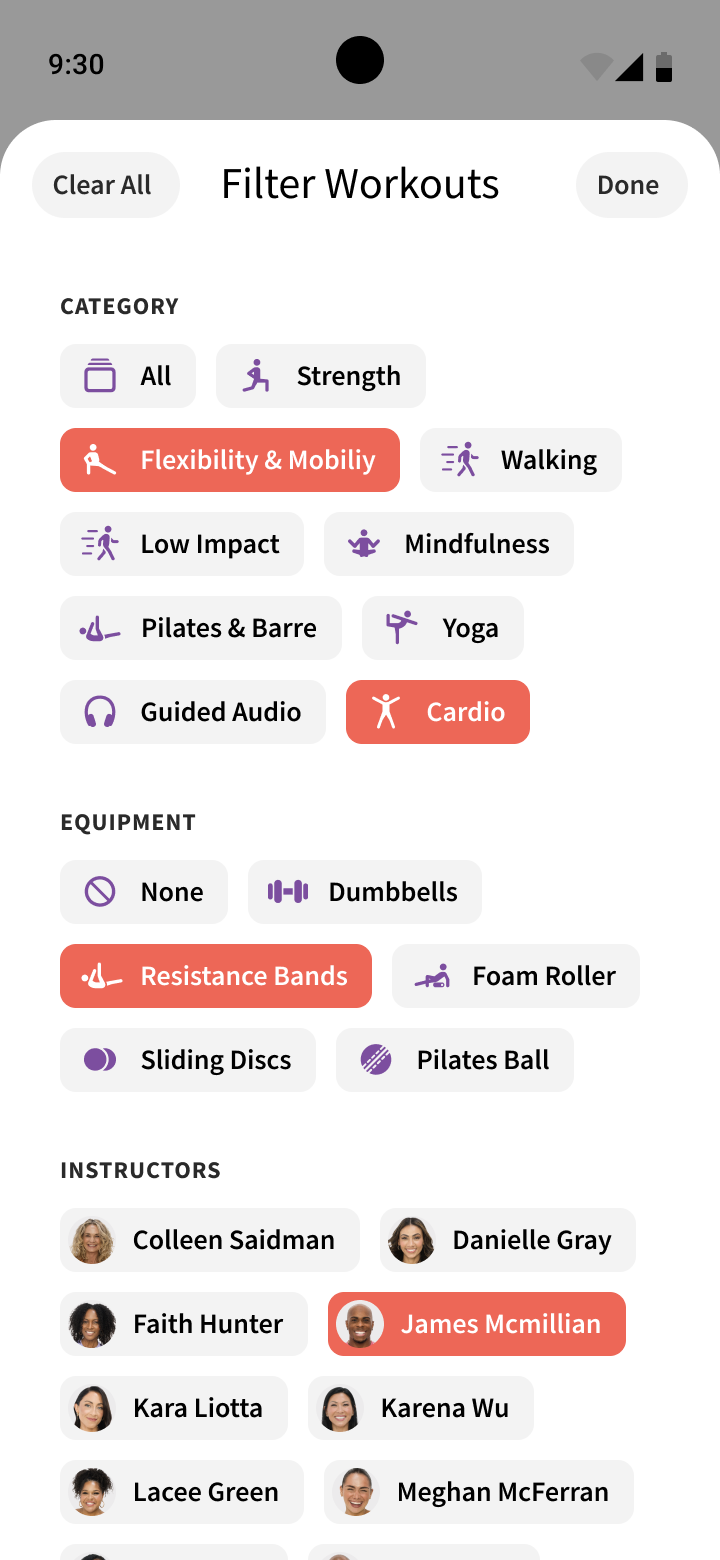
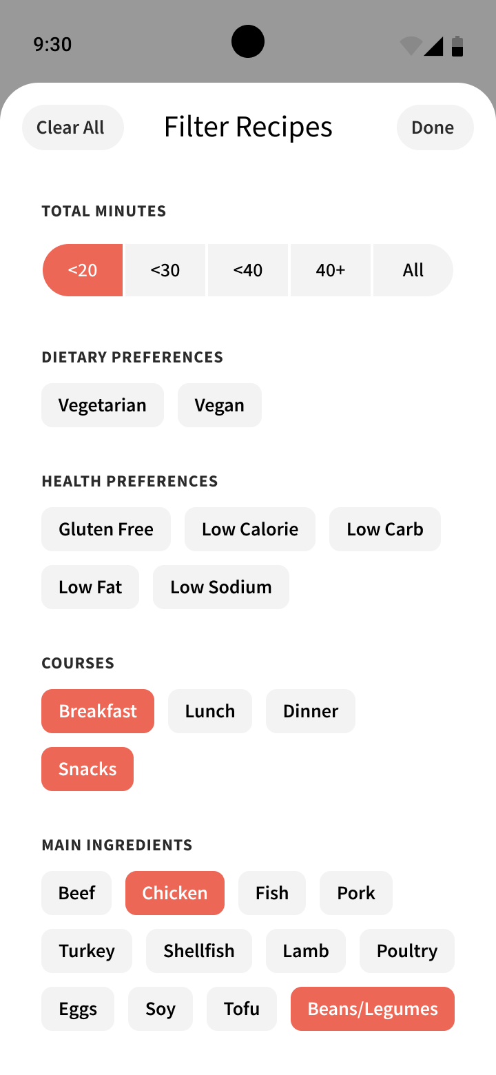
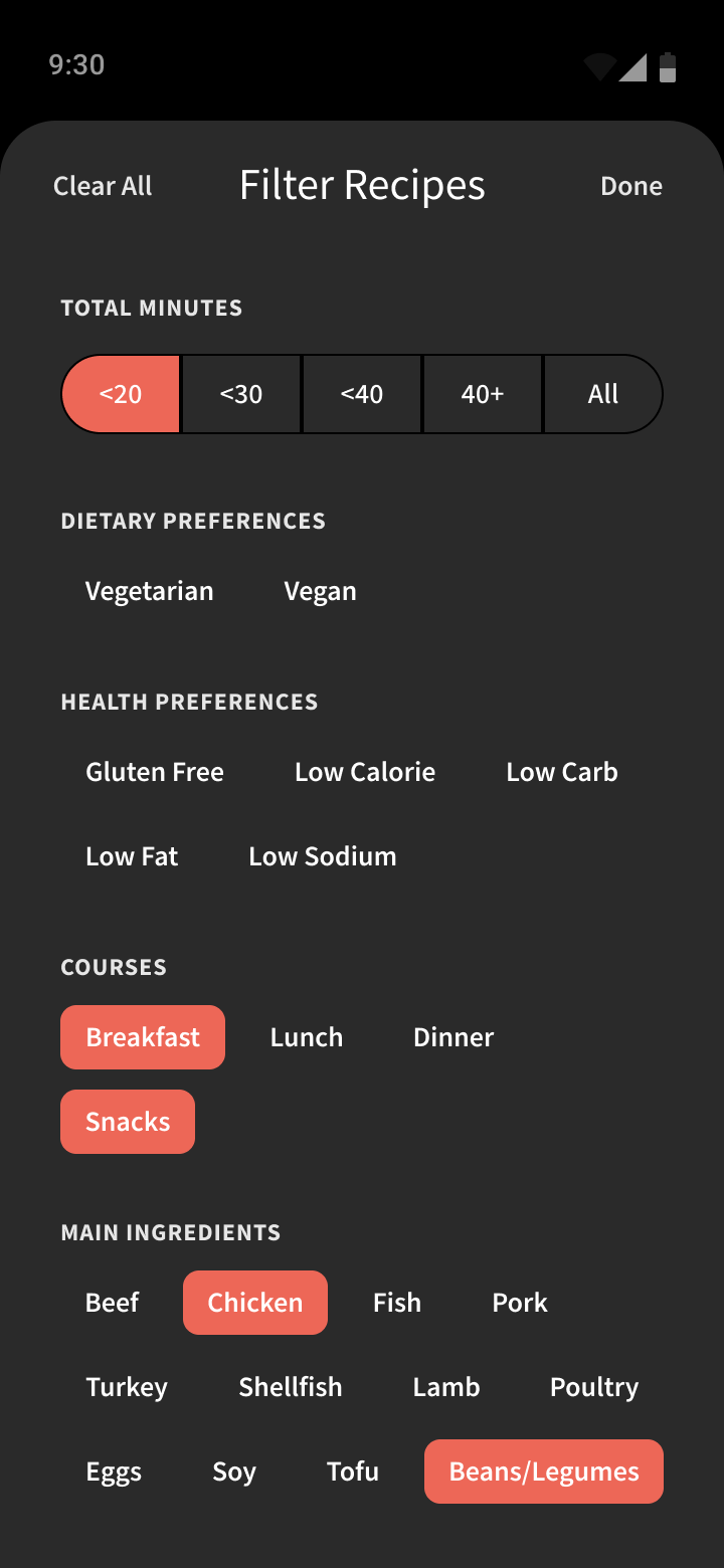
Here, modules can be seen as complete headers and tab bars, filtering mechanisms, and more.
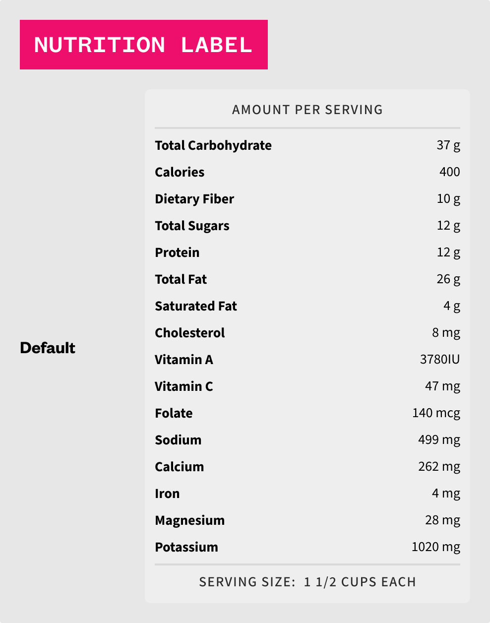
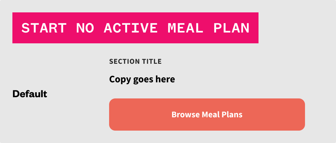
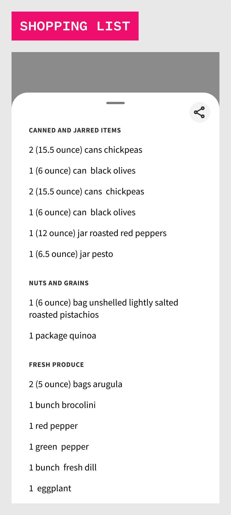
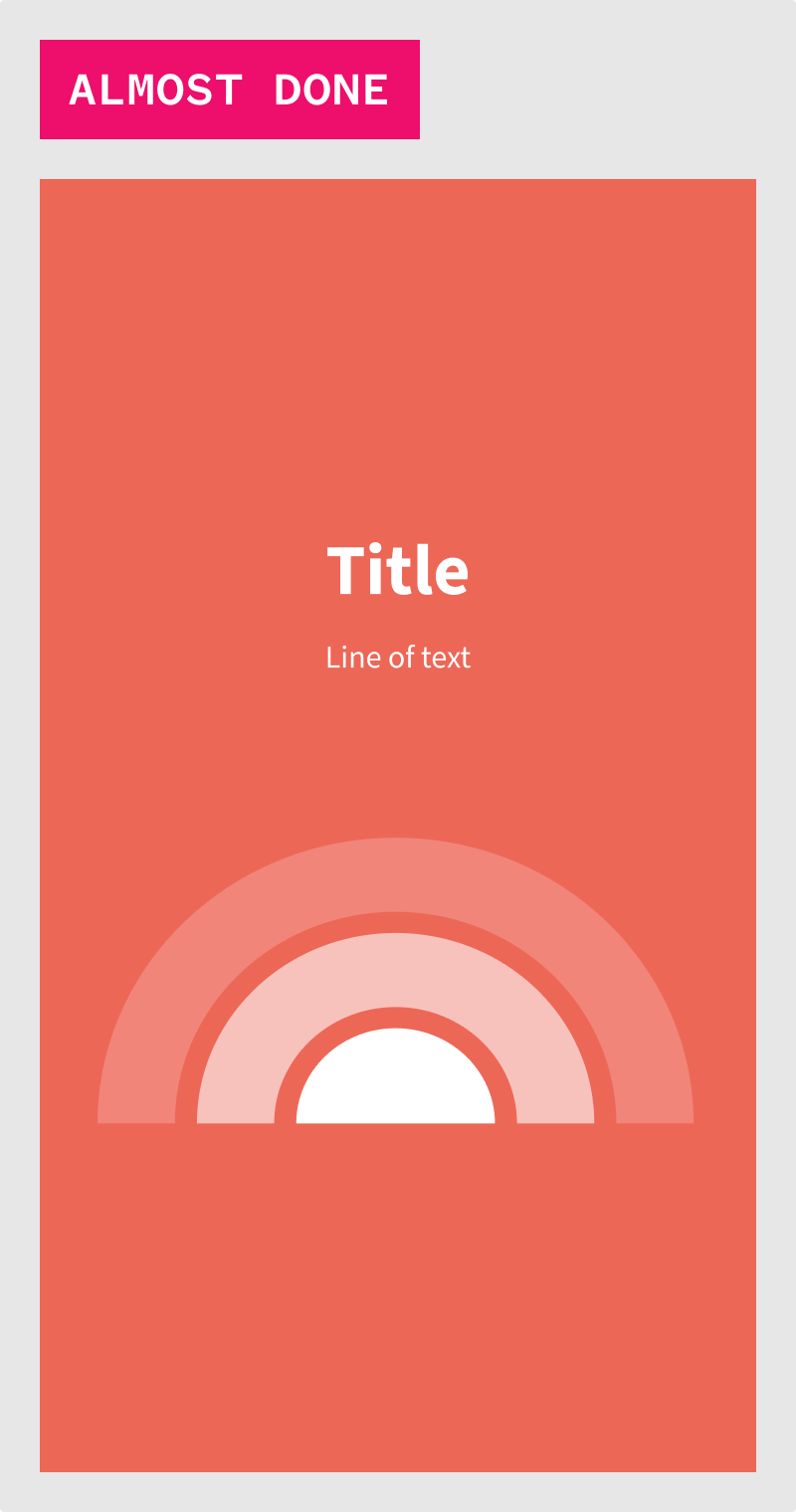
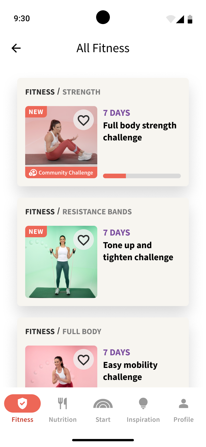
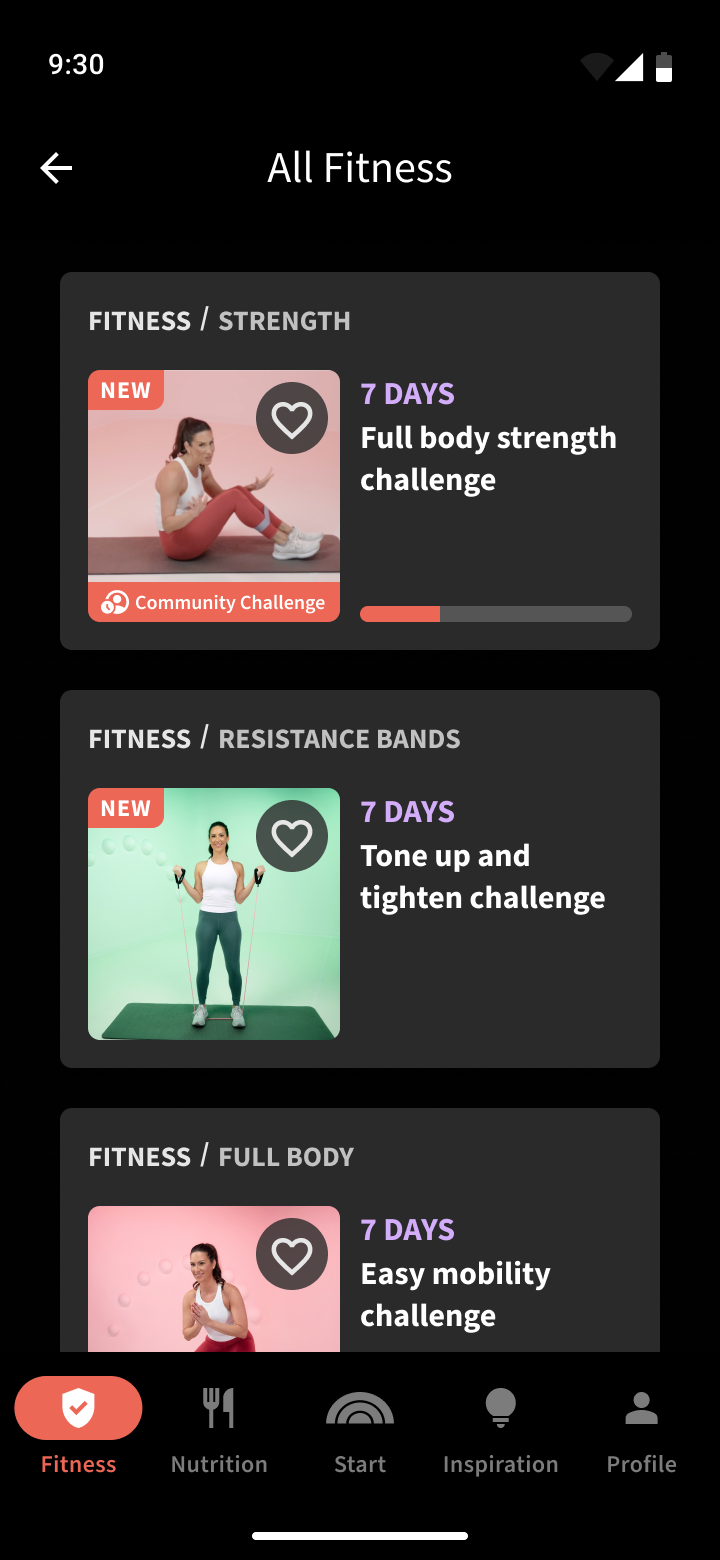
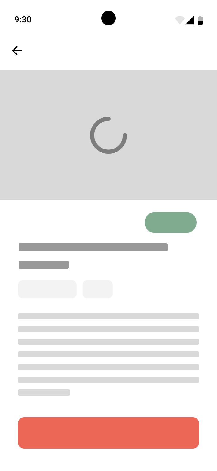
Templates can then be constructed from all previous foundations, elements, components, and modules and represent entire pages of content from either a completely generic perspective to house various types of content, or made to be more specific if used in one or two similar instances.
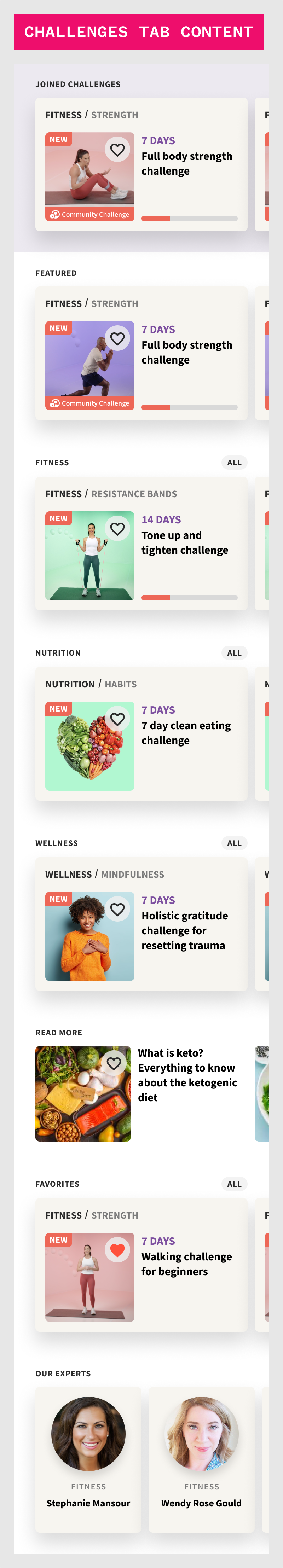
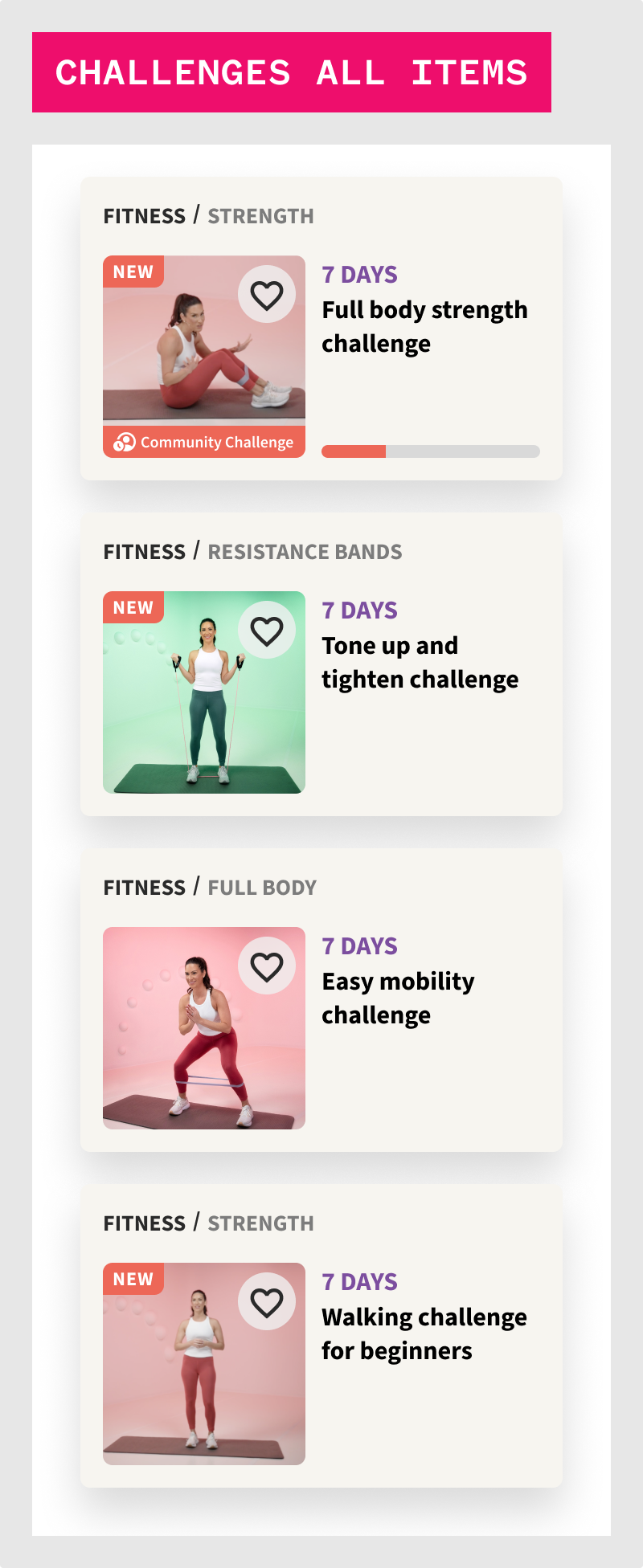
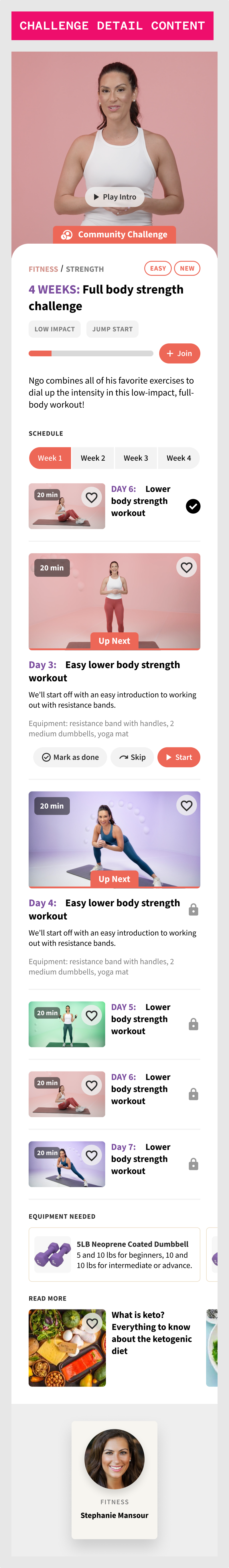
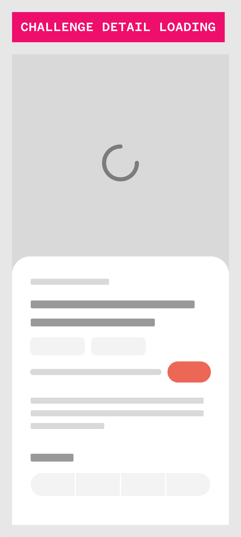
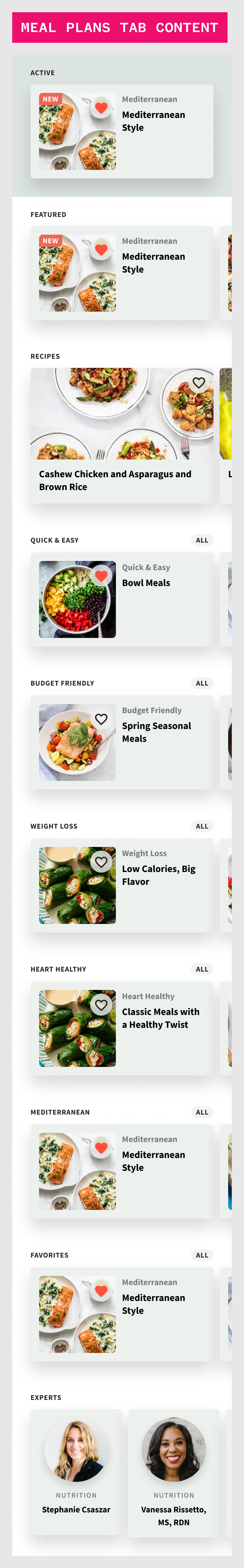
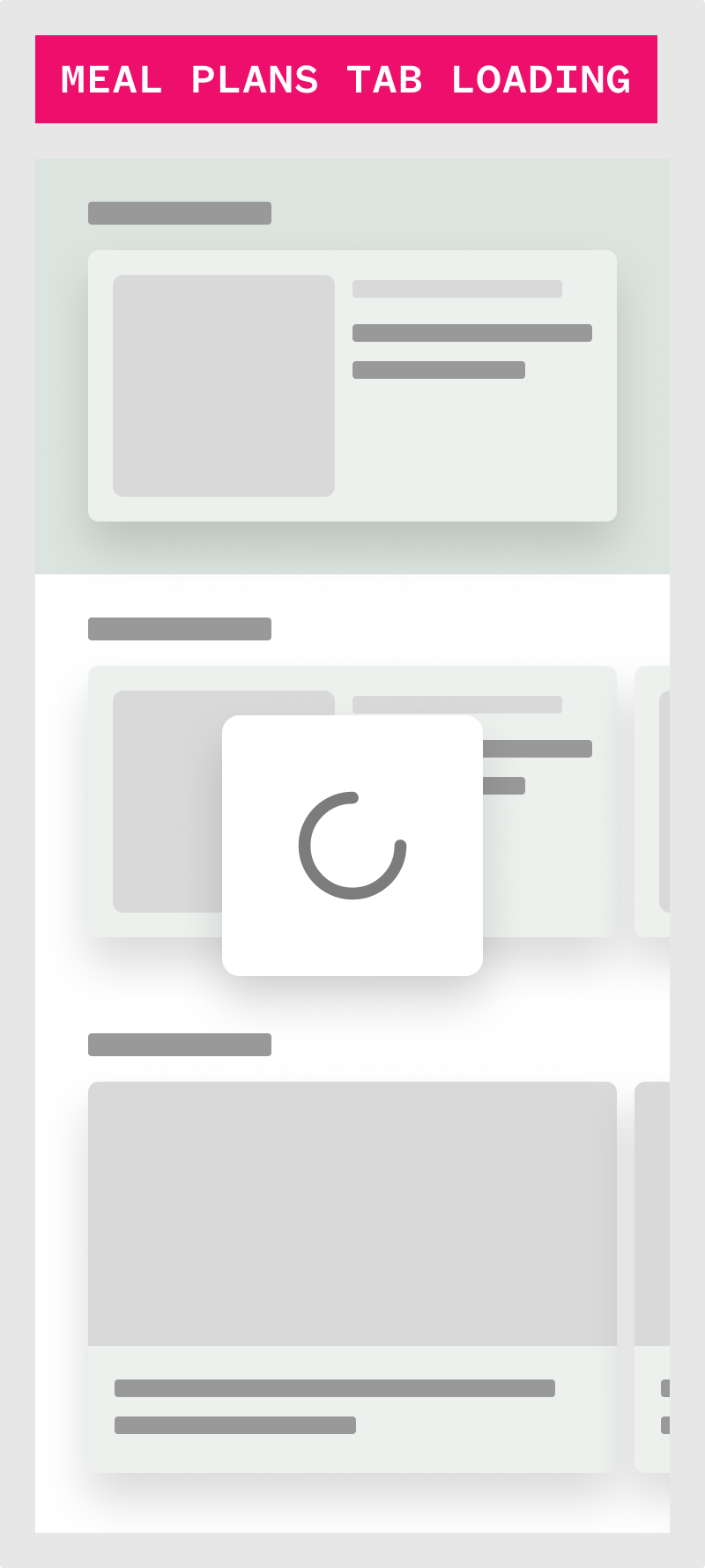
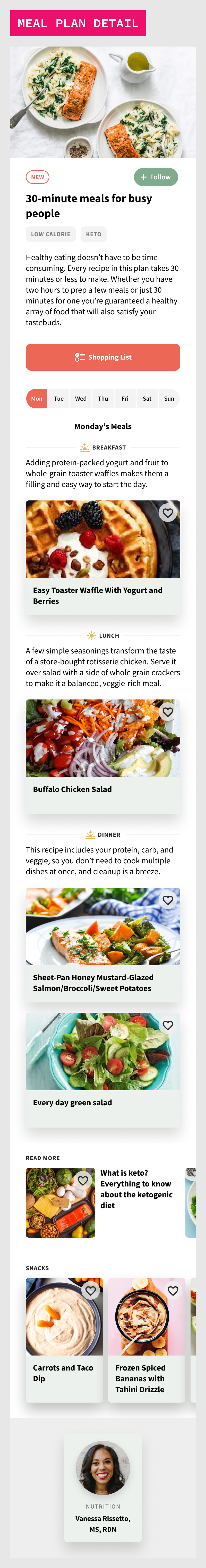
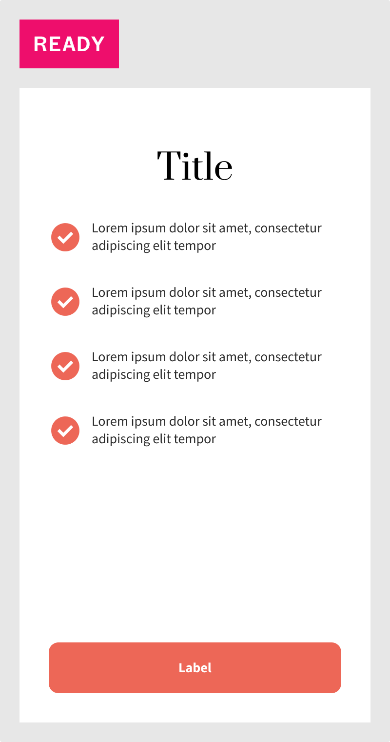
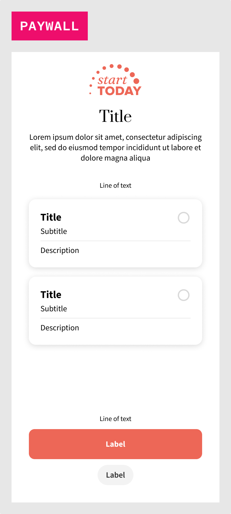
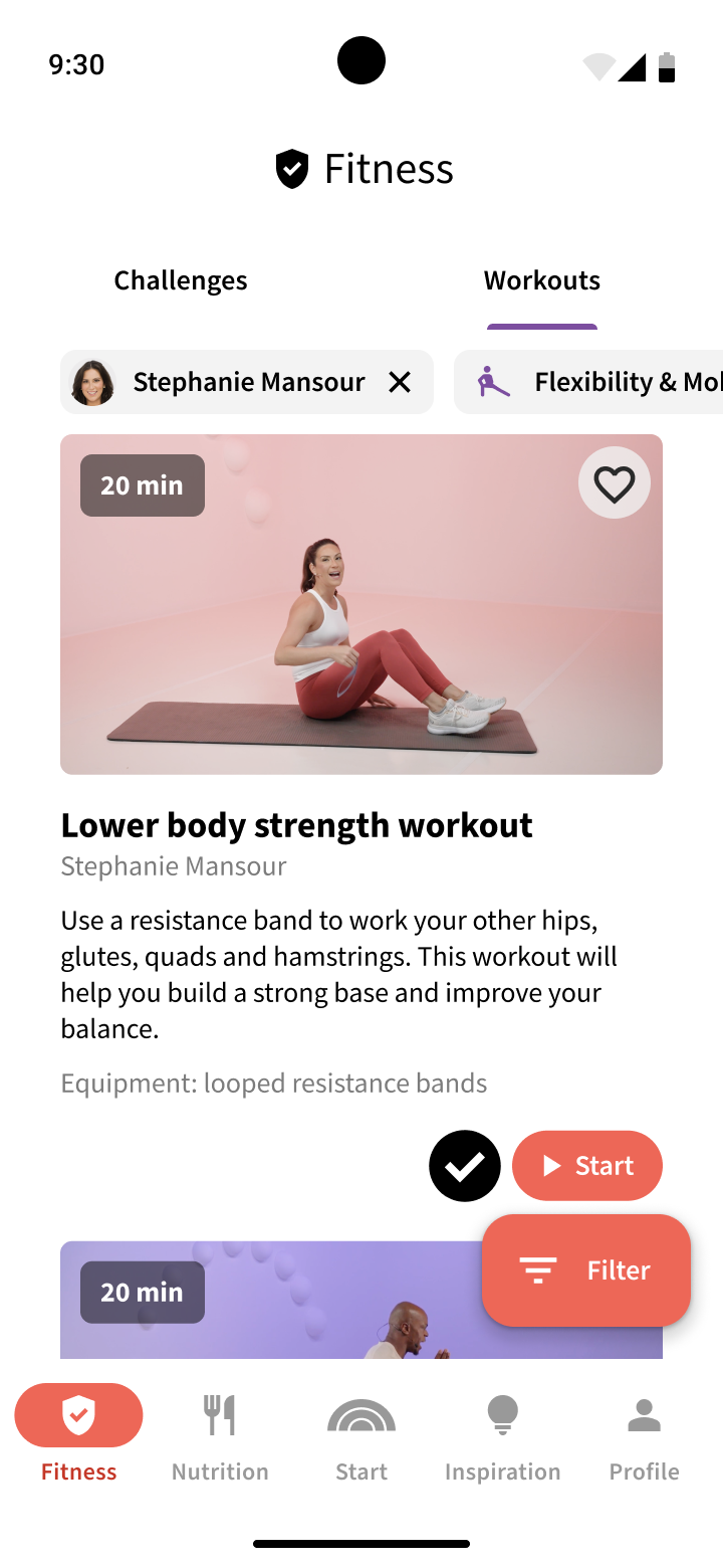
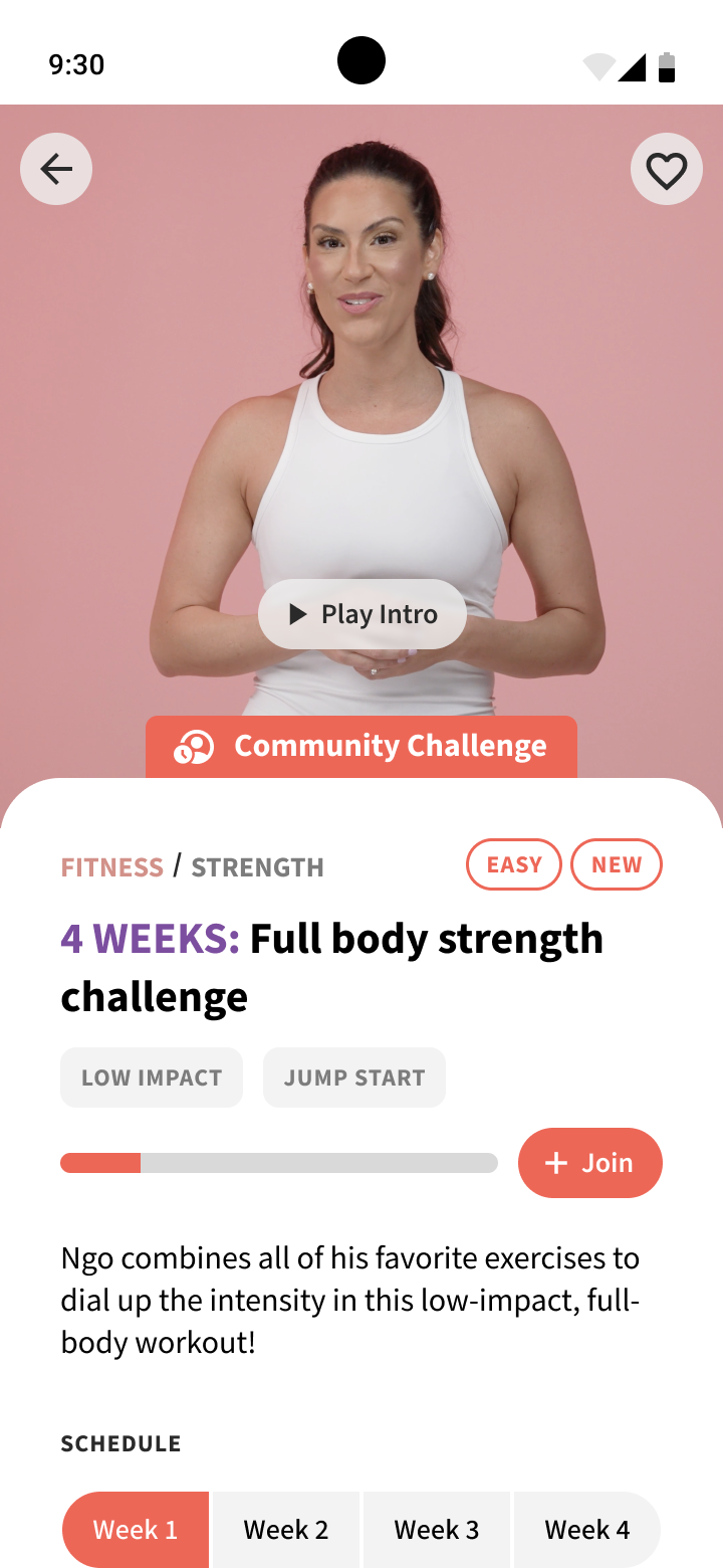
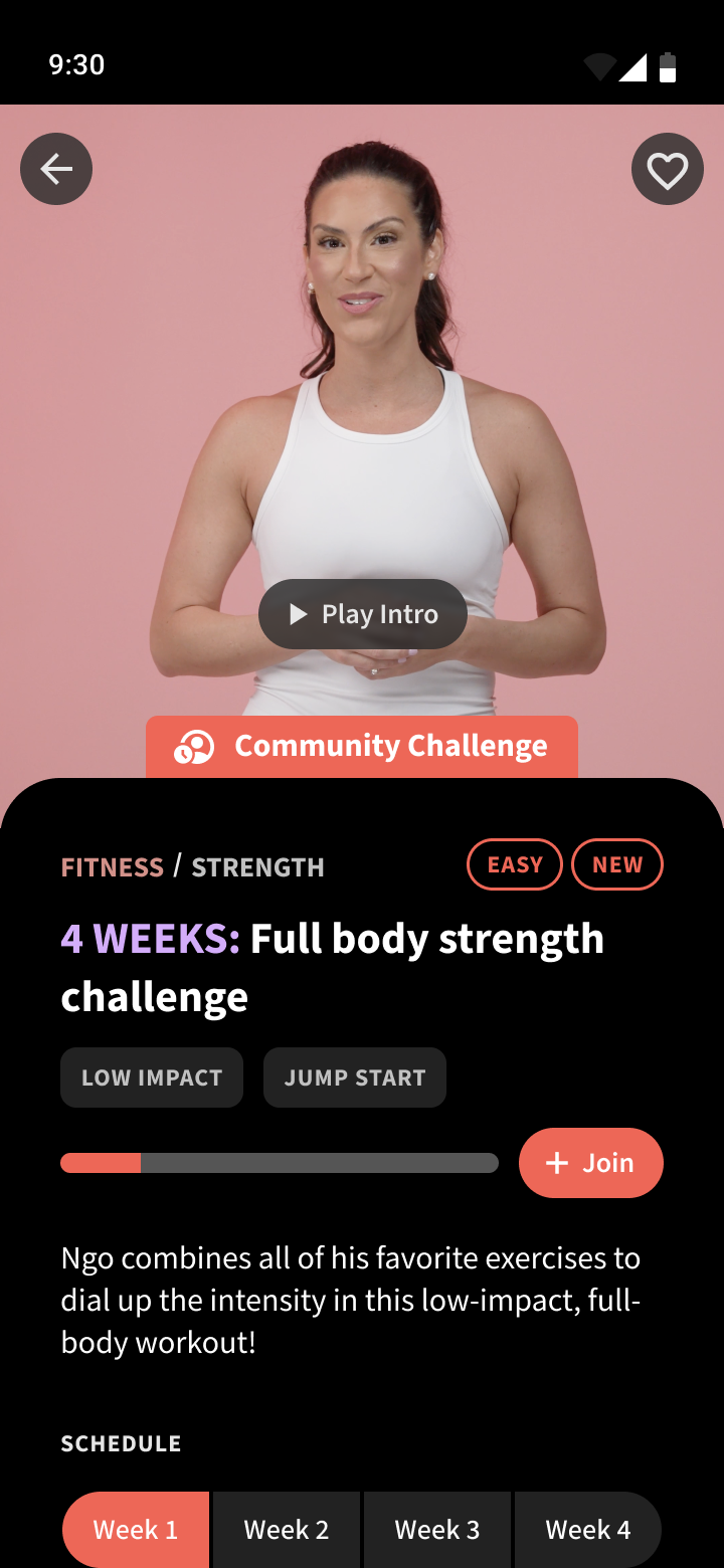
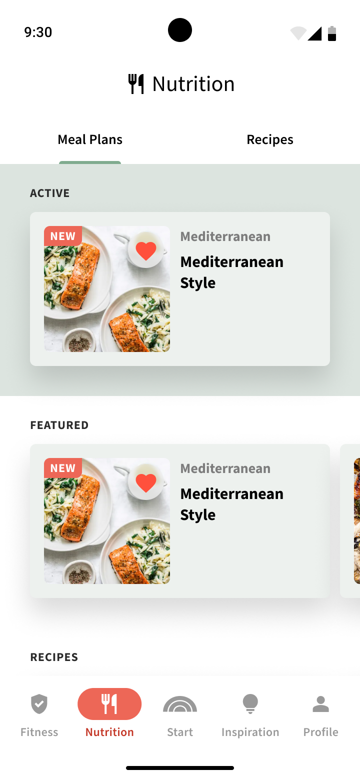
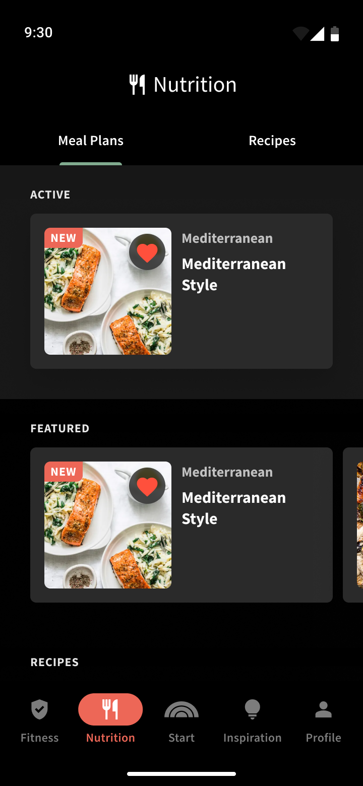
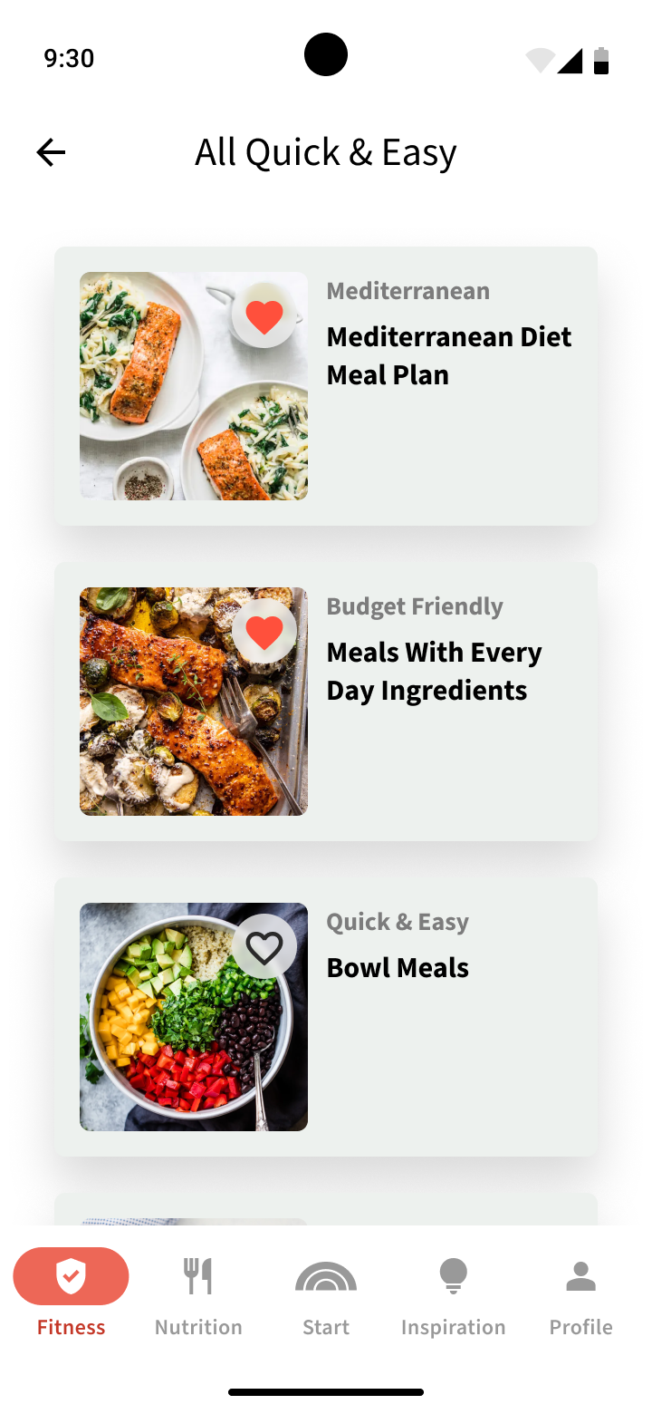
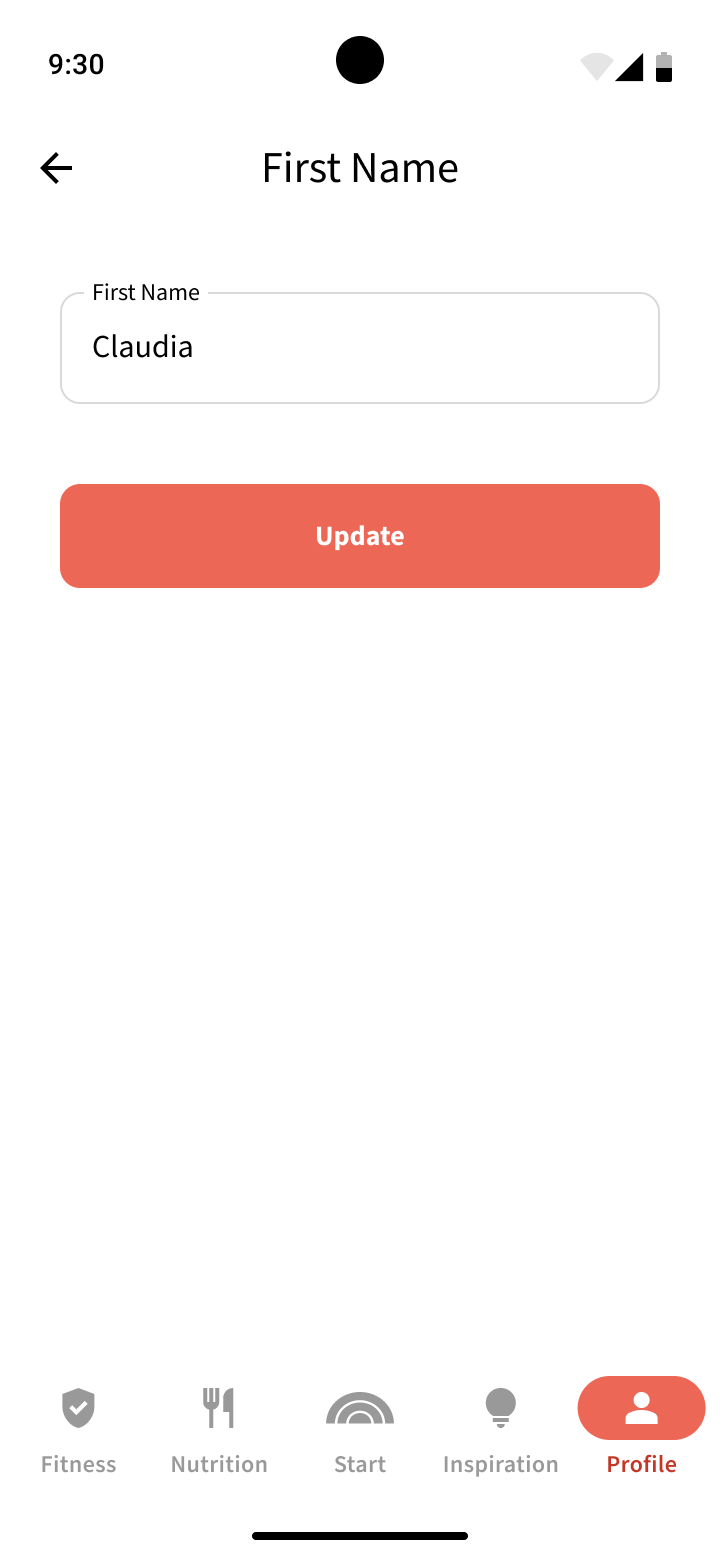
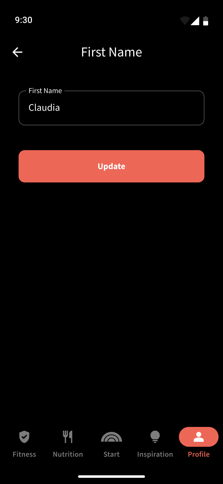
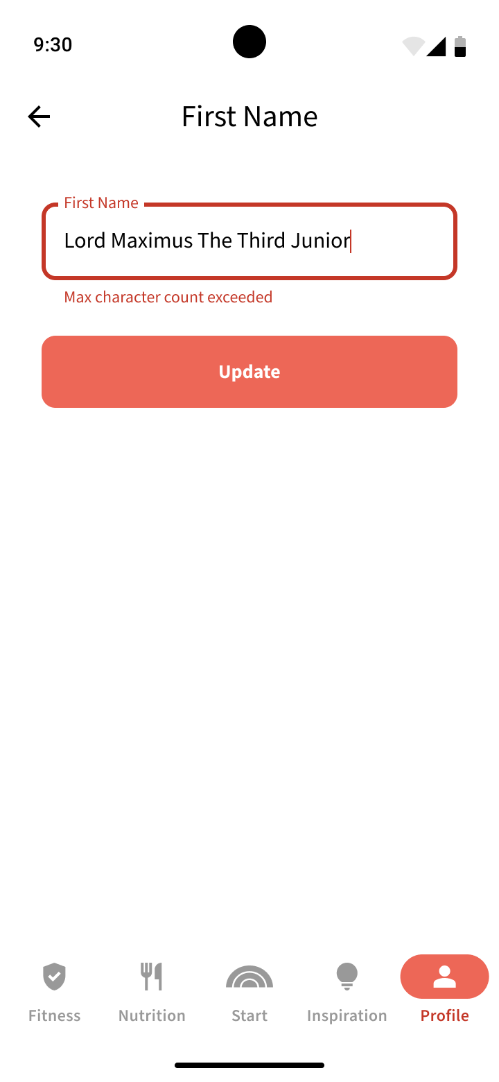
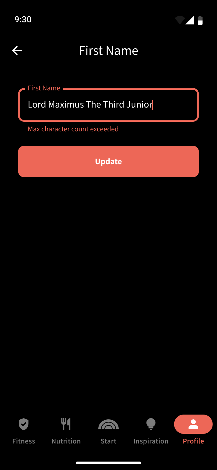
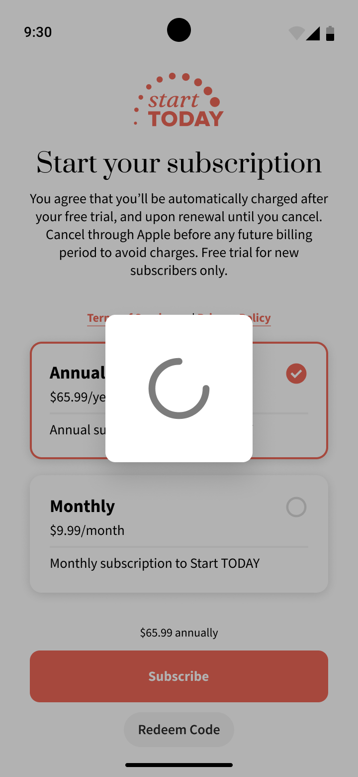
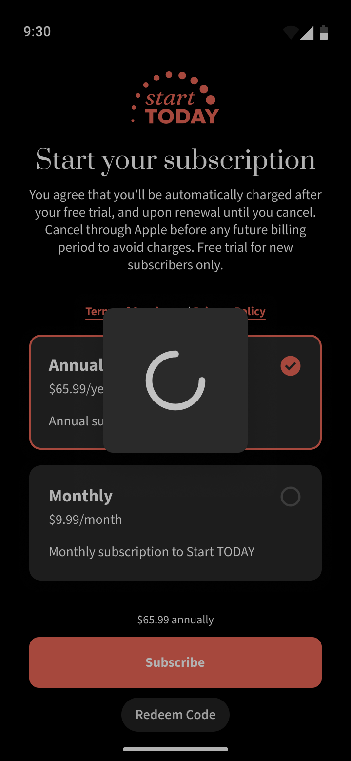
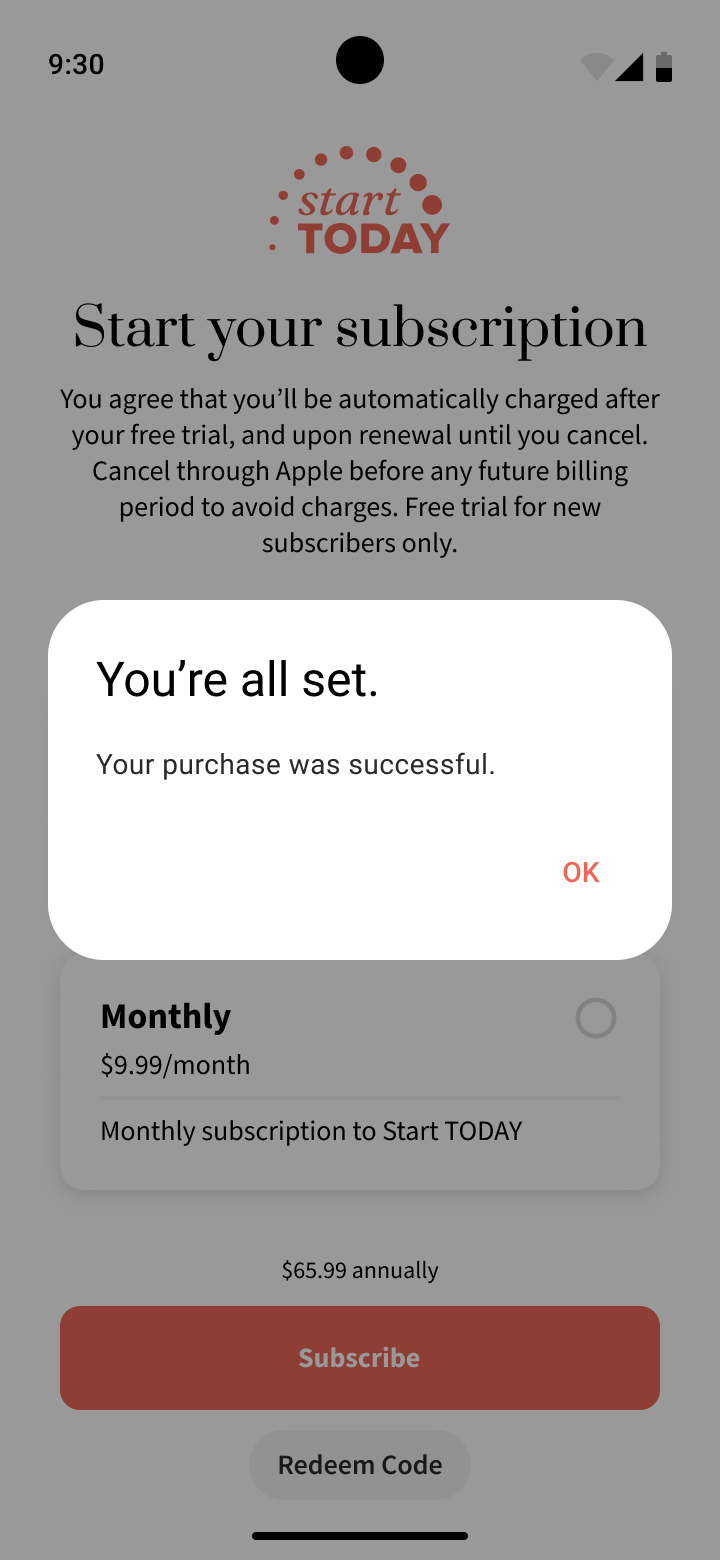
We then bring everything together in terms of screens, which represent entire fleshed out pages in the app with multiple variations such that we can inform developers on how the entirety of the app is constructed.
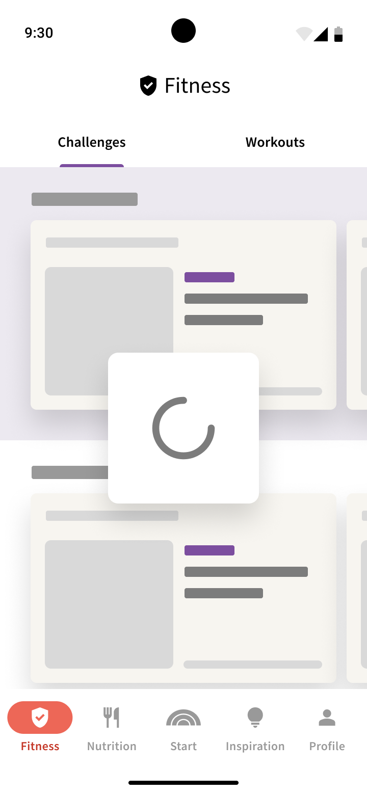
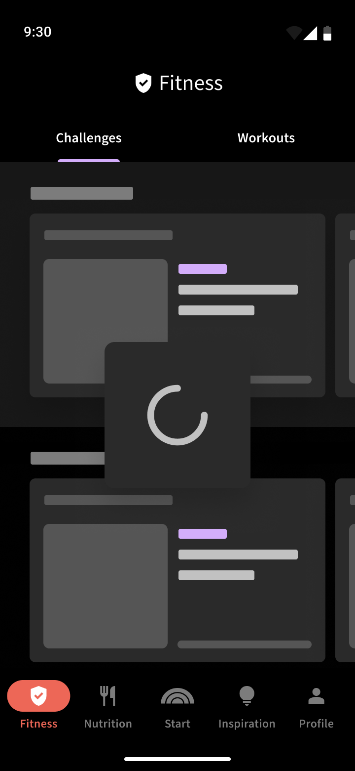
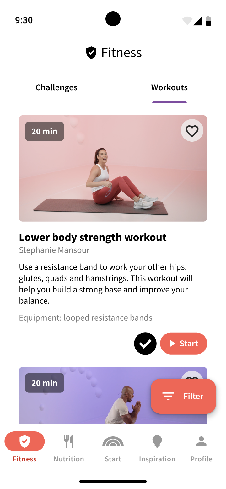
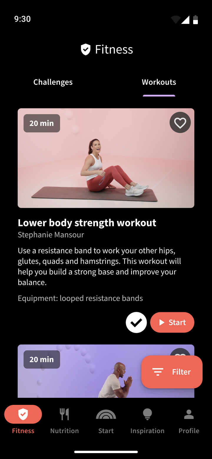
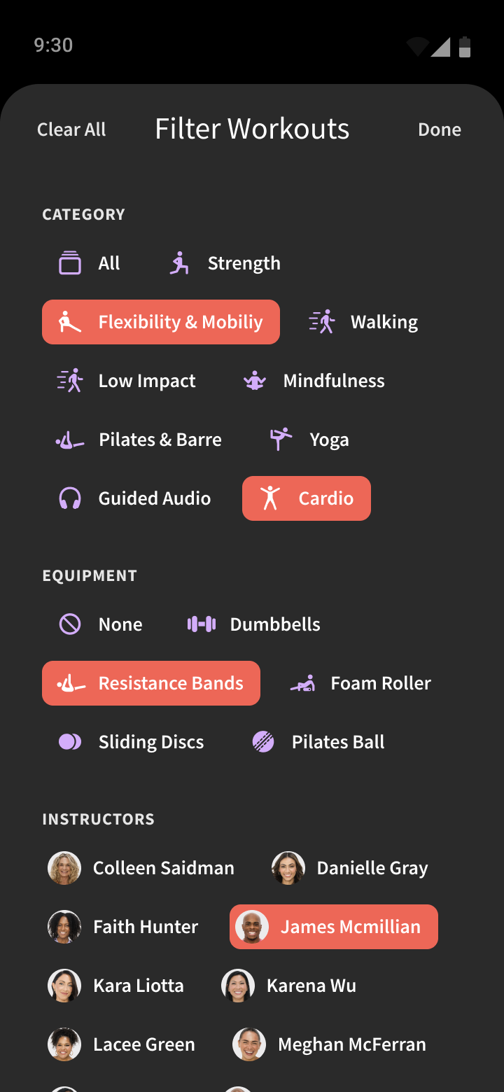
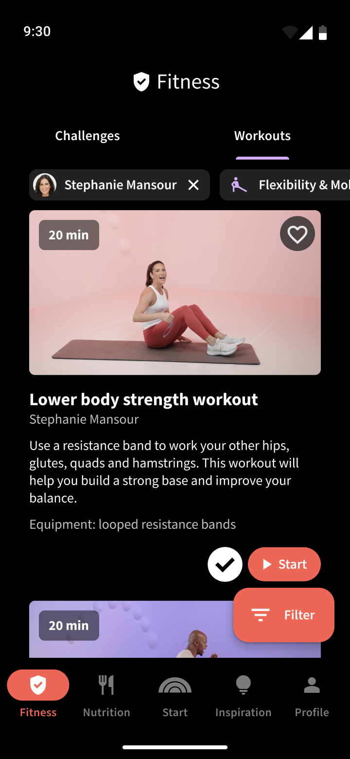
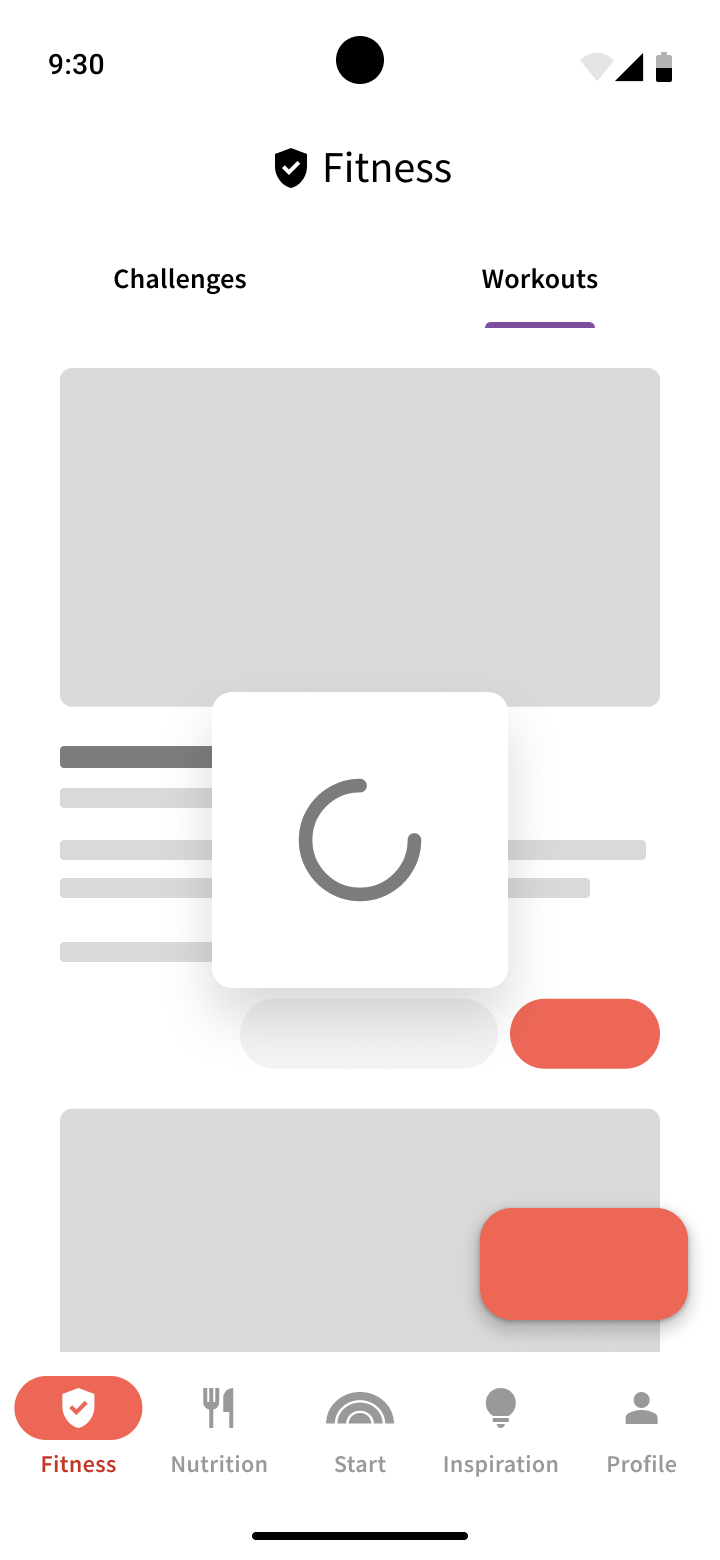
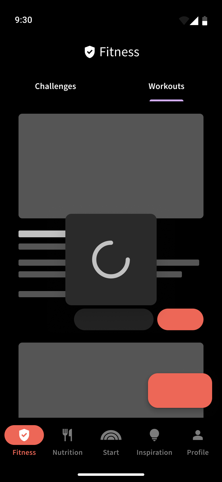
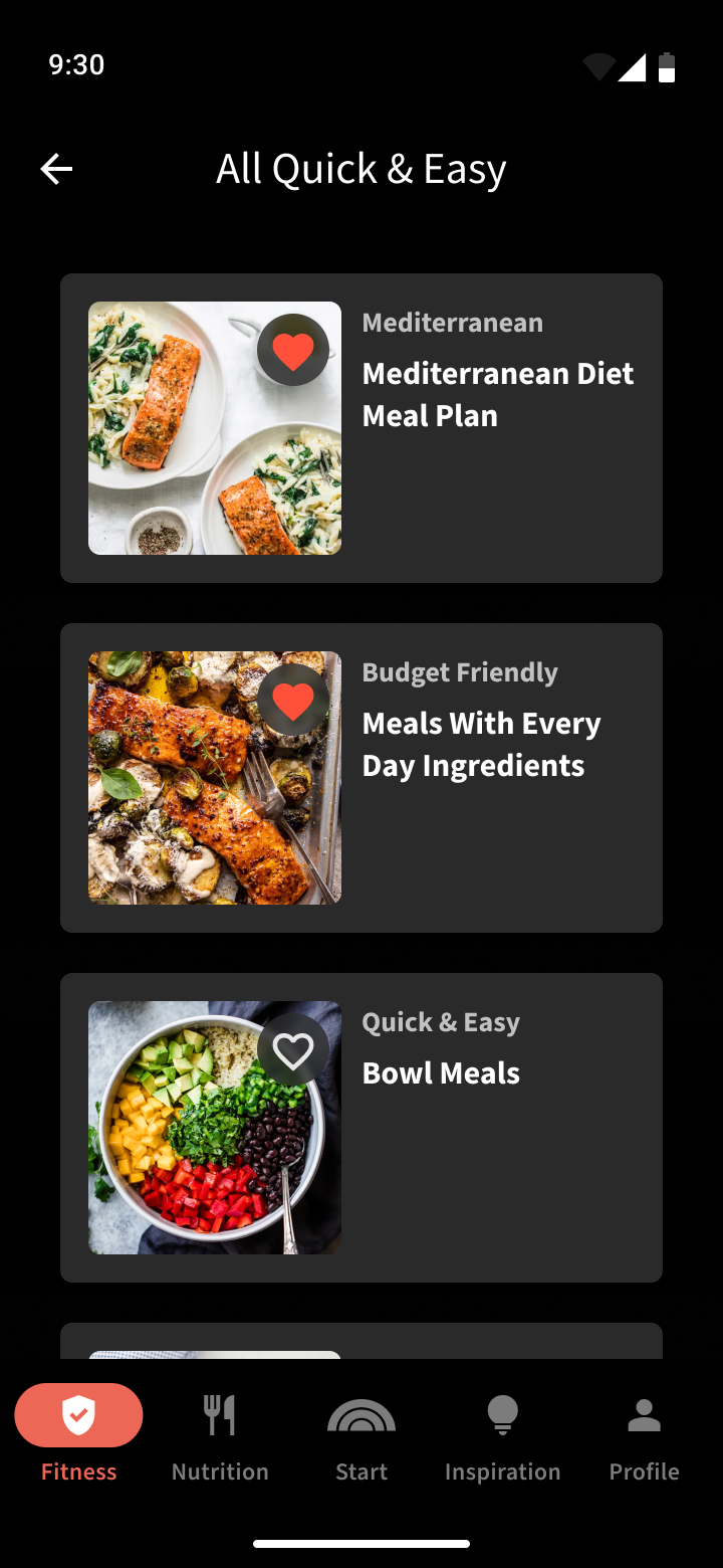
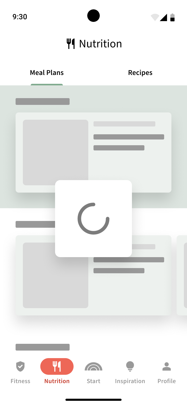
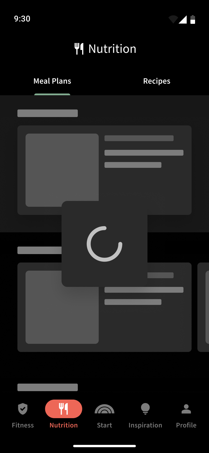
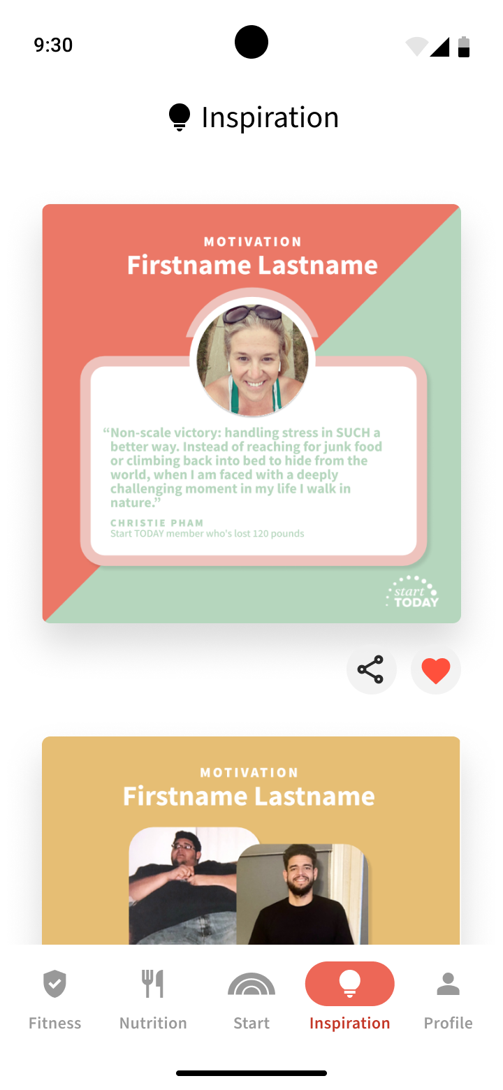
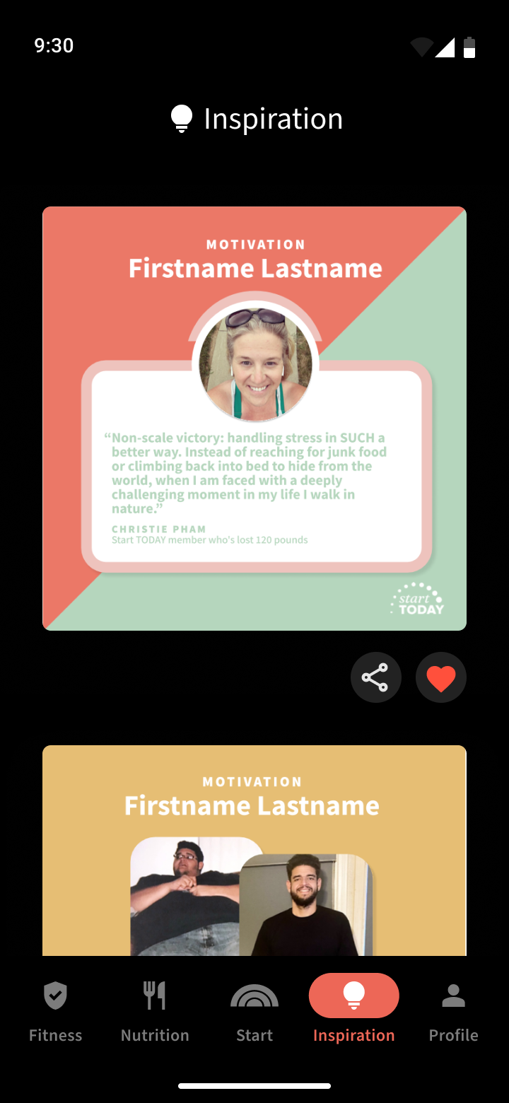
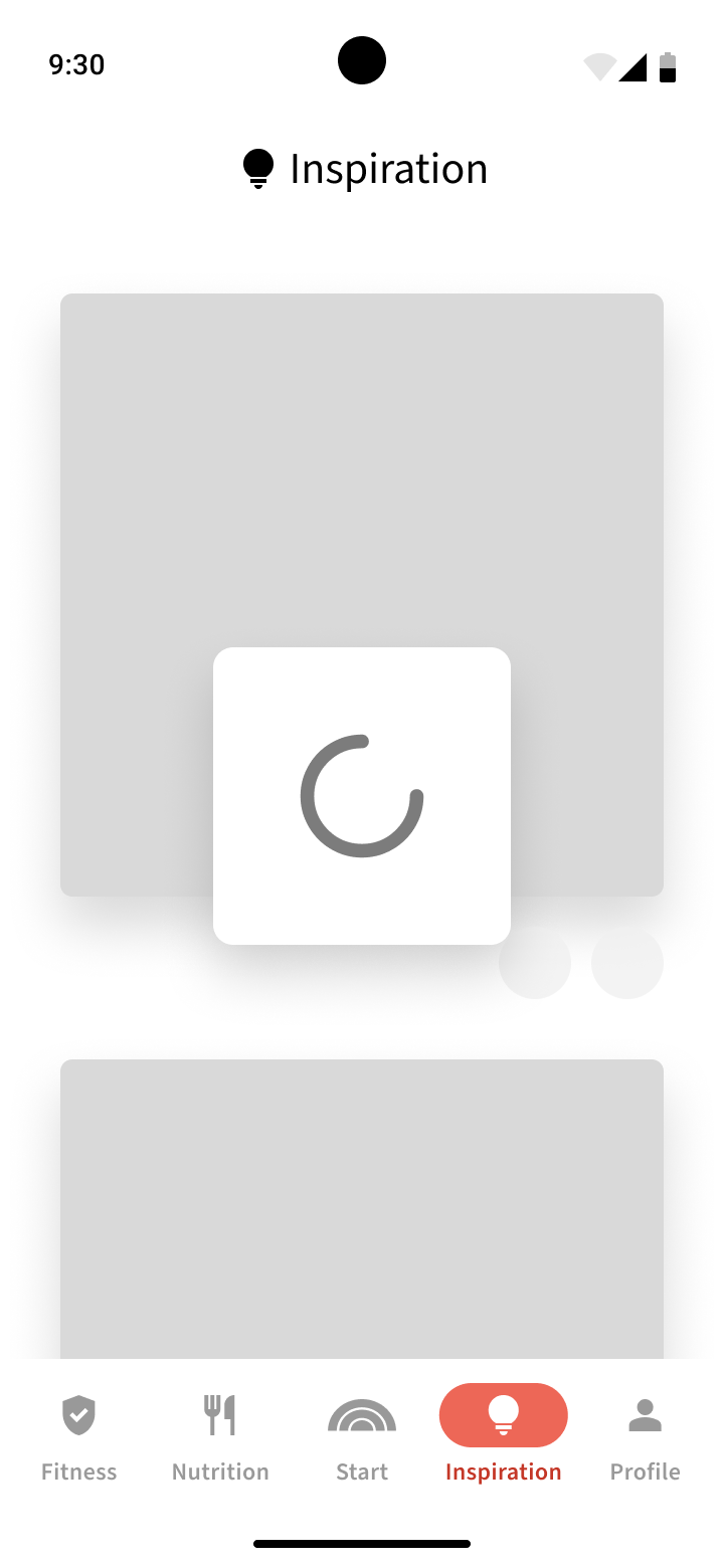
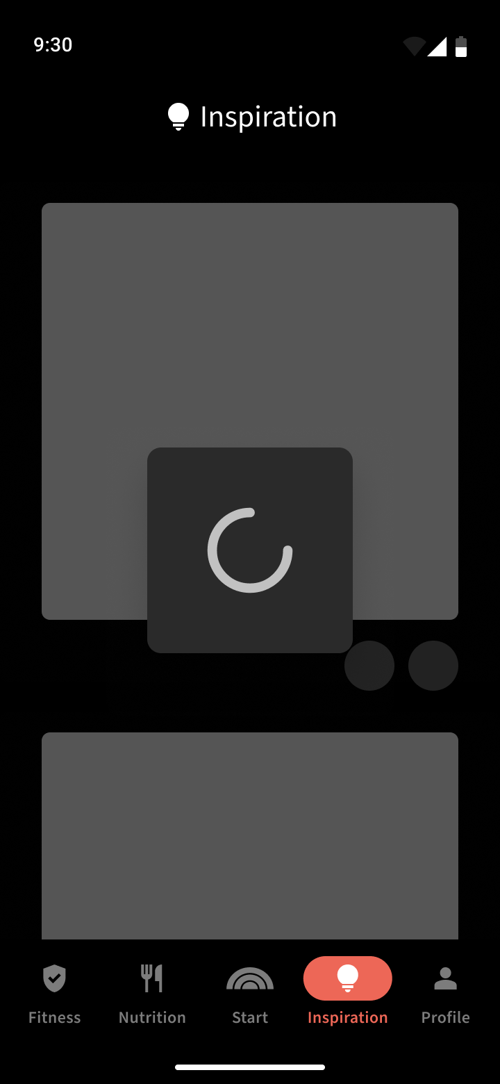
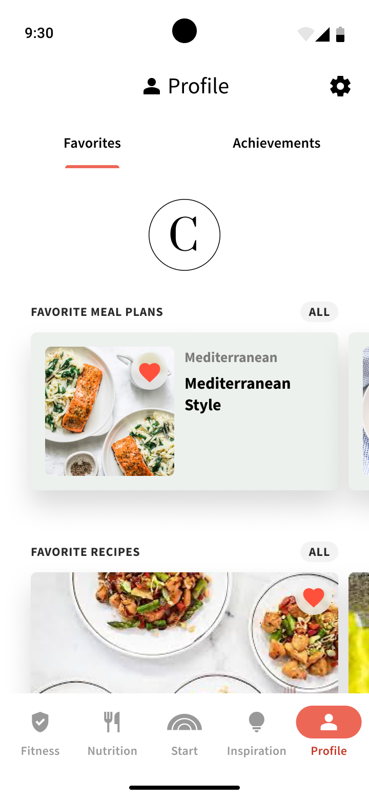
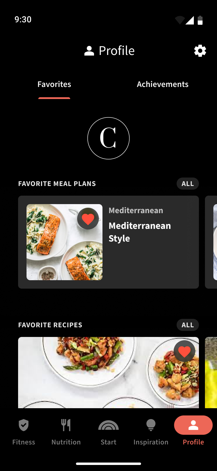
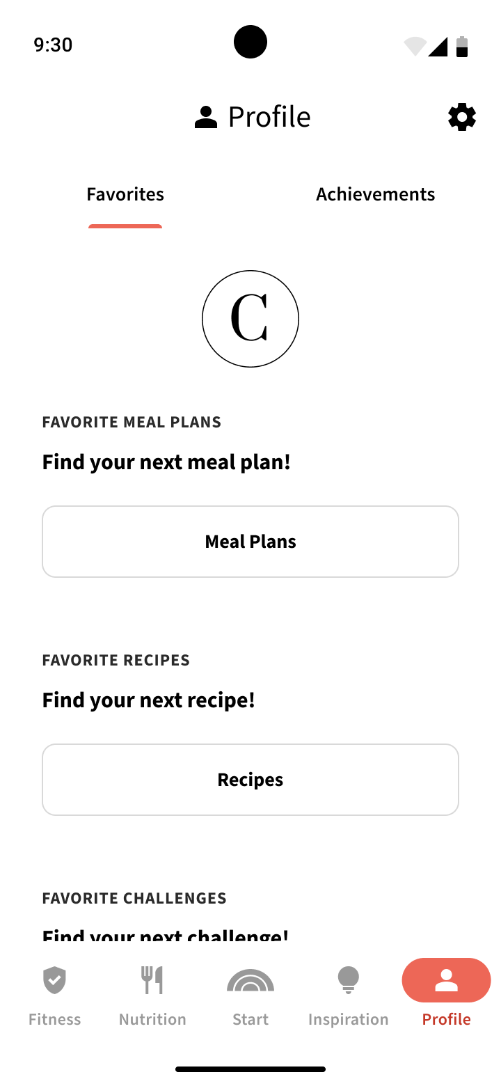
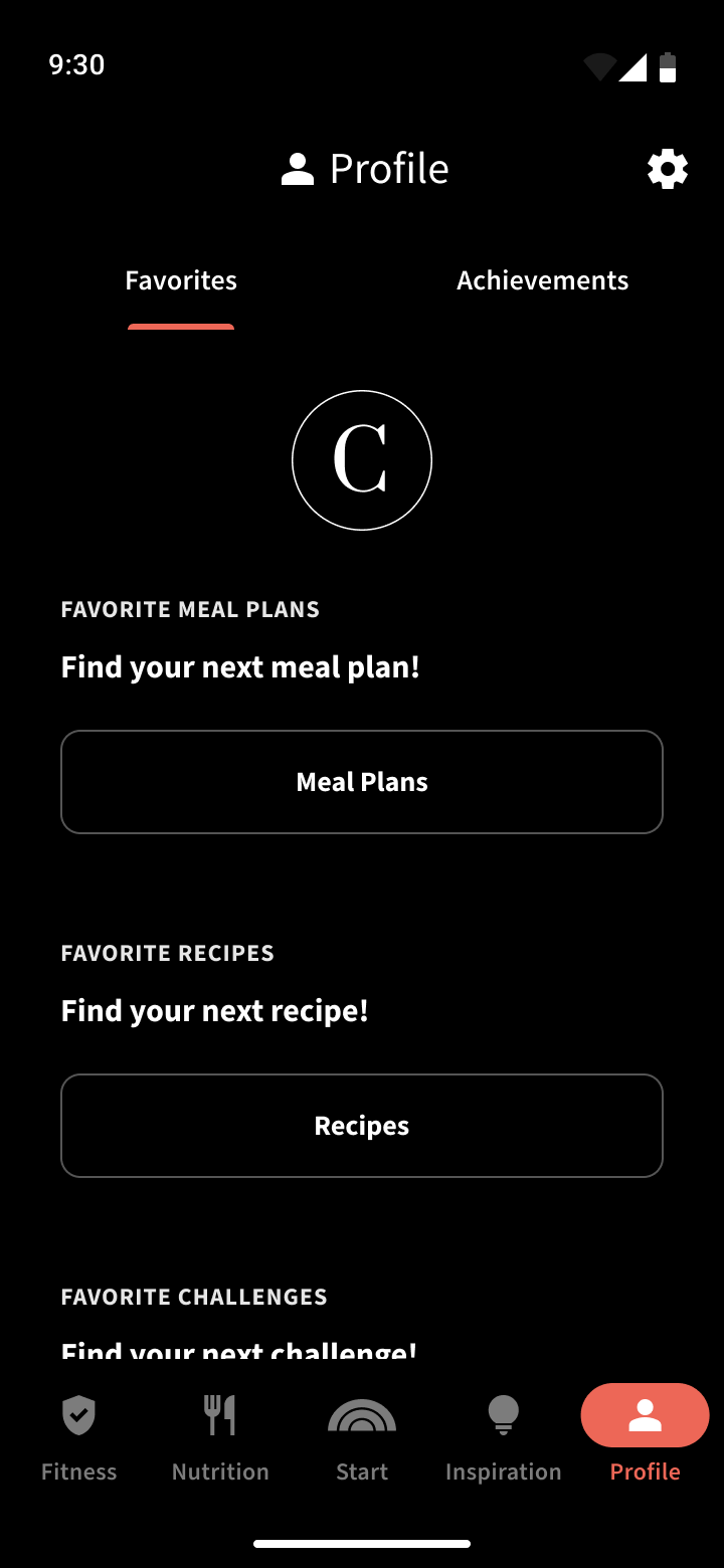
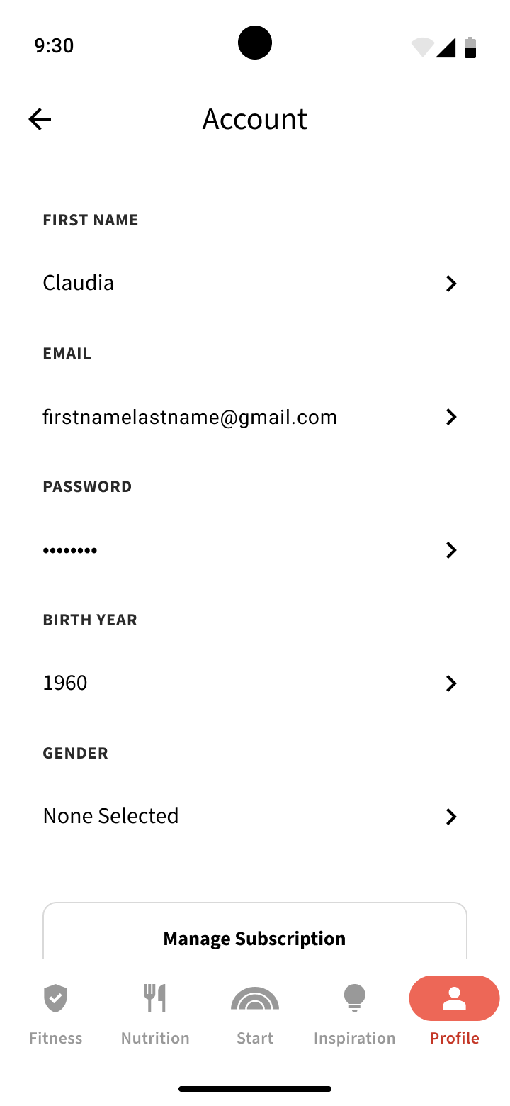
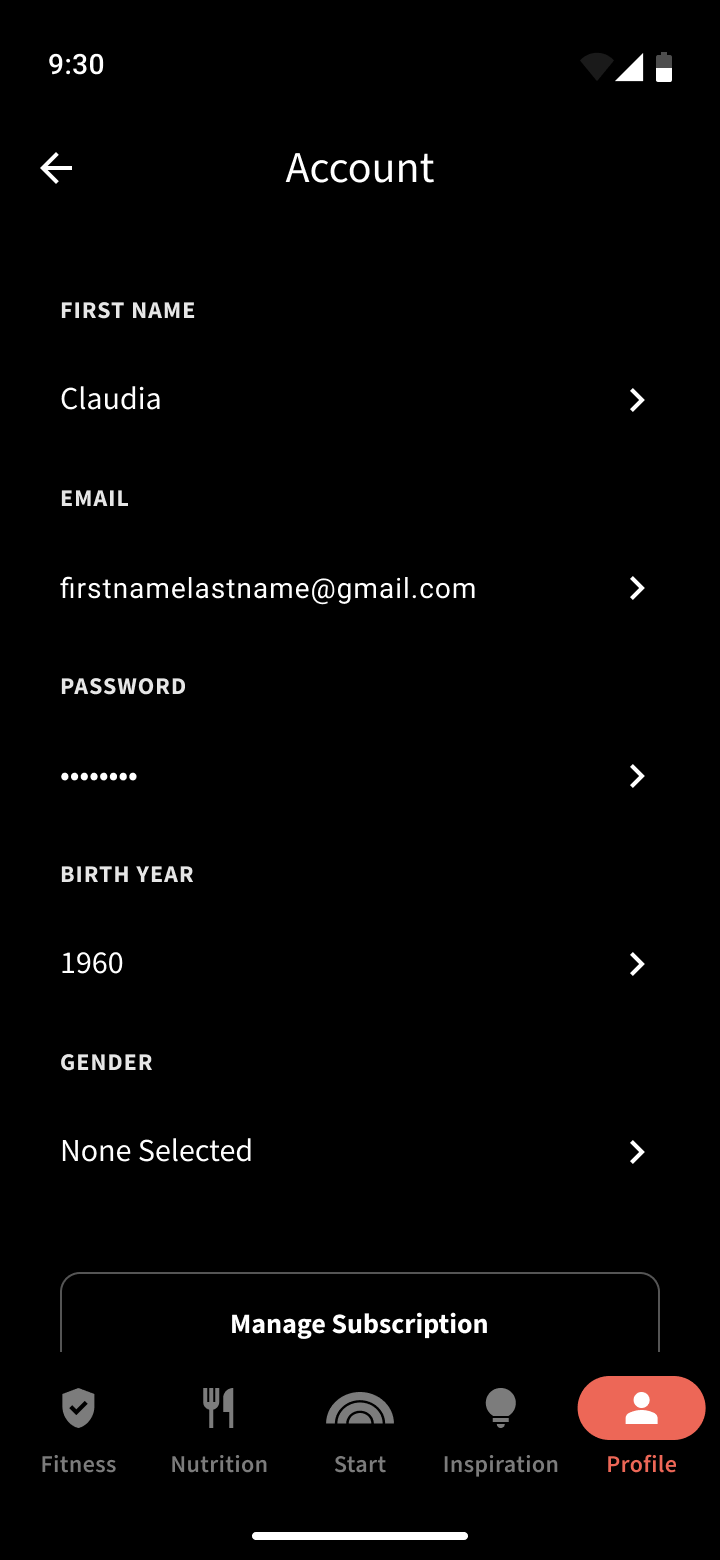
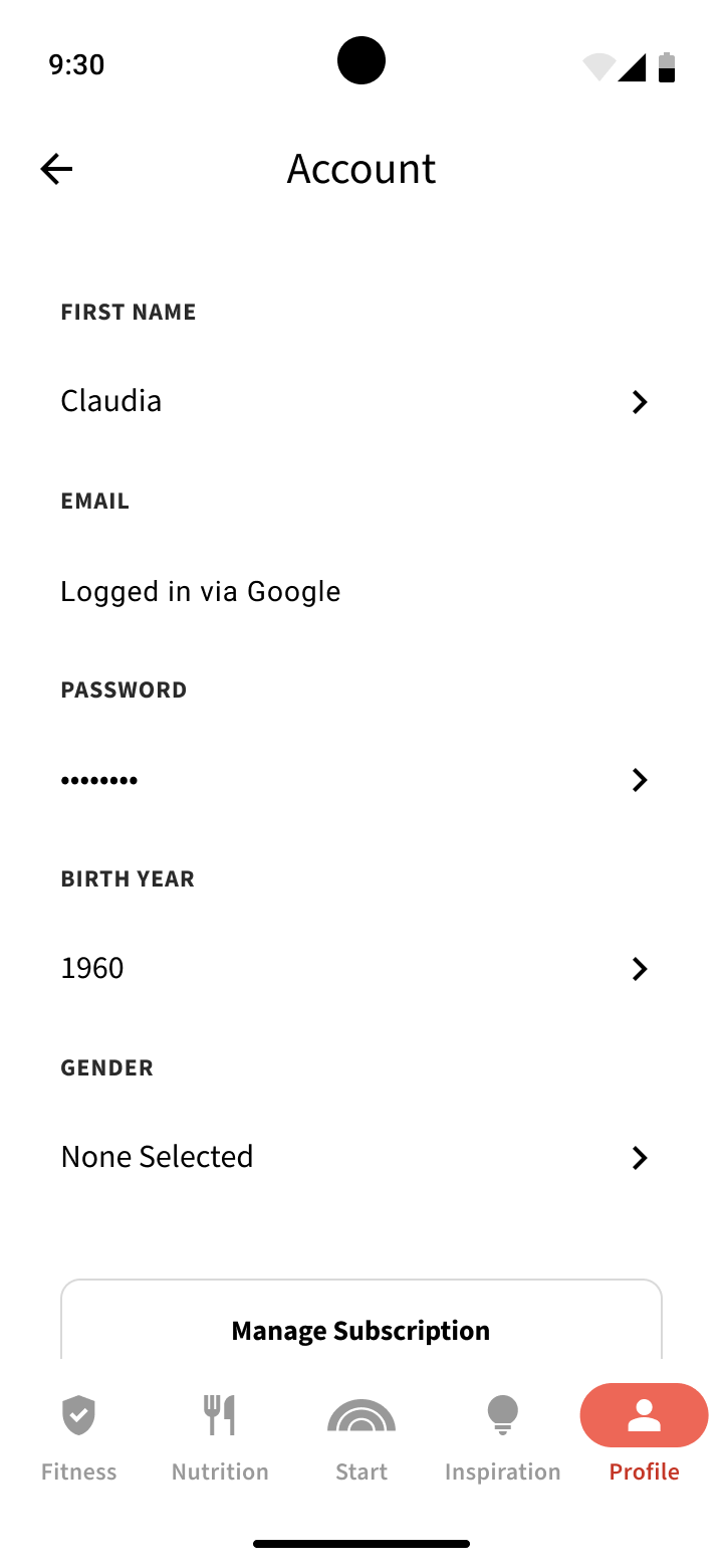
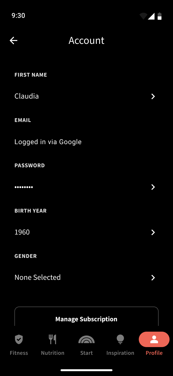
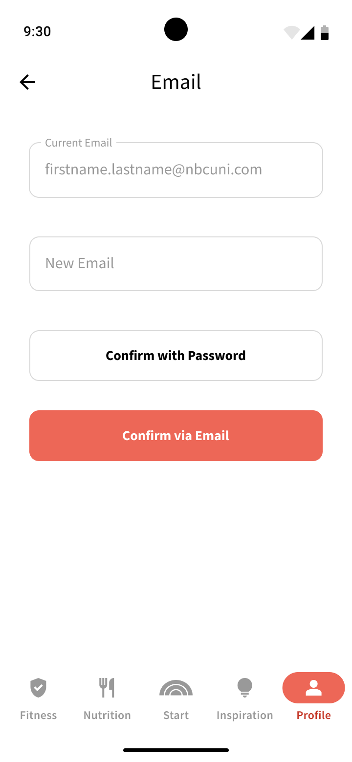
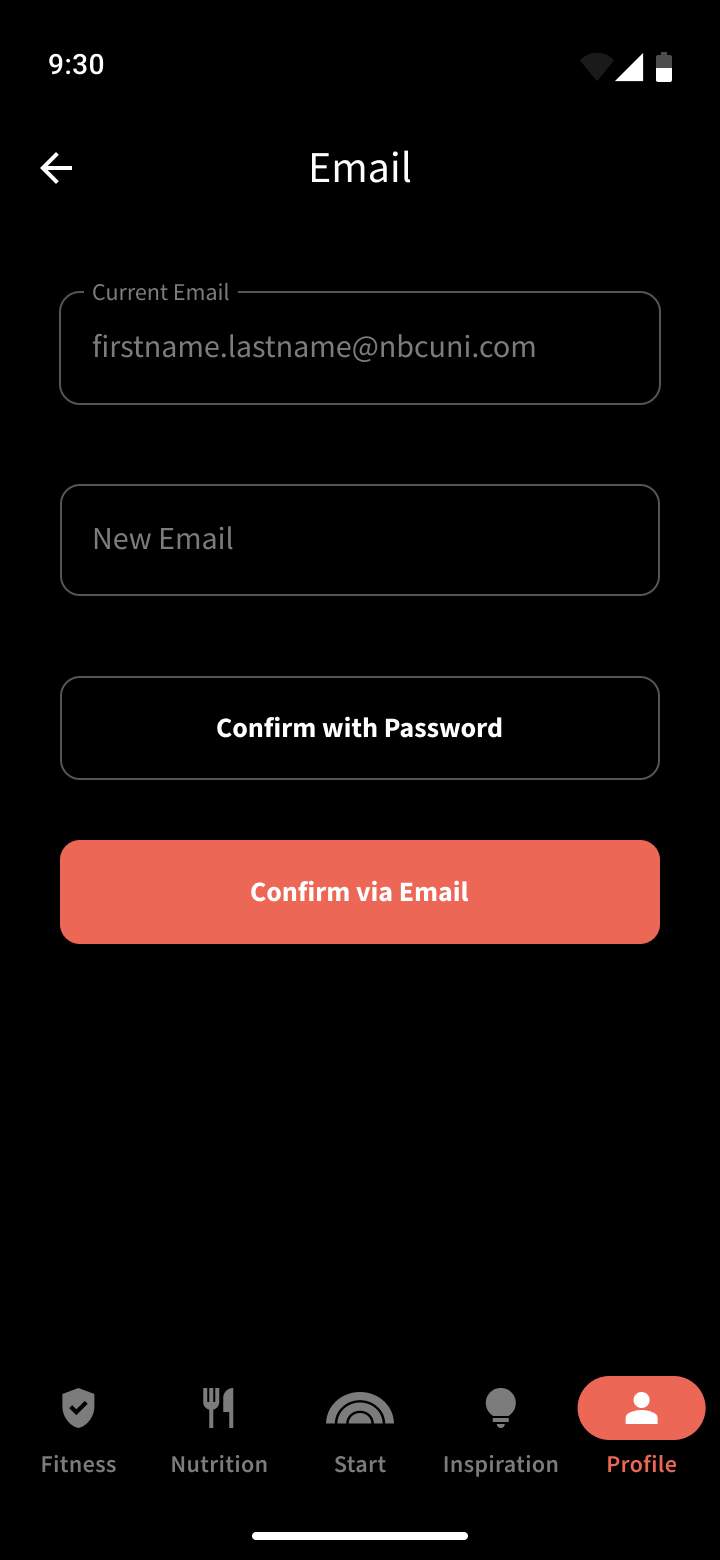
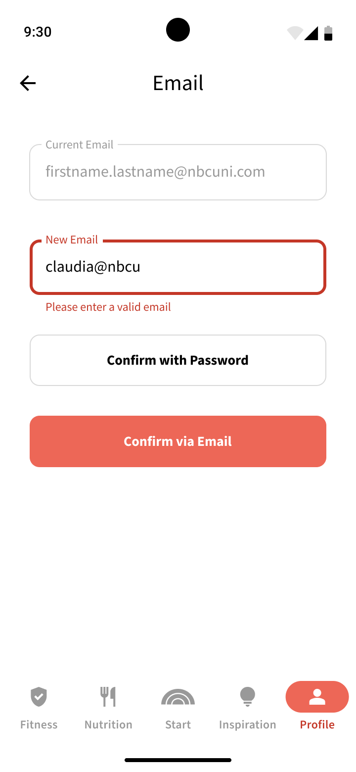
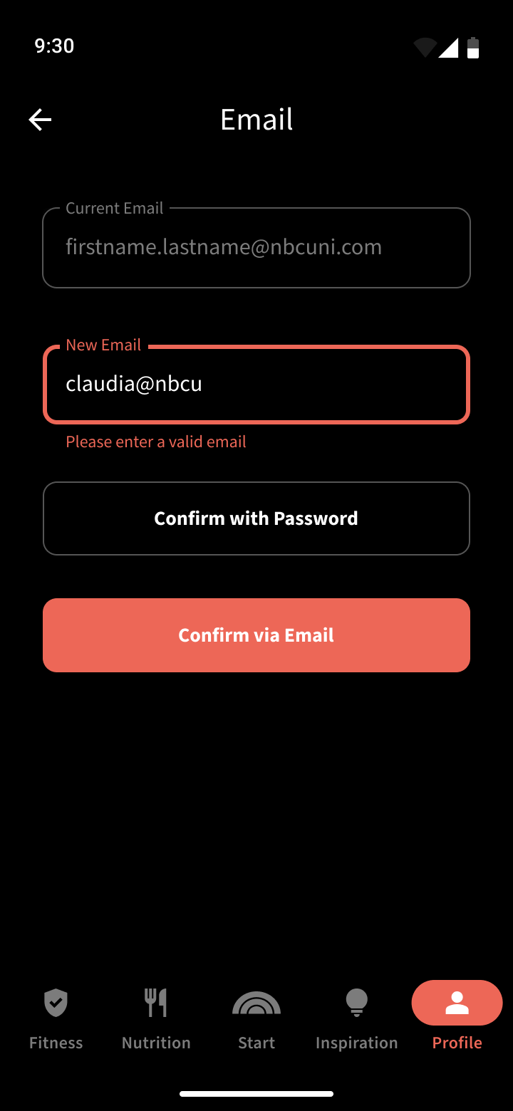
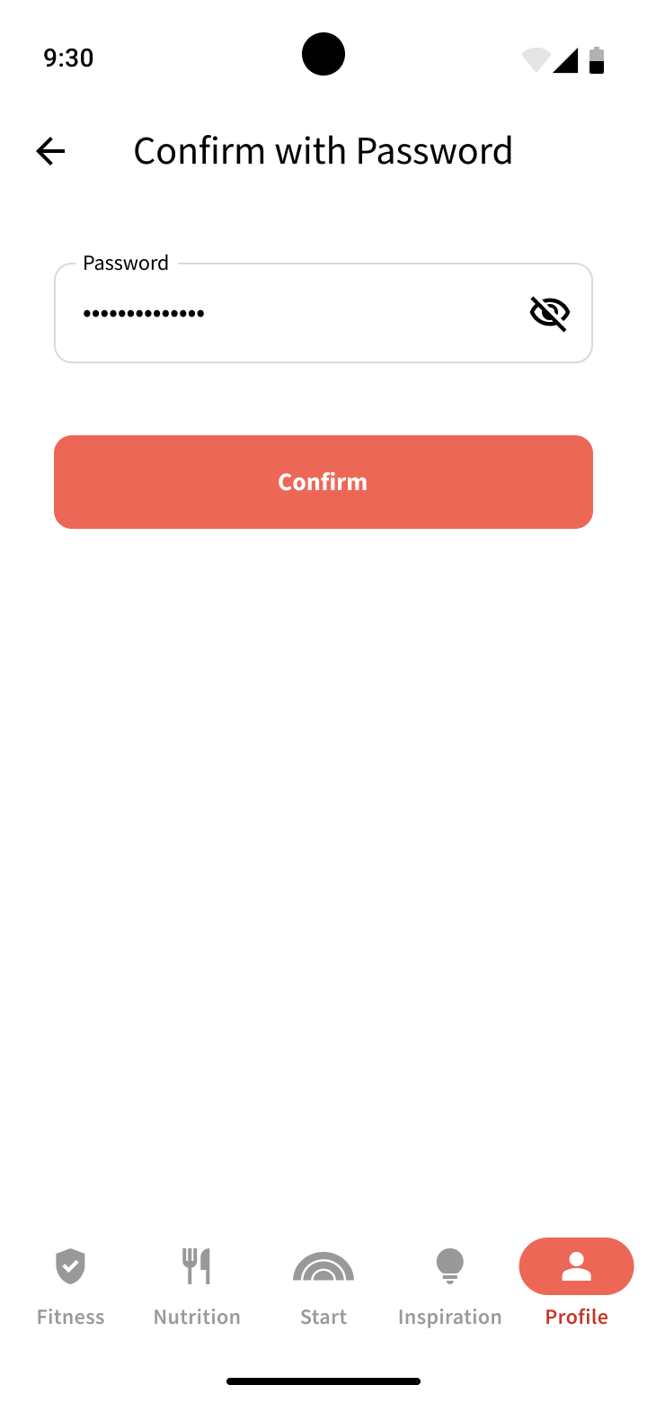
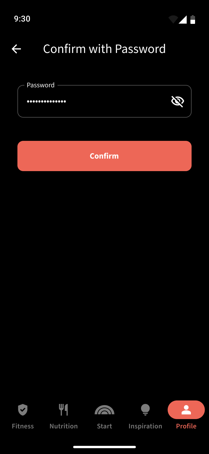
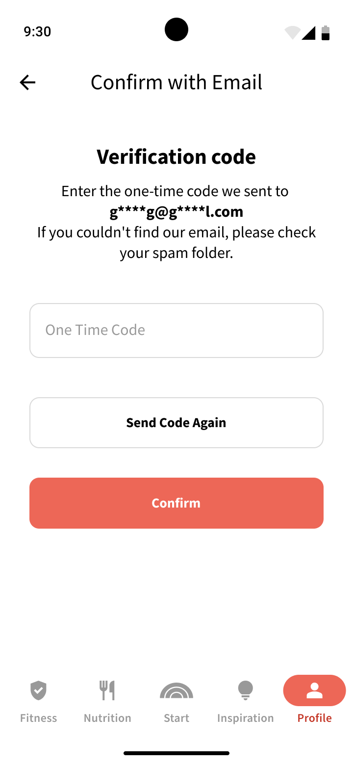
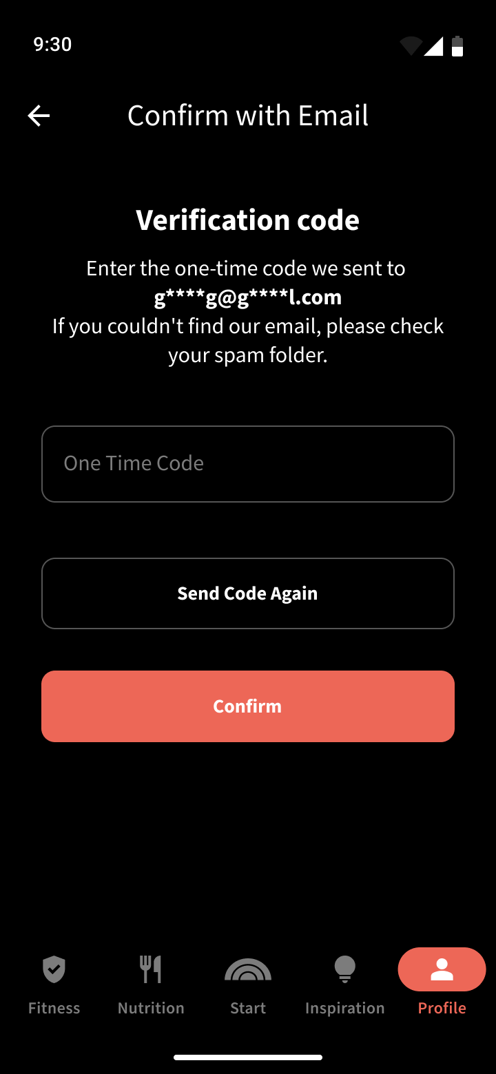
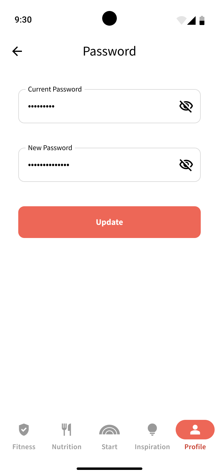
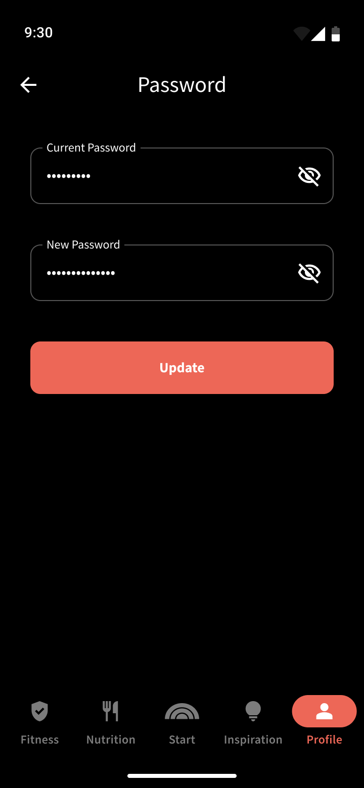
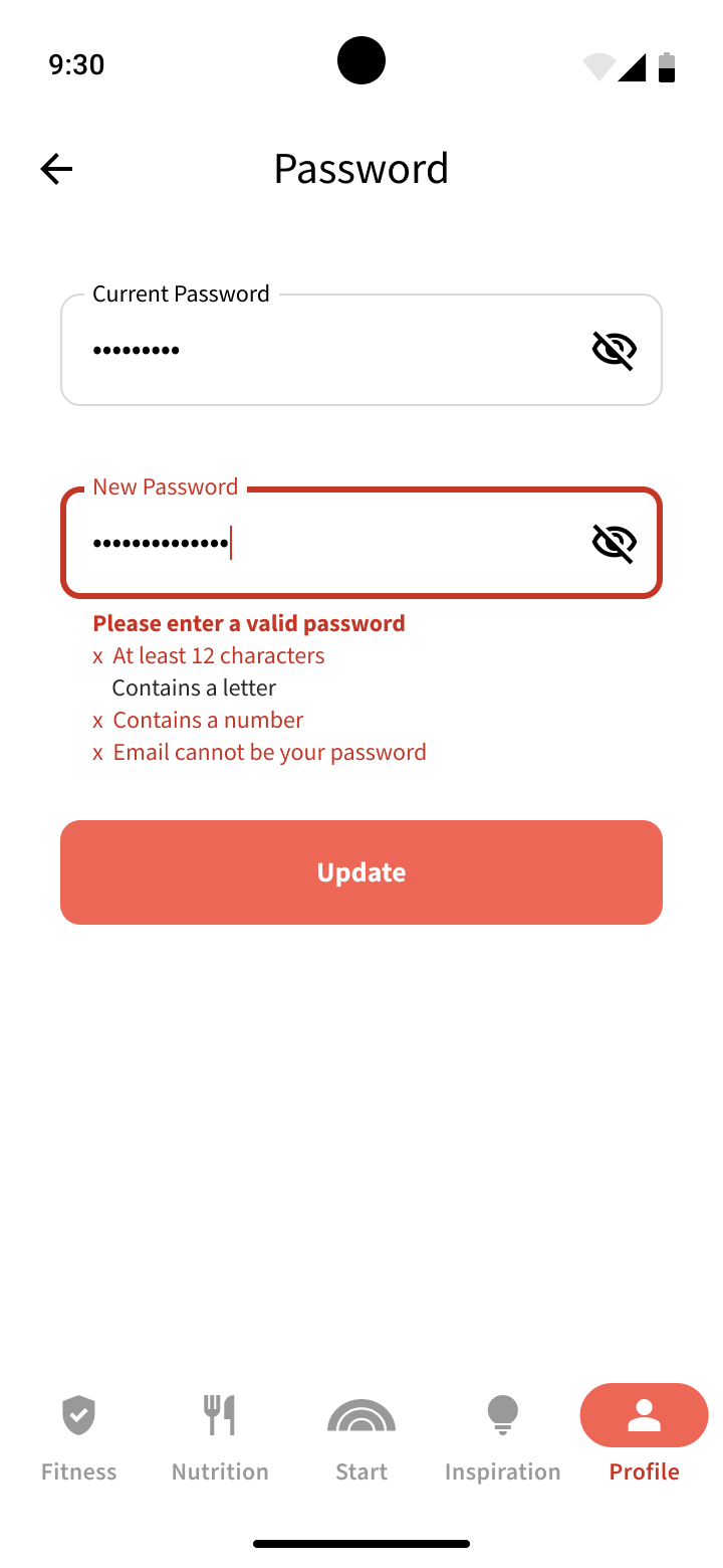
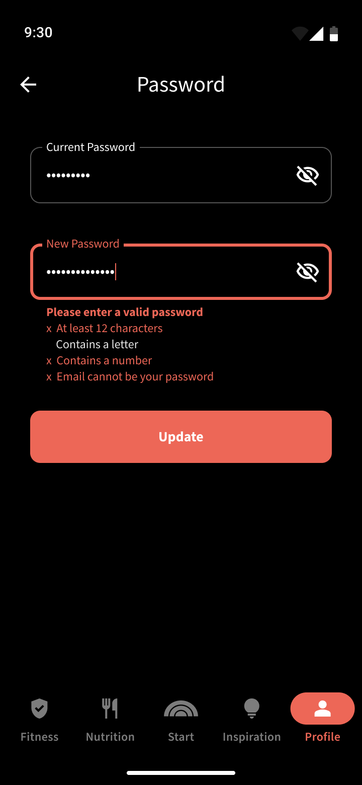
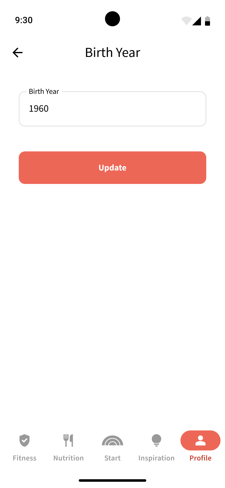
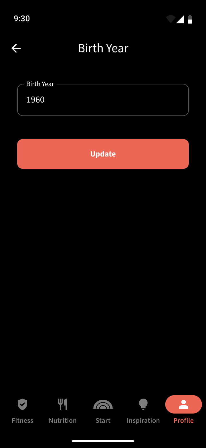
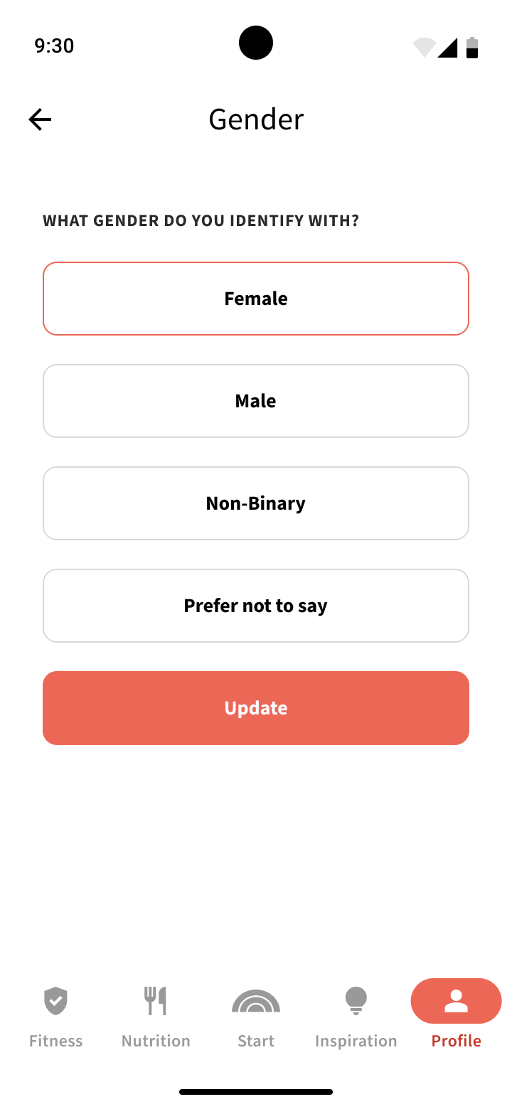
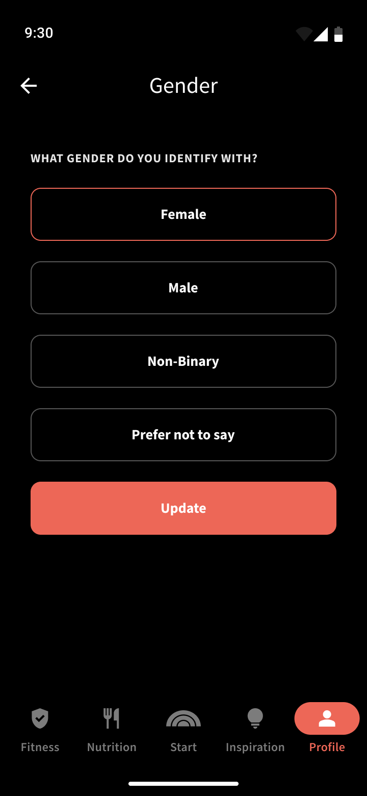
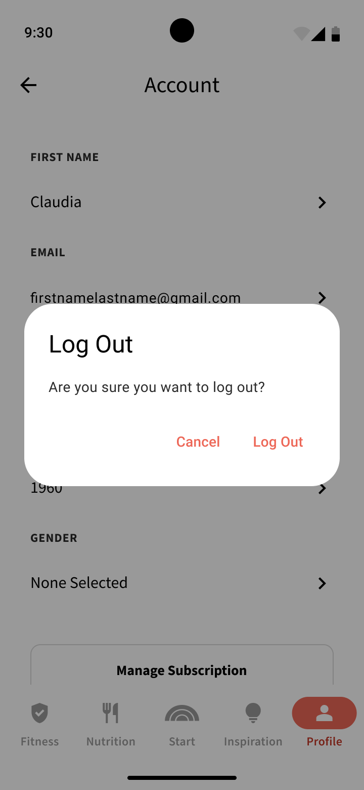
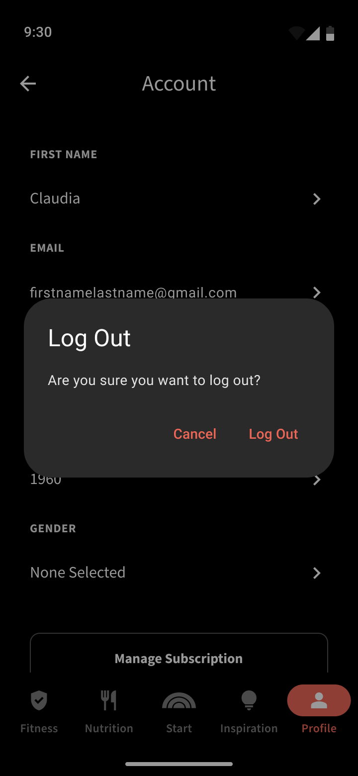
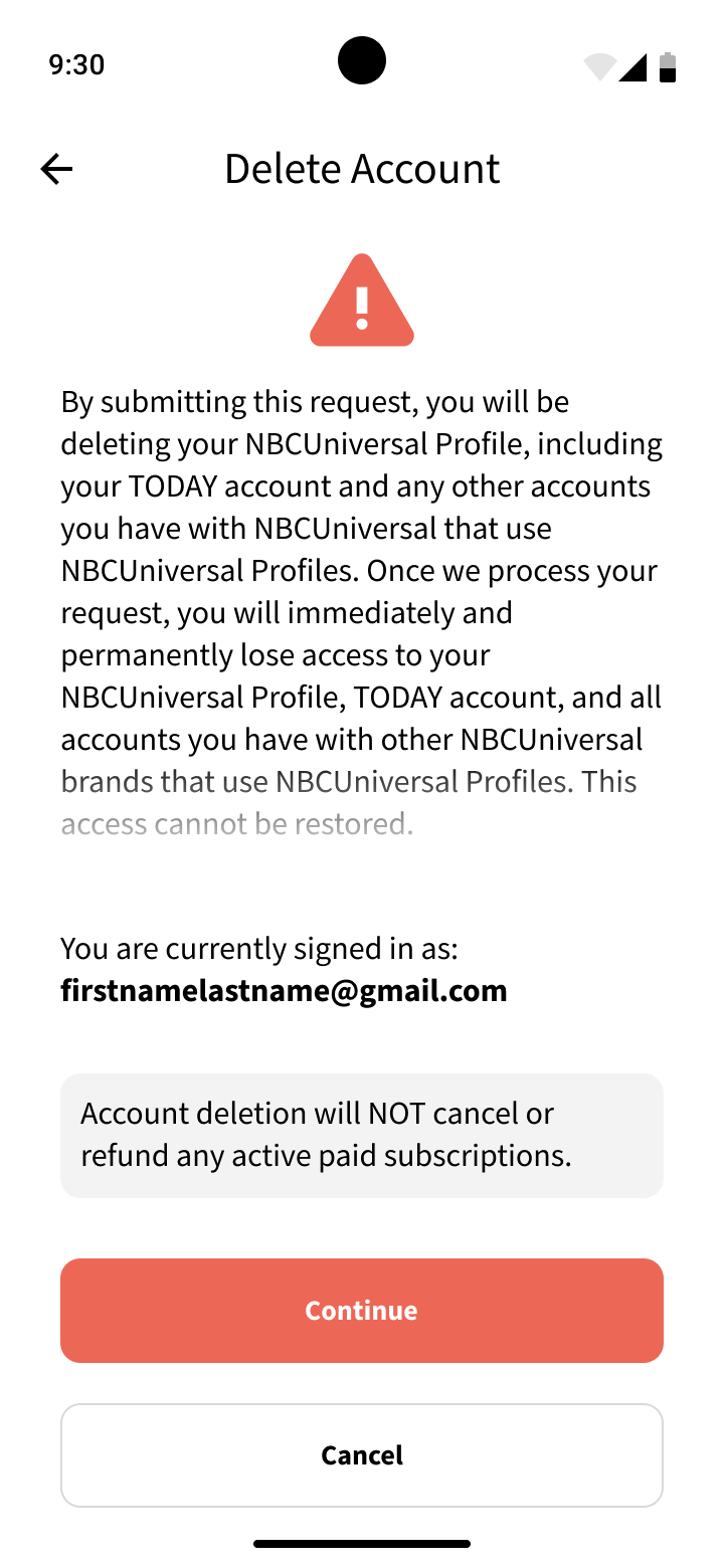
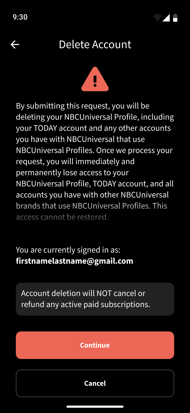
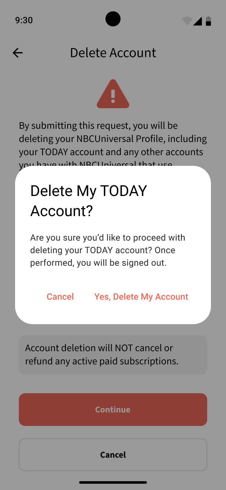
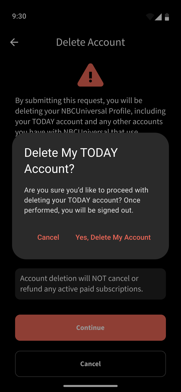
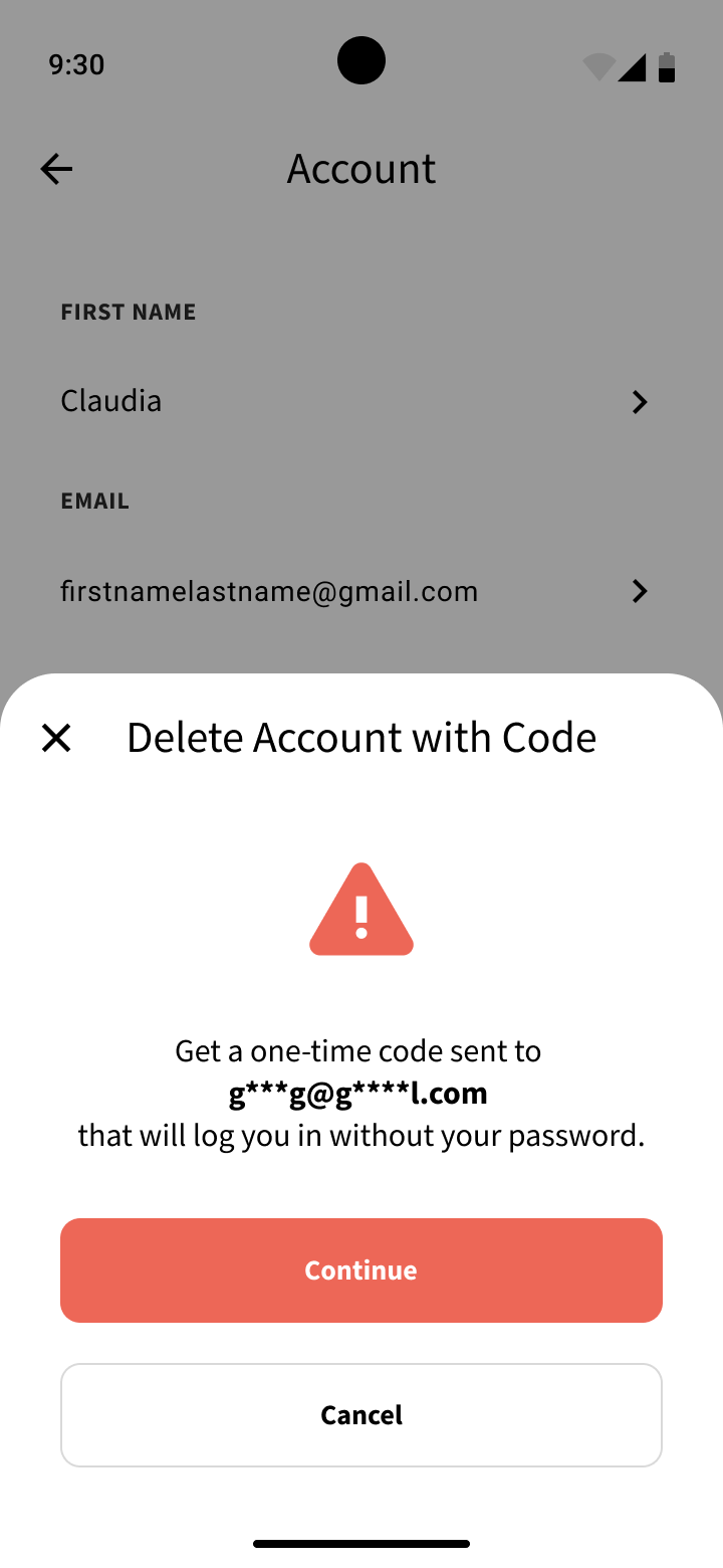
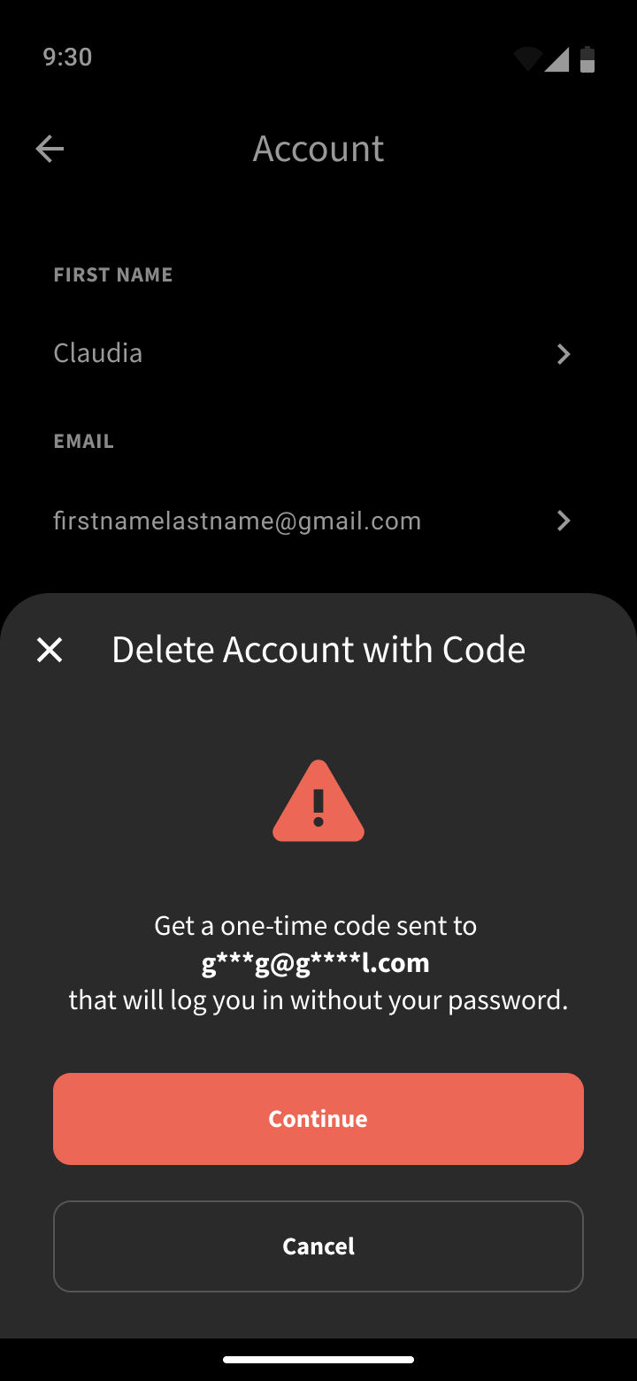
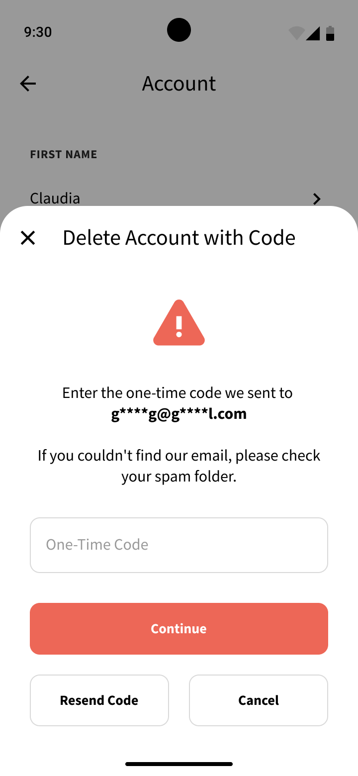
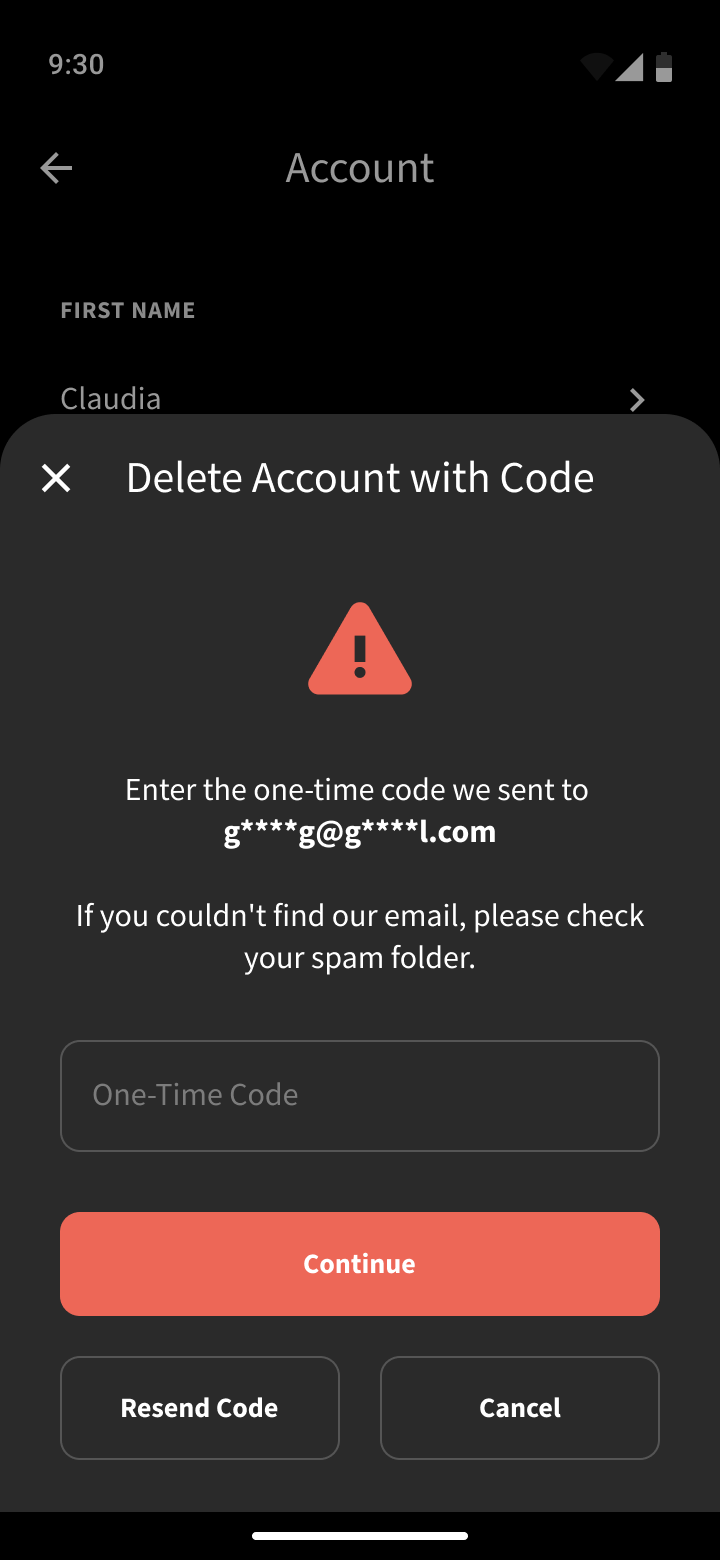
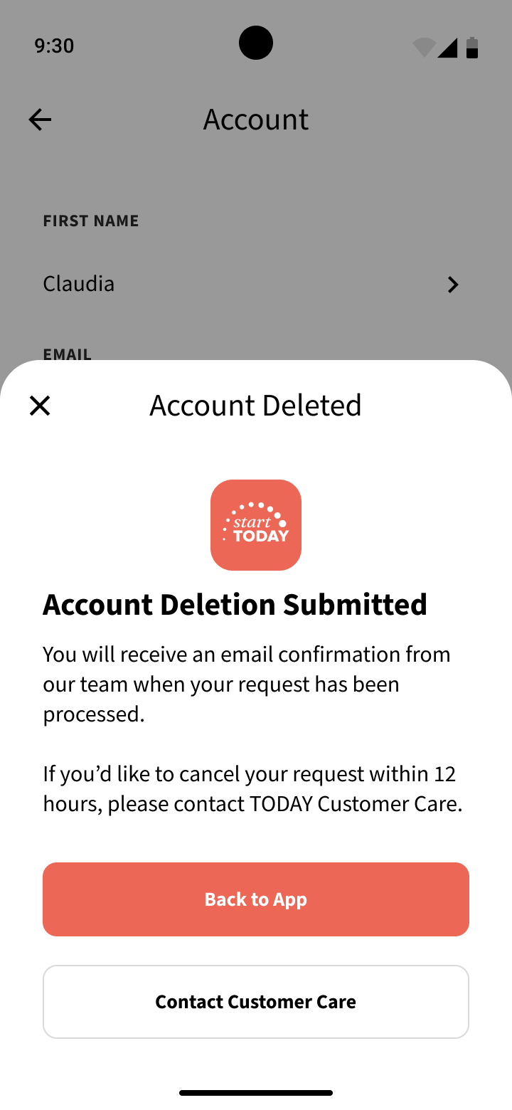
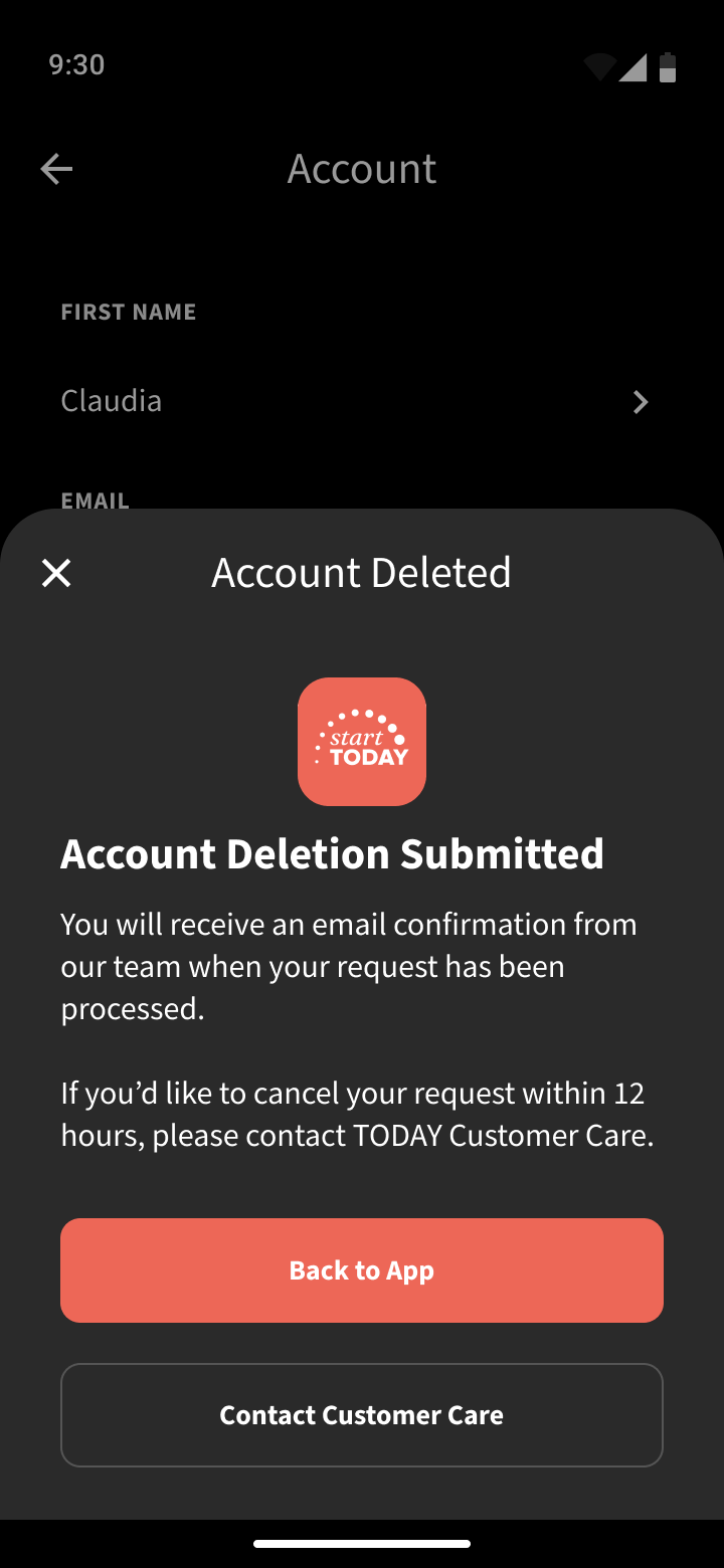
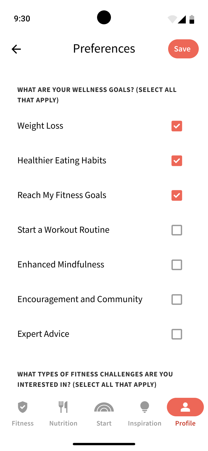
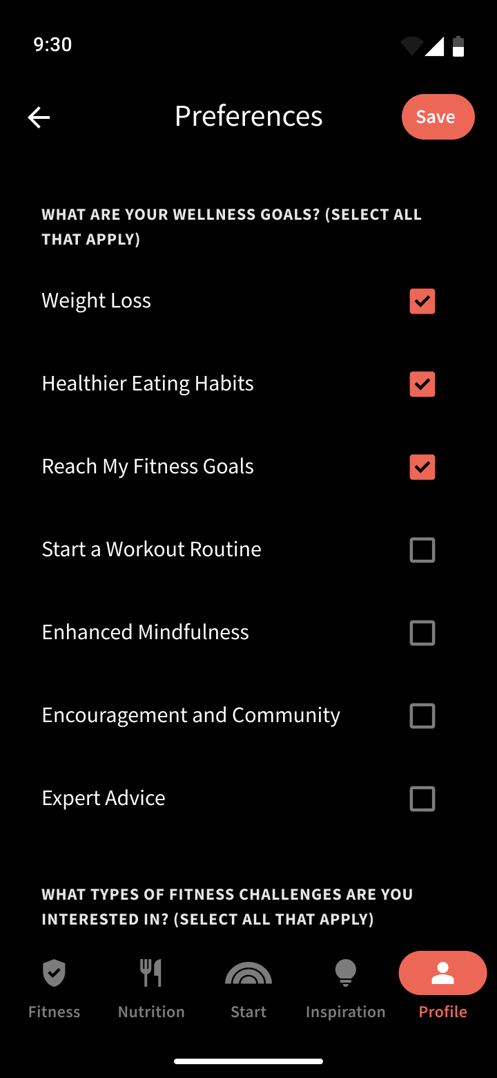
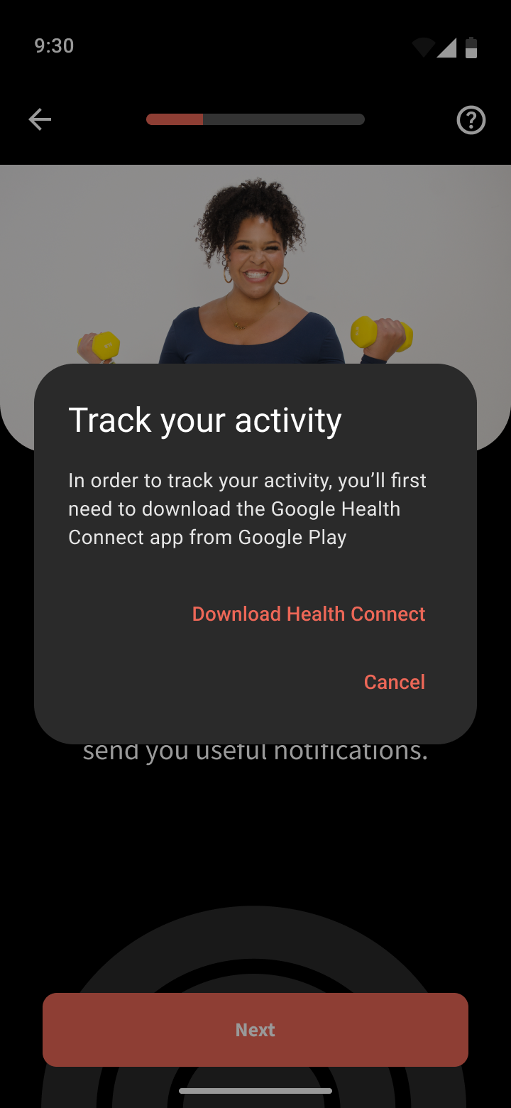
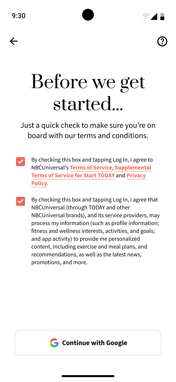
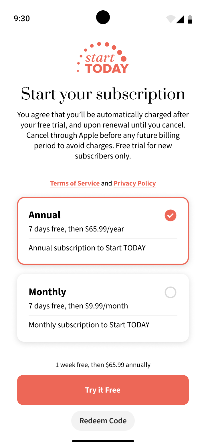
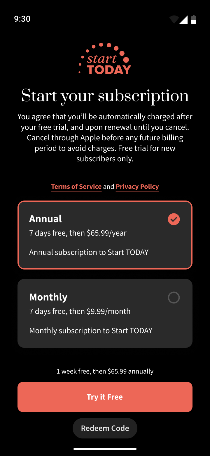
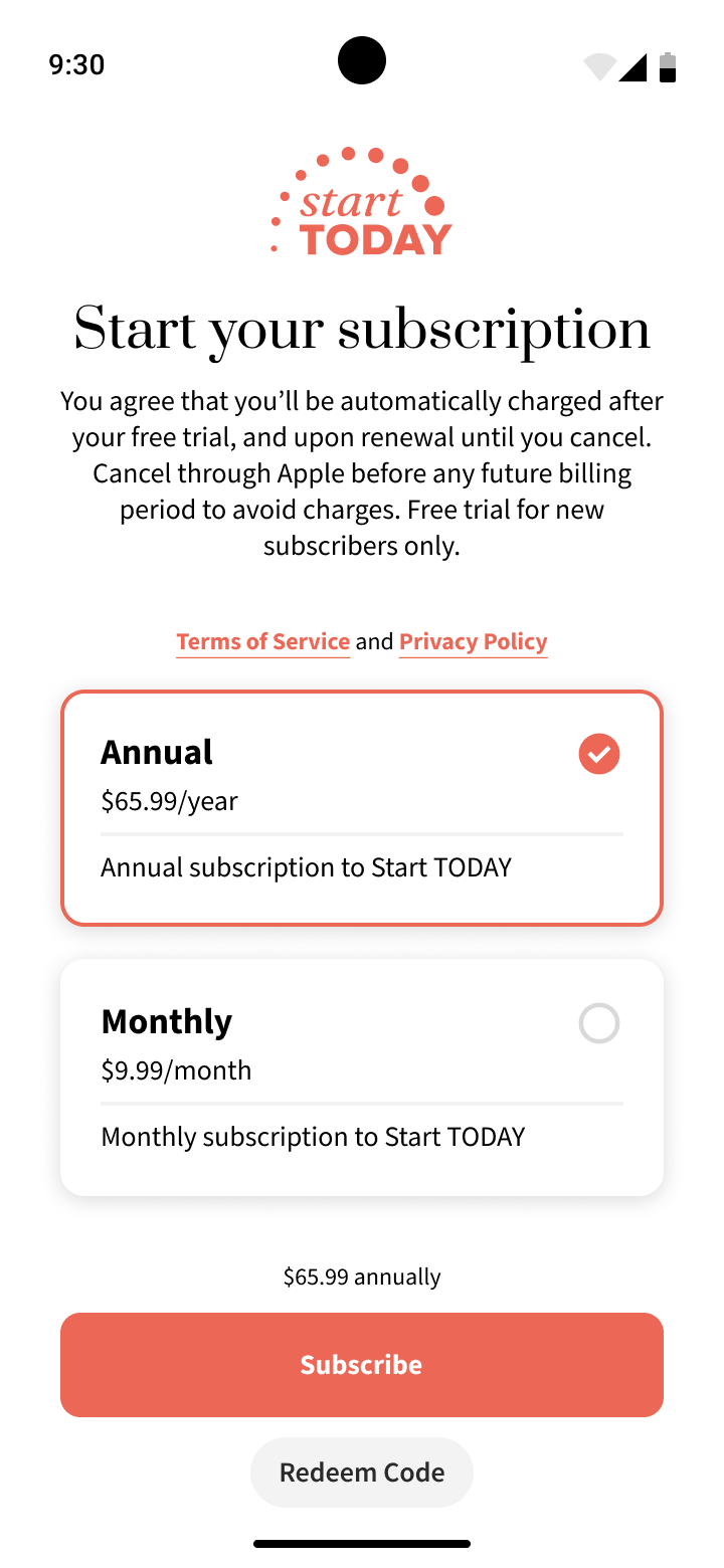
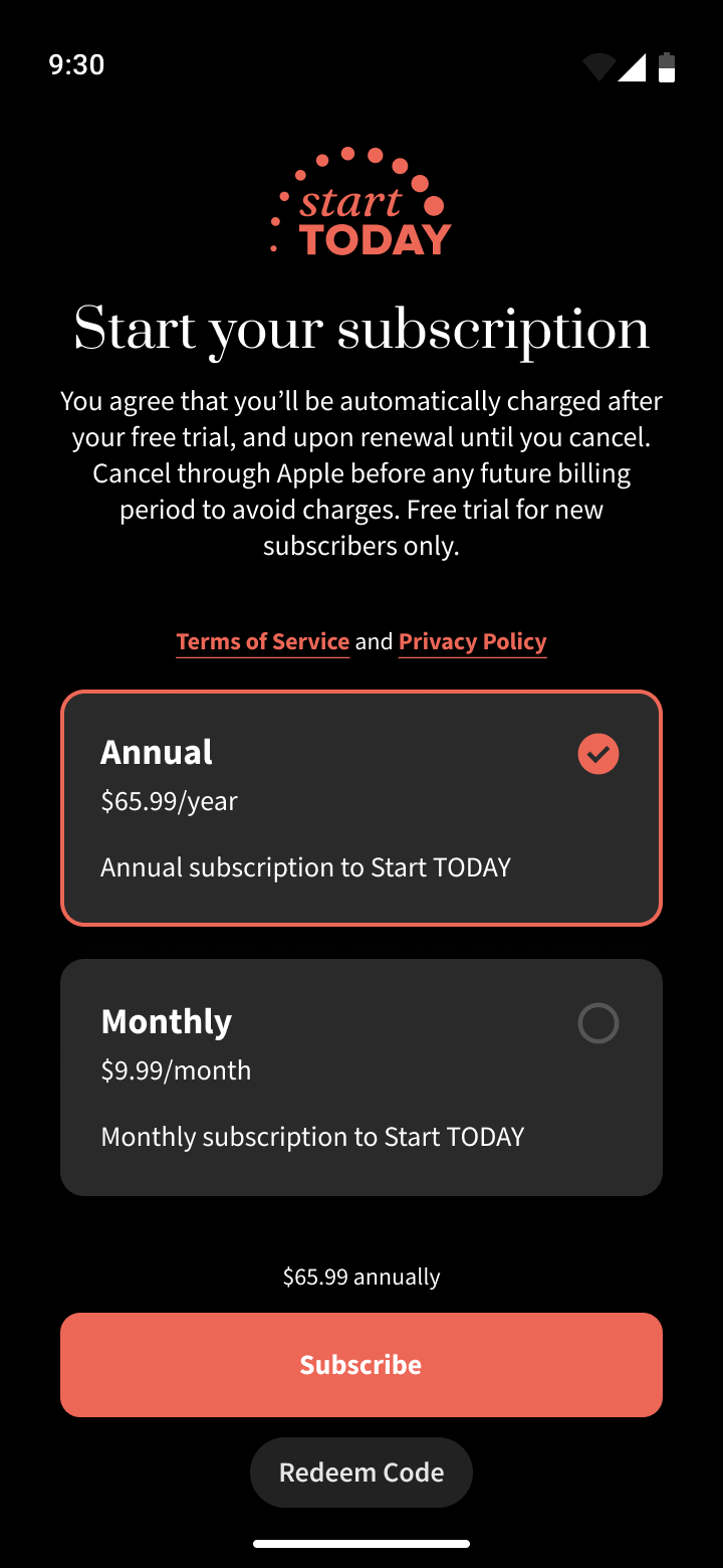
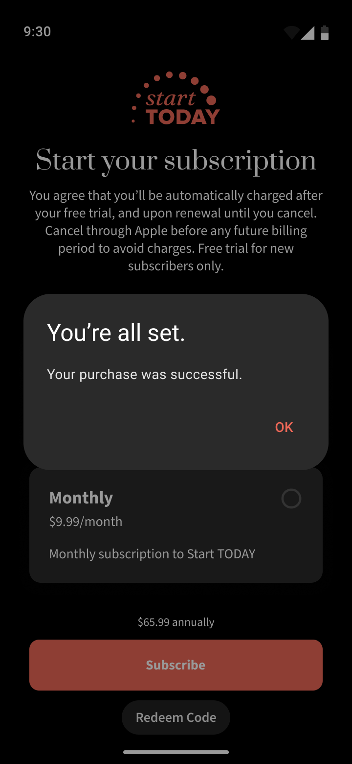
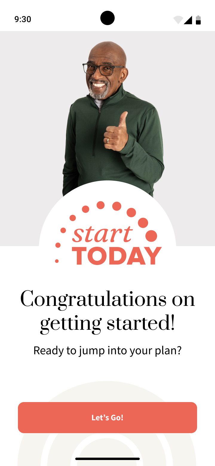
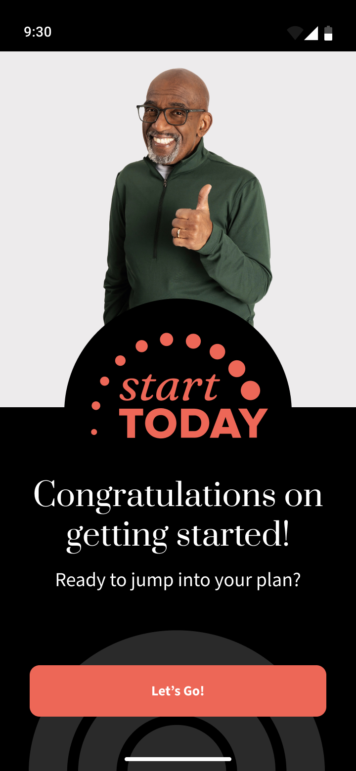
At this point we can also show the power of using Figma variables by easily switching screens from a light theme to a dark theme to round out and bring life to the entire experience, no matter how the user chooses to have their app shown to them.

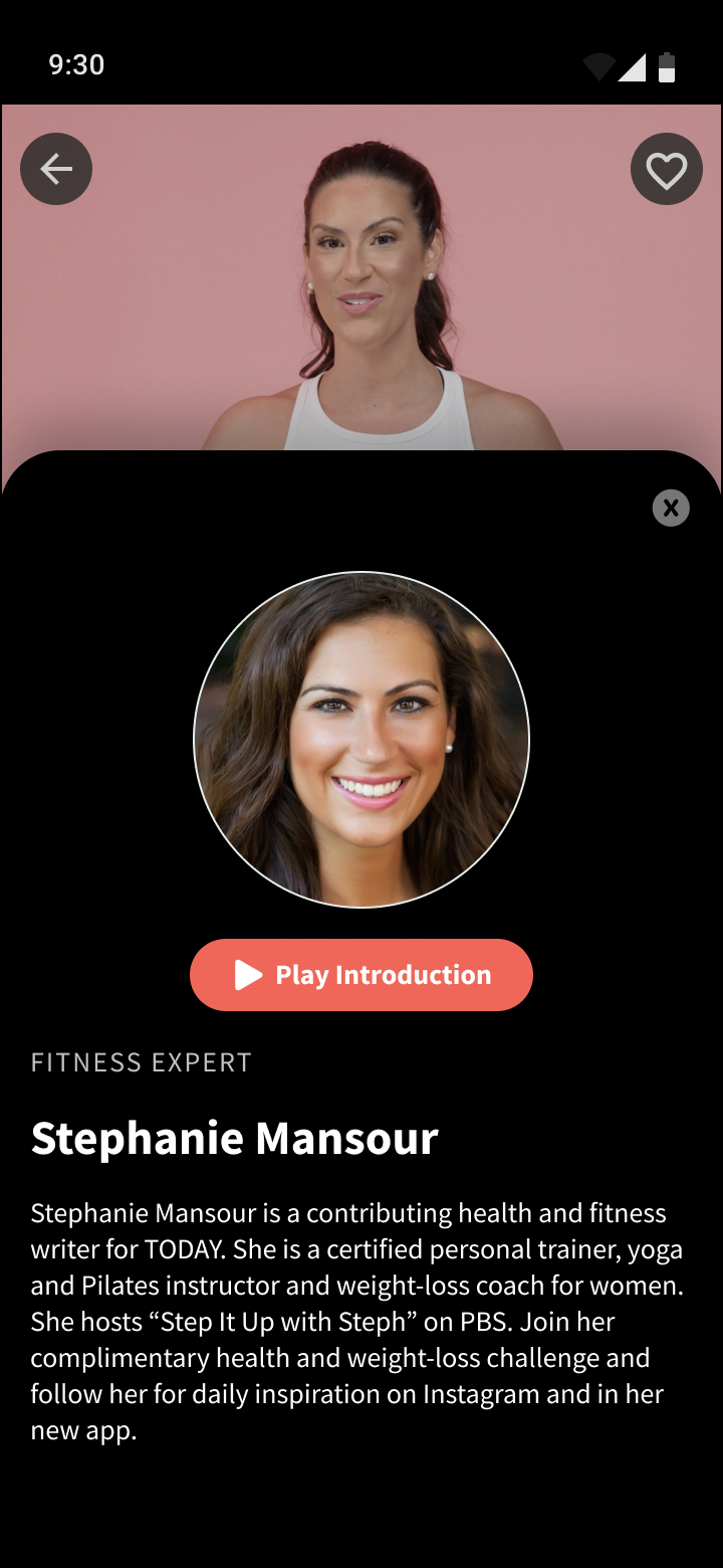


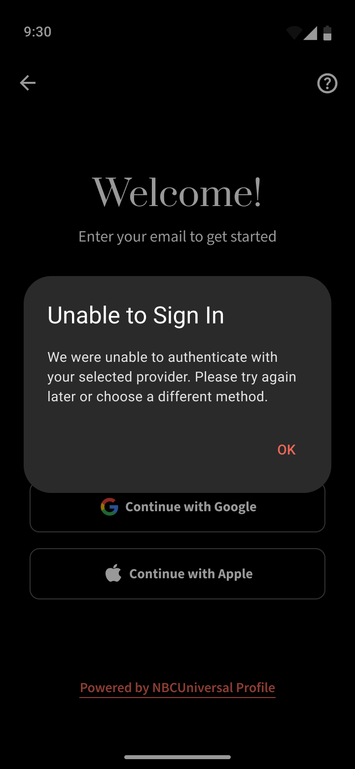
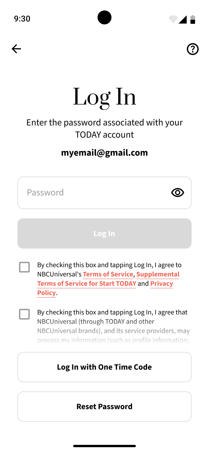


Thanks to the great work the full time Start Today designer did bringing the experience to life on iOS, creating this design system and app for Android was very easy.
While in his version of the designs, he was not able to create as robust of a system or reusable components due to an ever changing design definition and tight deadlines - I was able to use the final versions of his designs to inform the Android version very thoroughly and create an extremely cohesive, robust, reusable, and scalable design system.
Handing off this documentation to Android developers, this system and level of craft was praised as a way that kept developers in mind, that felt like it was made exclusively for them, and made their job much easier.
This is not the first or last design system I will make, but being able to constantly work on new and different designs and systems helps me continually hone my abilities.