As big news organization with the hugely popular NBC News NOW livestream available for free, local NBC News reporting on many NBC owned and operated channels in many regions across the country, there are many opportunities to bring live TV news reporting into app to greatly enhance our ability to engage users with the news, especially as its happening live.
In fact, due to being owned by Comcast, we also have the opportunity to bring several other national broadcast live TV channels into the app as well that have an overall relationship to the news.
Our mobile apps team singularly juggles many different features and enhancement work for CNBC, NBC News, and MSNBC at a time, thusly we need to be strategic about how we structure the work we want to accomplish.
One of the more important considerations in mind is that we wanted to be able to release a portion of this live TV functionality in time for the second 2024 presidential debate in September.
One of the primary reasons we want to integrate live TV into the app is for greatly enhanced storytelling opportunities.
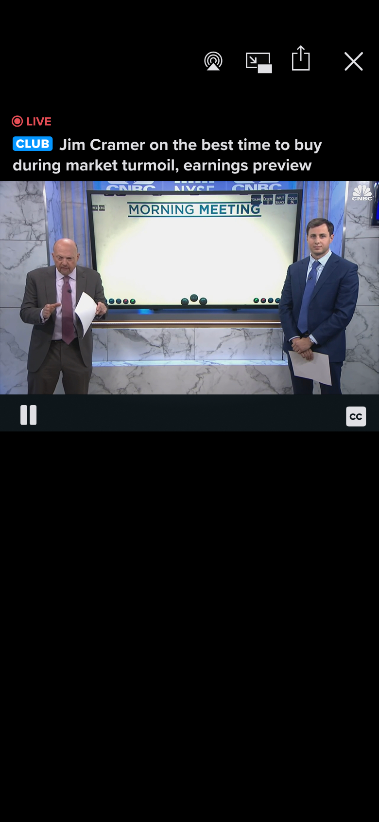
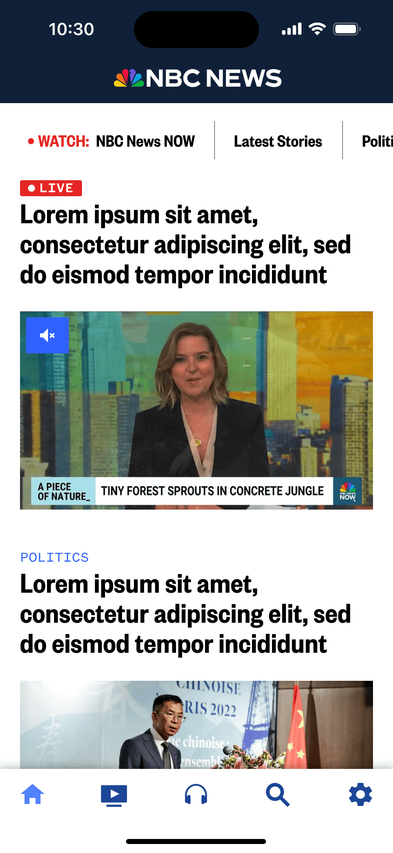
By integrating live TV directly into the news feed as a modular component that our editorial team can pair with headlines, articles, and related stories we can make the news more dynamic with the ability to not only read the news as it happens, but watch it as it unfolds live.
Secondarily, but just as important, is to redesign the existing Watch tab such that we can make it the de facto home for watching live TV regardless of the curation of the news feed on the Home tab and simultaneously improve the VOD clip browsing and navigation experience.
Utilizing the foundation of the first part of the Watch tab redesign we can then add 11 local NBC News owned and operation channels as well as more nationally available channels such as Sky News, Noticias Telemundo Ahora, Dateline 24/7, and more.
With this phase, leadership would also like us to bring a more media focused presentation to the redesigned tab including a new icon and name to emphasize the it being a hub for more live TV channels.
Given that the editorial team will be one of the primary users of this new live TV package to enhance their ability to tell stories, we want to ensure that it meets their needs and effortlessly fits in with their editing style and with the other contents in the news feed.
Generally just thinking through what we as the product team would like this live TV experience to be and that we would like it to ideally
We can start mapping out the other components and features this experience should contain, such as
We know that we want the live TV package to be a major focus of content in the news feed in the Home tab as well as eventually becoming the anchor point for the Watch tab.
To create a component that can easily be utilized for both segments of the app with minimal changes and ease of implementation, we decided to both take a look at our existing curation packages and to see if we utilize and adapt one of them as the basis for implementation as well as new designs that could potentially lend themselves well to the situation.
The 1:1 hero package is a package type that is used only when there is a very important news story with striking imagery is when this package is used.
This package type bleeds edge to edge across the screen, has a square ration, and incorporates text directly on top.
Due to this package type bleeding edge to edge across the screen, having a square ratio, and incorporating text directly on top of the media doesn't lend itself as well to displaying live TV content as it potentially could.
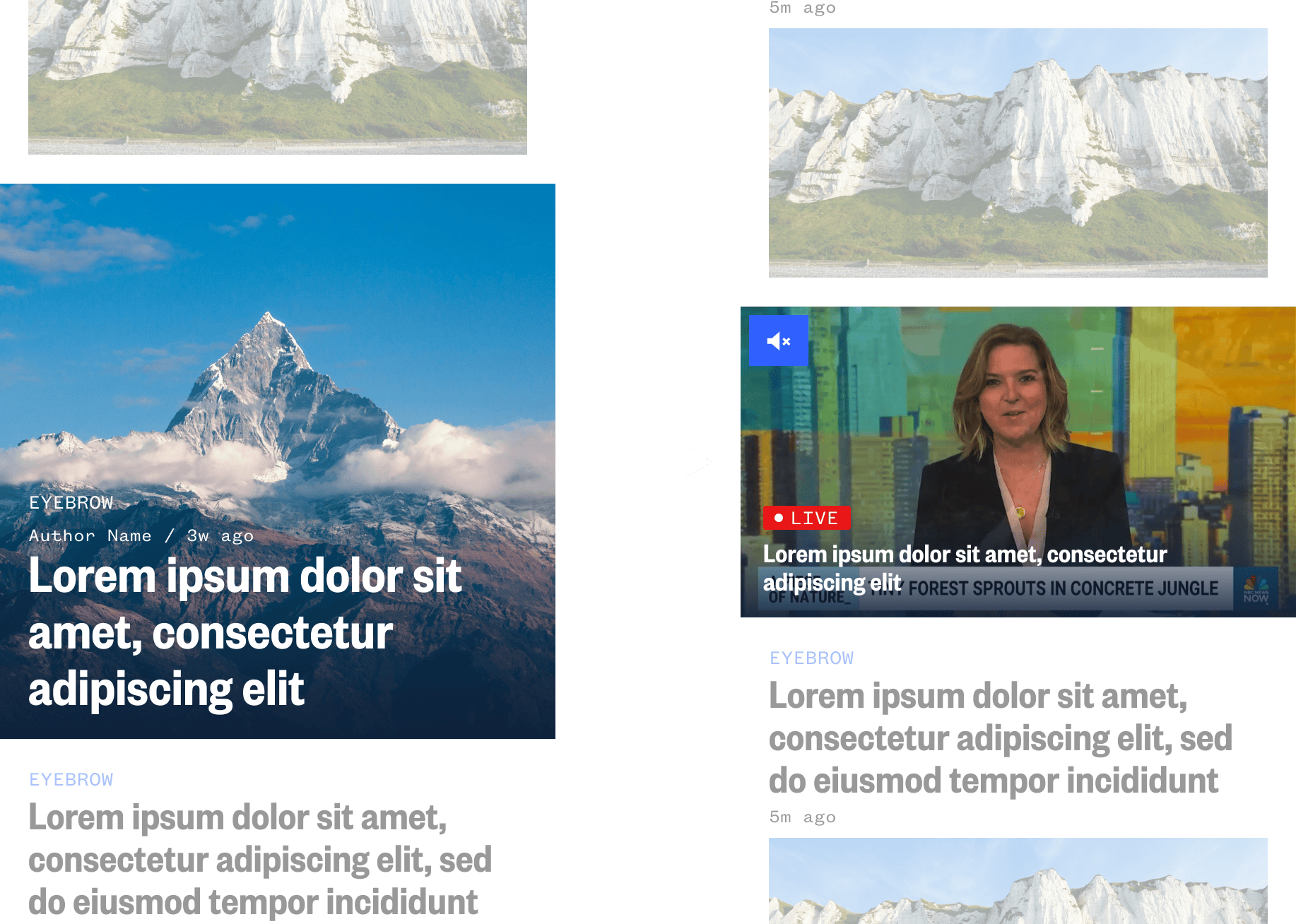
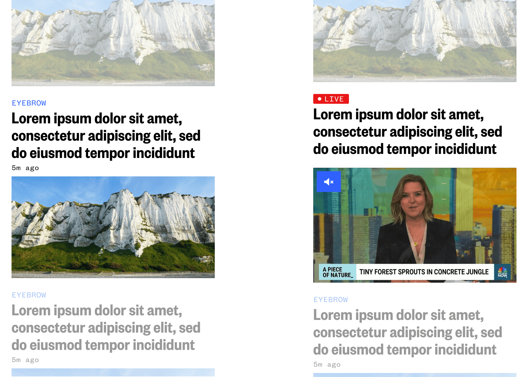
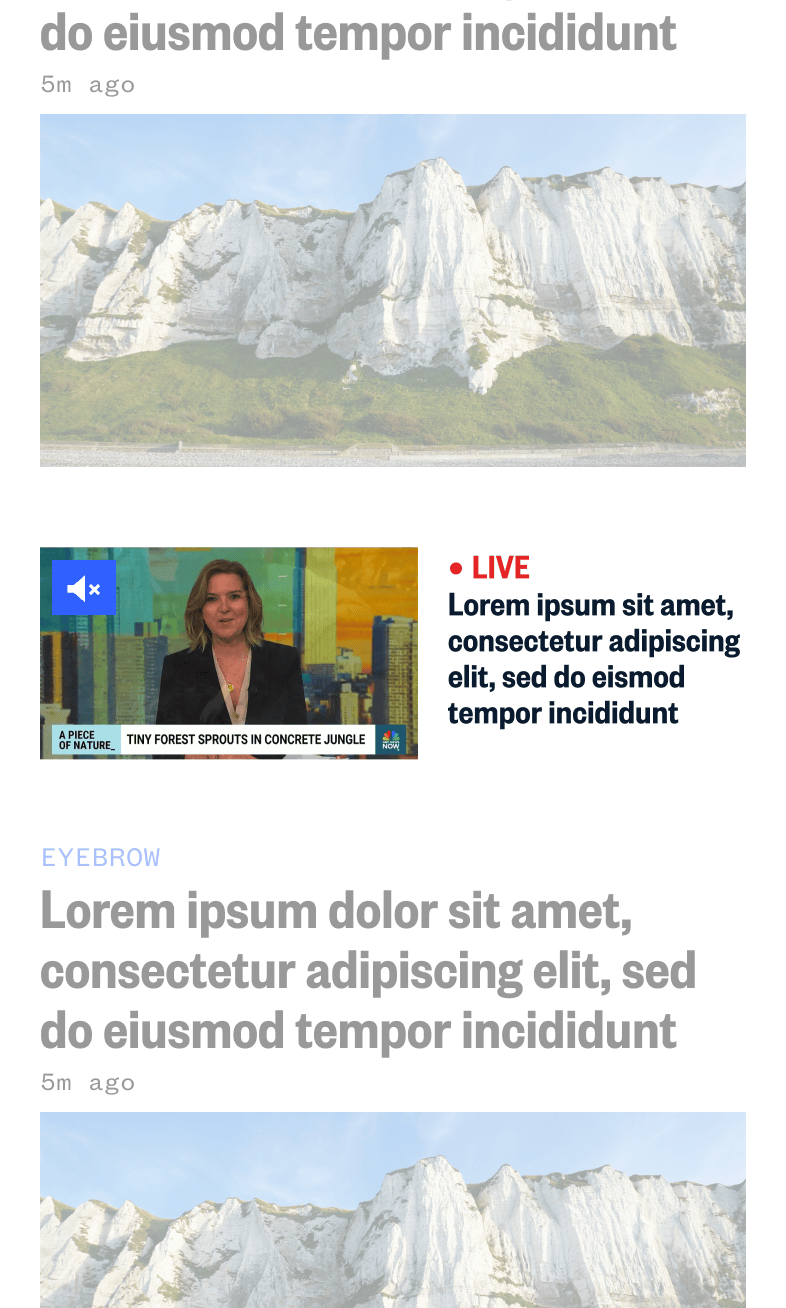
The 2:1 hero package is a package type that is used for all article types and single instances of video. It's essentially the default way in which editorial curates the news and contains nearly all of components editorial would need to curate it as a new package type.
It doesn't bleed edge to edge across the screen and can easily handle text above and below the media space and fits in perfectly with the news layout.
This type of conceptual package design would be designed to minimally present live TV and let the content around it speak more.
It could primarily be used to for lesser news coverage that doesn't need to be highlighted, however, it would be not ideal for linking live TV to contextual stories around it.
This type of conceptual package design would be designed to bleed edge to edge on the news feed and really pop, but its overall design doesn't allow it mix with other contextual stories well.
We ran some quick guerrilla user testing with various people in the company and reviews the concepts with various stakeholders.
Overall the feedback we received was that the concept that utilized the foundations of the 2:1 hero package yielded the best results in terms of being able to contextually blend in with the stories around it to help with better telling the news and the larger text makes legibility much easier, and can really highlight content the best.
With the direction finalized our developers went ahead building this live TV package and we were successfully able to launch it in time for the second 2024 presidential debate in September.
With this work now complete, we have a new way to present dynamically updating stories to users as live TV coverage captures it.
This in turn is a huge win not only for us, but for our users as well.
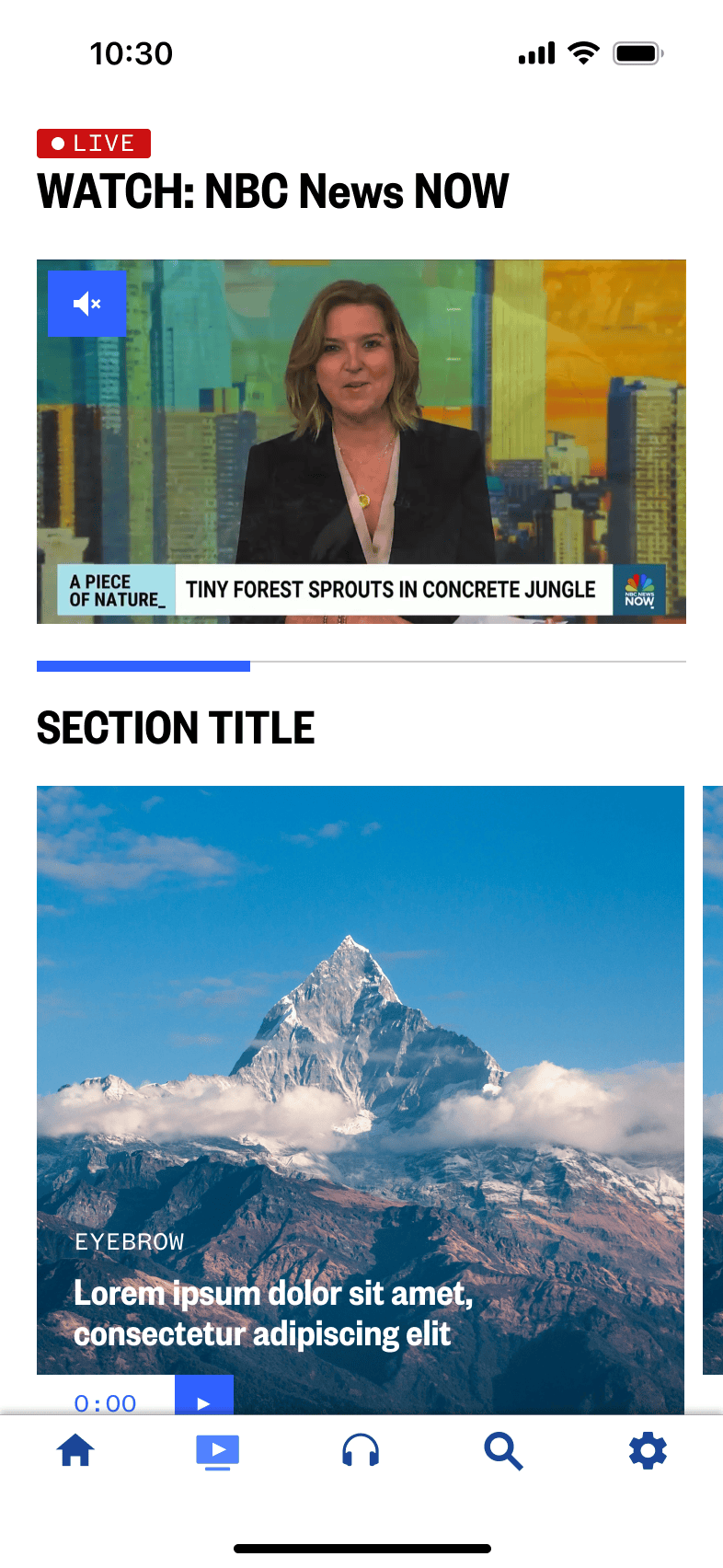
The existing Watch tab layout in the app has been a pain point in the experience for quite some time.
As you can see below and like mentioned previous, there are a number of issues with the design as it stands currently.
Some of these issues are:
Thusly the new Watch tab must
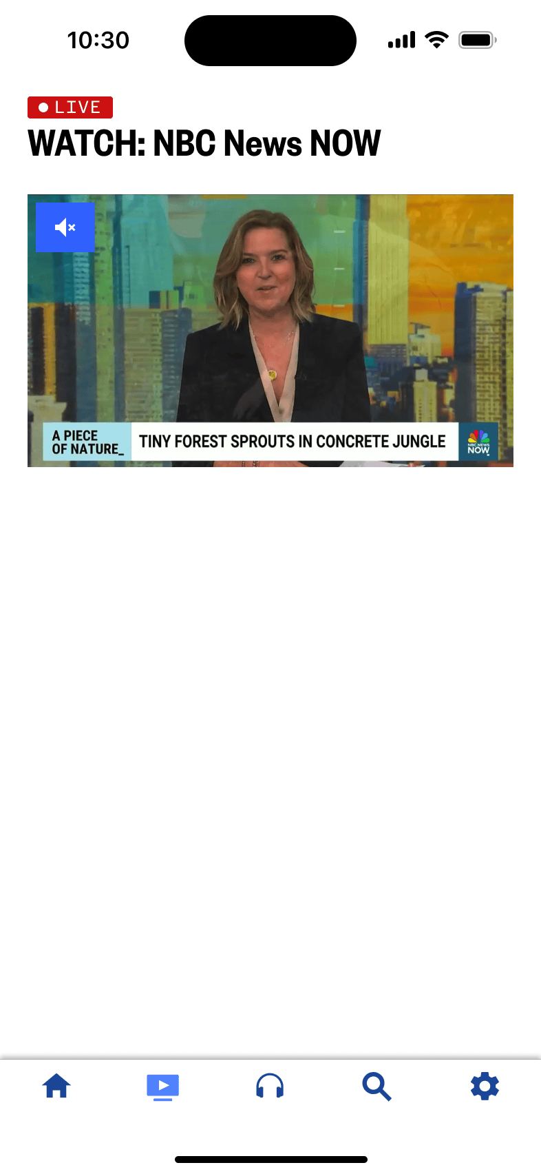
With the decision to utilize the 2:1 hero package foundation for the live TV package, it effortlessly lends itself well to the top placement in the Watch tab
Based on this, the last component we really need to consider for this phase is how best to display VOD content for the user to browse through and watch.
Luckily we have many existing package types that we can explore to see if they fit our needs or create a new package type if the existing ones don't fit the bill.
All of our existing package types that allow for typical horizontally scrolling content are referred to as promo packages. The meaning of which has been lost to time.
All of these packages come equipped with section titles, which will be key in our ability to communicate to the user the type of content per package so we can group sections by shows or topics and keep the context easily.
The Large Promo Package provides a large format horizontally scrolling tray with square formatted images that can serve up either articles or videos with an included badge to indicate video duration.
Unfortunately as you can see, this type of promo package is just too large.
While 1 full cell can be seen on screen while the live TV player is on screen simultaneously, the video duration badge starts to bleed off the viewable area.
For these reasons, the Large Promo Package immediately becomes unideal for the task.
The Medium Promo Package is similar to the Large Promo Package, but as can be gathered from the name, it is a bit smaller. Instead of providing a square aspect ratio, it provides a 2:! aspect ratio.
Testing out this package type yields this layout:
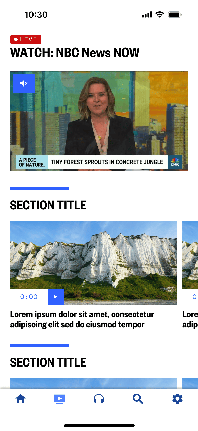
While this package lends itself much better to displaying the content we want within the Watch tab, I believe we can do it even better.
My plan is to create another offshoot of this type of promo package to make it smaller to display more content on screen at once, but not too small where the amount of content could be too much for users to take in all at once.
Like mentioned above, we can utilize the existing Medium Promo Package and build off it to create a smaller, slightly more dense version to increase visibility of content on the screen.
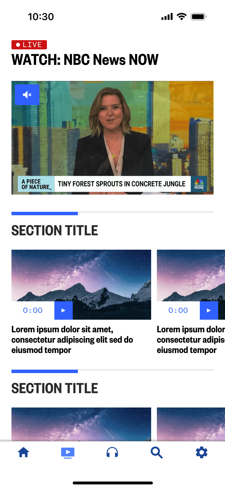
We ran some quick testing with external users and reviewed the proposed concept and new package type with internal stakeholders.
All agreed we were on the right path, so we continued with a plan to build and launch this new experience.
With the direction finalized our developers went ahead building this new Watch tab, we were able to launch it in Nov 2024.
With this work now complete, we have a new way to present our Watch tab, enabling a new dedicated home for users to watch live TV and find VOD clips.
This also provides for us a fantastic foundation from which to build the next phase of the Watch tab from.
This work started as an initiative within NBC News across all platforms to include access to more live TV streams with 11 local NBC News channels and 4 nationally available channels.
We can easily use the foundations set up with the new Watch tab to build this updated experience from.
Leadership also expressed desires for us to make more visual enhancements to the branding in the tab to display channel logos as well as adopting a dark theme specifically just for that tab.
Additional context: unfortunately the NBC News apps as a whole are not built to support a distinct dark mode just yet, even though users have been asking for it for a long time.
To go along with these updates, we'd also like to explore potential options to replace the older Watch tab icon to bring more attention to the new Watch tab and to emphasize the ability to watch more live TV.
We explored a number of concepts around a new tab bar icon to see if we could better communicate the idea of a home for live TV.
With this work we also decided to test whether or not adding text labels to the tab bar icons was beneficial to users to help in the understanding and discover of the tab bar items to boost page views.
With all the concepts, we decided to move the Watch tab icon into the center for the greatest visibility.
We decided to test 6 concepts:
This first concept explores utilizing the existing tab bar icon, but flanking it with emanating concentric waves. This, as you'll see, will be a theme with other concepts to try and capture that feeling of a broadcast.
This concept looked to test an animated icon. We wanted to see if we could capture the idea of a blinking icon indicating the feeling of a broadcast live on air.
We had originally tried a few different variations of this icon including one with a center icon that would blink on and off, but we had determined internally first that this would be far too distracting to the overall experience.
With this concept we wanted to test that center, non-animating dot with concentric rings emanating from the top similar to radio waves from a tower.
With Concept 4 we wanted to test utilizing an existing paradigm to help literally convey the idea of a place to find live content with the usage of the live badge element we use elsewhere in app, especially in relation to the newly design live TV package and our existing live audio streams.
When exploring this concept we had also decided to remove the text labels as a way to truly test whether users preferred to have them or not and the labels didn't make as much as sense when using the badge which already has text within it.
For this last concept, we wanted to test a more simplified version of the icon used in the first concept, where we still use the concentric emanating rings with a solid central circle with a negative play icon.
Like mentioned before, the NBC News app has not been updated to support an app-wide dark mode and is only displayed with a light theme.
This has been a constant request from our users to implement, but unfortunately do to other business priorities, we've never had a chance to design or develop for it.
With this work to enhance the Watch tab further into a Live TV tab, leadership has finally given us the opportunity to implement a dark mode, but only for this tab specifically.
This was decided based on available developer bandwidth and (at the time) the rush to release this enhancement before the end of the year or very early the next year.
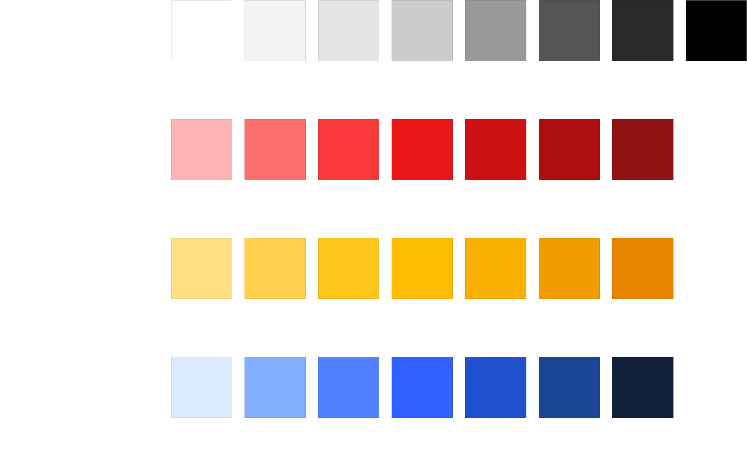
Although we cannot spend the time to bring an app-wide dark mode, we can design intelligently to make use of color tokens and Figma variables to define a color system that would work not only for the Live TV tab, but for the entire app and all we would need to do is adjust the components throughout the rest of the app to make use of this new color token system.
The color system would make use of all of the library of defined brand colors, but structured in a way to work the ideal way that color tokens should work.
The color tokens as designed can be seen below.
I had created a series of Core Color Tokens to define at a high level what the colors we utilize in app are as well as a series of Alias Color Tokens which take the Core Color Tokens and expand it to define an implementation of light and dark modes.
Besides the overall branding and color differences, the channel tiles are now the major differentiating factor between the old Watch tab and this new Live TV tab.
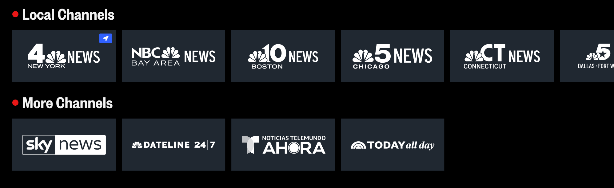
Overall, at least in this first release, users will have access to 11 local NBC News channels from various regions across the country as well as 4 nationally available channels.
We want to make sure we highlight the channels appropriately through the use of their distinct logo, of which we have a couple options to test from, as well as indicating to users that these channels are all live.
We also want to indicate and surface to the user their most local NBC News channel if they have given the app location permissions.
There are a couple of options that we'd like to test
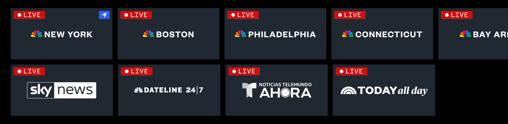
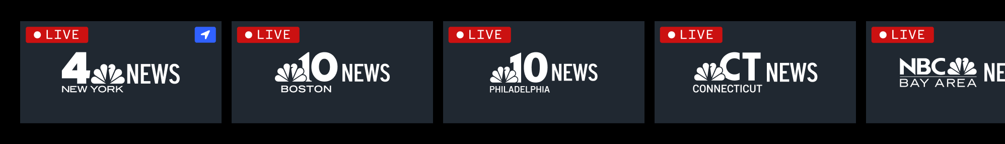
Two distinct unlabeled rows utilizing large local and national channel tiles, full live badges for each tile, simplified region logos, and a blue location icon in the top right of the most local channel
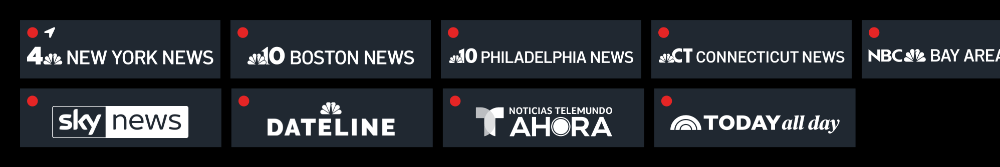
Two distinct unlabeled rows utilizing thinner local and national channels, red dot live indicators for each tile, longer full region logos, and a white location icon in the top left of the most local channel
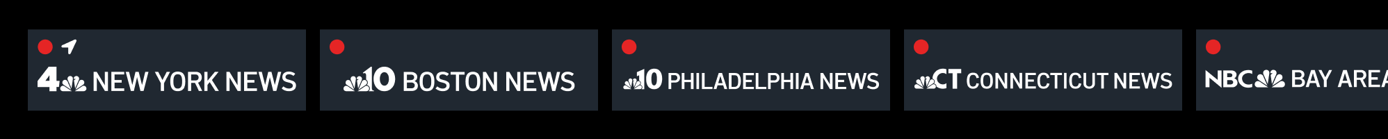
One distinct unlabeled row combining both local and national channels in one horizontal scroll utilizing thinner local and national channels, red dot live indicators for each tile, longer full region logos, and a white location icon in the top left of the most local channel
One distinct unlabeled row utilizing large local and national channel tiles, full live badges for each tile, larger region logos, and a blue location icon in the top right of the most local channel
Two distinct labeled rows utilizing large local and national channel tiles, red indicator live dots for each section title, larger region logos, and a blue location icon in the top right of the most local channel
We ran testing with external users and reviewed all proposed concepts with internal stakeholders.
The testing feedback we received was very clear.
Users preferred
With the direction finalized our developers went ahead building the new enhancements for this Live TV tab.
Unfortunately, just as we finished the work for it and planned to launch it in Jan 2025, we got word from leadership that they wanted us to hold off on its launch and instead integrate these changes into a new DTC subscription experience that was announced in Jan 2025 with plans to design, build, and launch it in Dec 2025 - which is now when this experience is expected to launch.