Matt Kofman
Senior Product Designer
Platforms
iOS & Android
Design
Jun - Sep 2021
Launch
Unreleased
Team
Product Designer
Product Manager
User Researcher
1

Context

all about the Onboarding initiative

Rethinking the Onboarding Experience

Create a more meaningful, more compelling onboarding experience for users who newly install the CNBC app

Issues with Current Experience

Design is very different between Android and iOS
The only step is enabling push notifications
A low double-digit percent of users are choosing to enable push notifications

Additionally...

Due to changing company policy requiring users to have an account to use certain features, account creation and sign in has become a higher priority

It would benefit users to have this functionality up front to enable a smoother experience

2

Ideation

and thinking through what could work

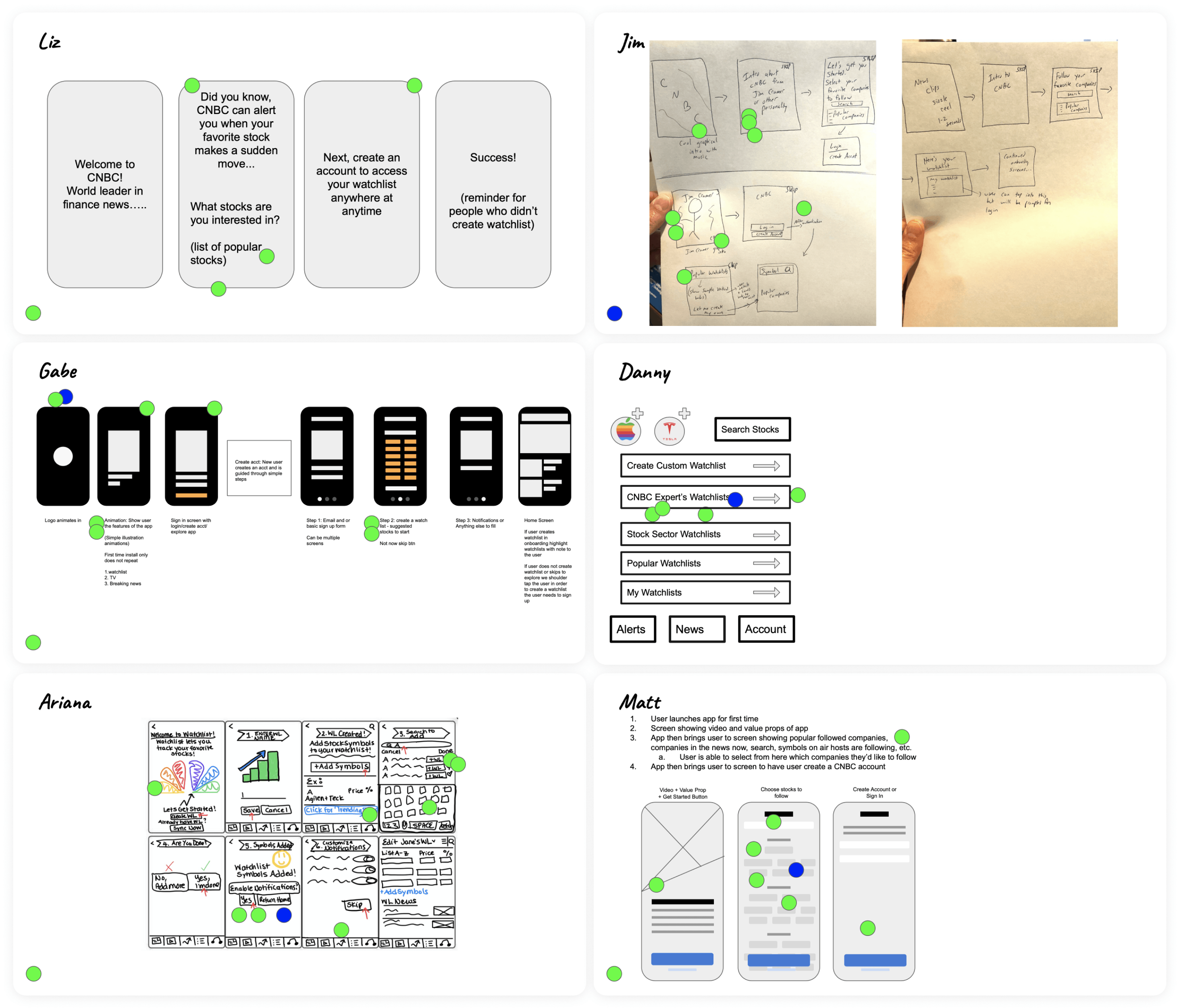
Held a workshop with the team

Included members from across the team and across disciplines to discuss goals, ideas, and the pros and cons of everything

How might we offer a compelling new onboarding experience?

A prevalent idea that was shared was to provide more ways for users to define and personalize their app experience from the start

We could offer key pieces of the app experience upfront to users to customize how they use and see content
Core Components of Onboarding

Account
Create Account
Sign In
Syncing Preferences across Devices
Watchlists
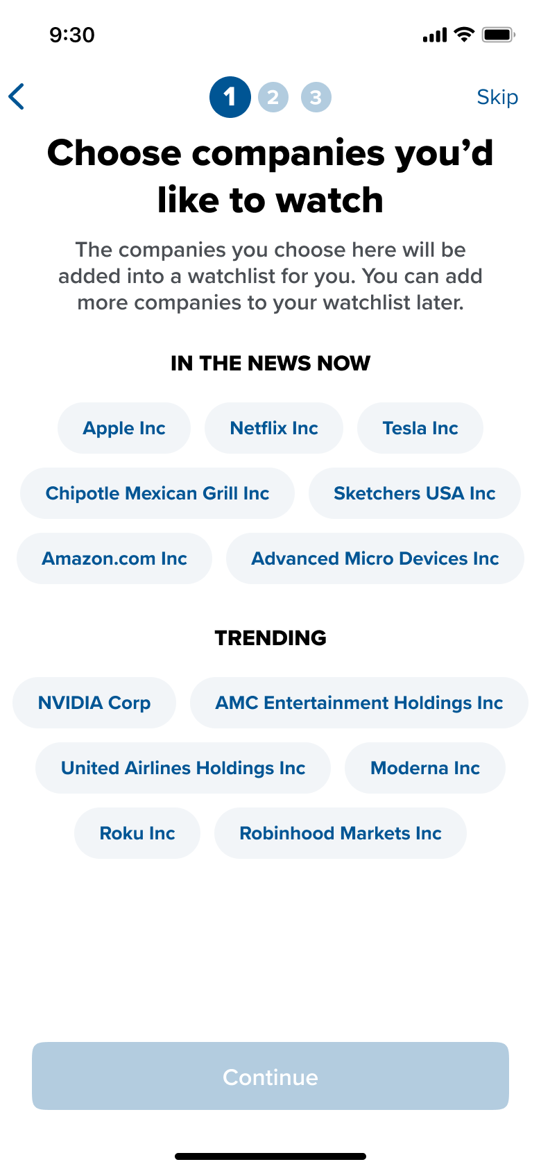
Create a Watchlist
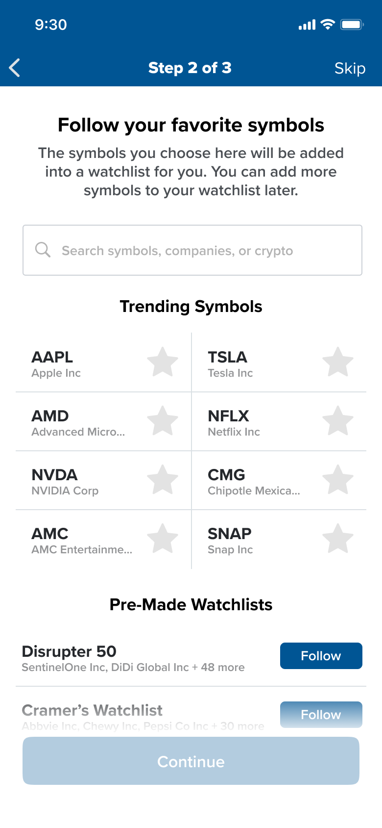
Follow Symbols
Add Pre-Made Watchlists from CNBC
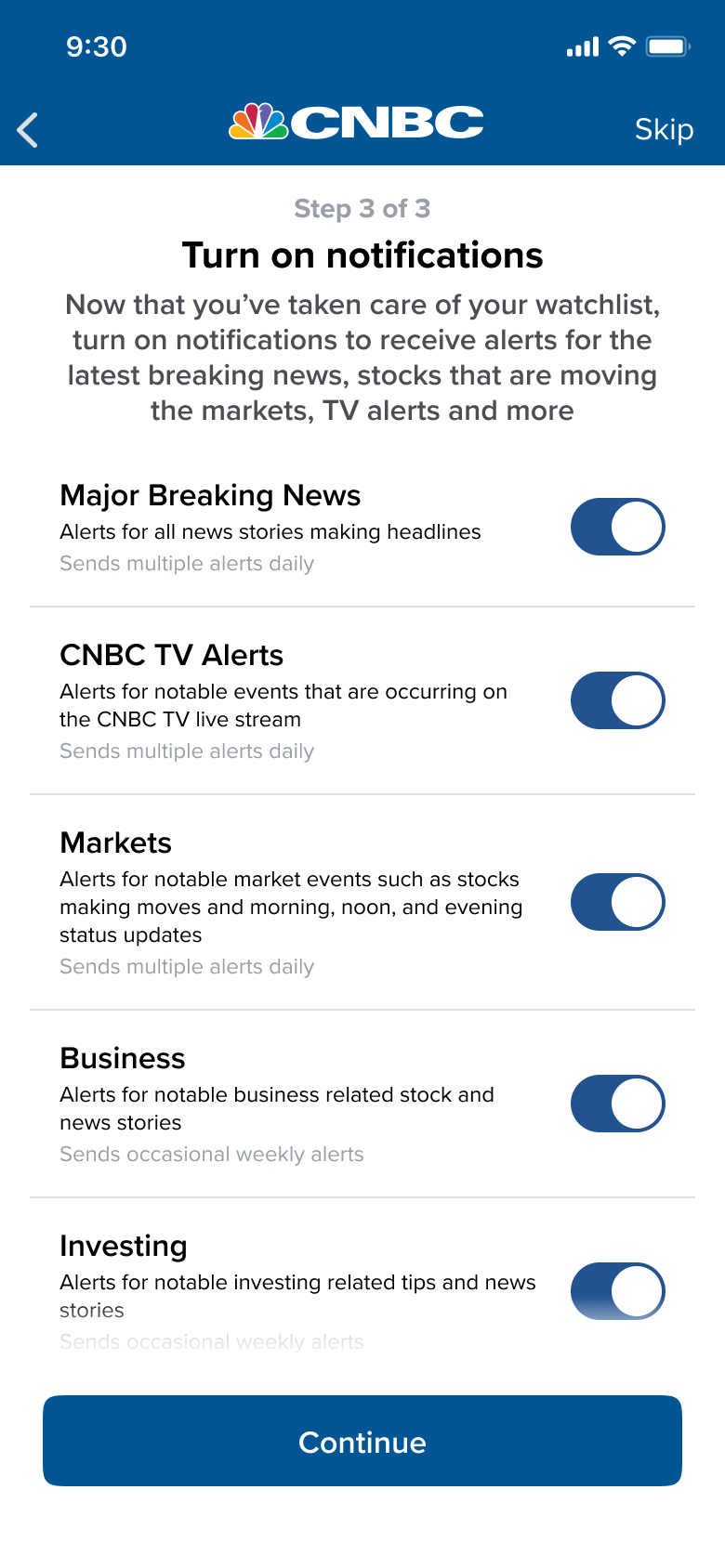
Notifications
Enable/Disable Specific Alerts
Enable/Disable Groups of Alerts
Provide more info of the content and how often alerts will be sent
News
Personalize the type of news content displayed
CNBC Pro
Free Trial Offer
More Insights into the Stock Market
Watch live CNBC TV without a TV Provider

We know from analytics and user feedback that all of the above categories are under utilized

Streamlining the experience is key

We want to keep the amount of steps involved to a minimum

We want to avoid overloading the user with too much all at once

We should allow users to skip onboarding

As a group we sketched and voted for ideas

Having a general idea of where we ideally want to head, work on bringing these ideas together as concepts started

3

Concepts

and thinking through different perspectives

Based on the results of the ideation workshop, I decided to create two conceptual variations

This would allow us to test order sequencing, visual aesthetics, interaction methods and will give us insight into general user sentiment
Concept 1

Concept 1 allows us to test...

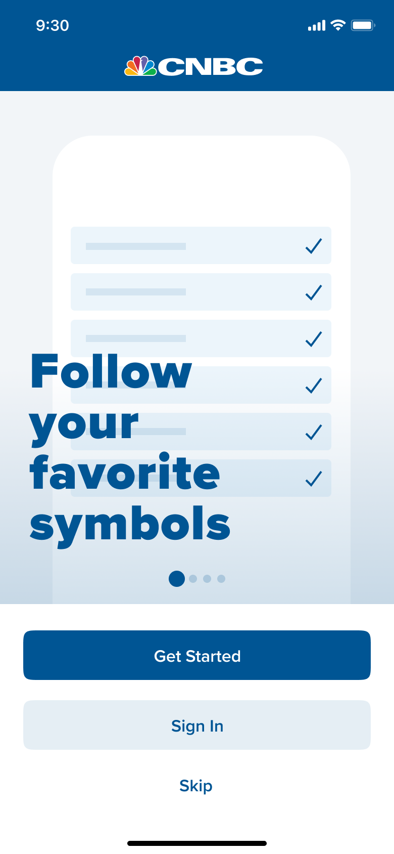
Swipeable pages of value props
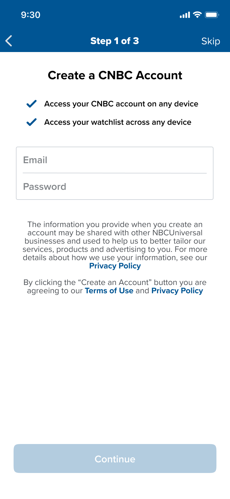
Creating account as a first step
Finer control over creating a first watchlist, such as the ability to search for stocks
Sentiment towards pre-created watchlists of notable groups of stocks
A design aesthetic that's more inline with the rest of the app experience

Concept 2

Concept 2 allows us to test...

A looping video of value props
Watchlist creation as first step
Notification control for groups of related alerts
A design aesthetic that's a little more bubbly and fun

Concept Welcome Screens in Motion

4

Testing

and understanding user preference

We held five moderated interviews testing both concepts in alternating order

User Feedback
Swipeable Welcome Pages Preferred
Users felt it gave them more control over what they were seeing as well as the overall video just feeling too long to get the point across.
Account Creation Preferred as First Step
Users felt it was more natural to create an account and that it lead better into watchlist creation
More Customizable Watchlist Creation Preferred
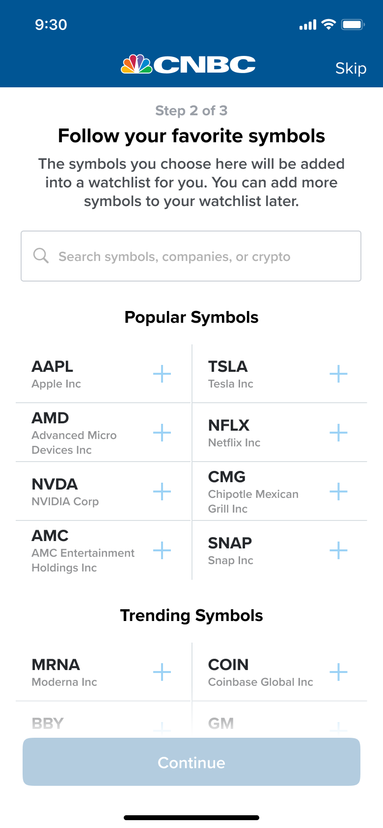
Users felt the pre-populated symbols section by itself didn't meet their expectations and didn’t allow for enough personalization
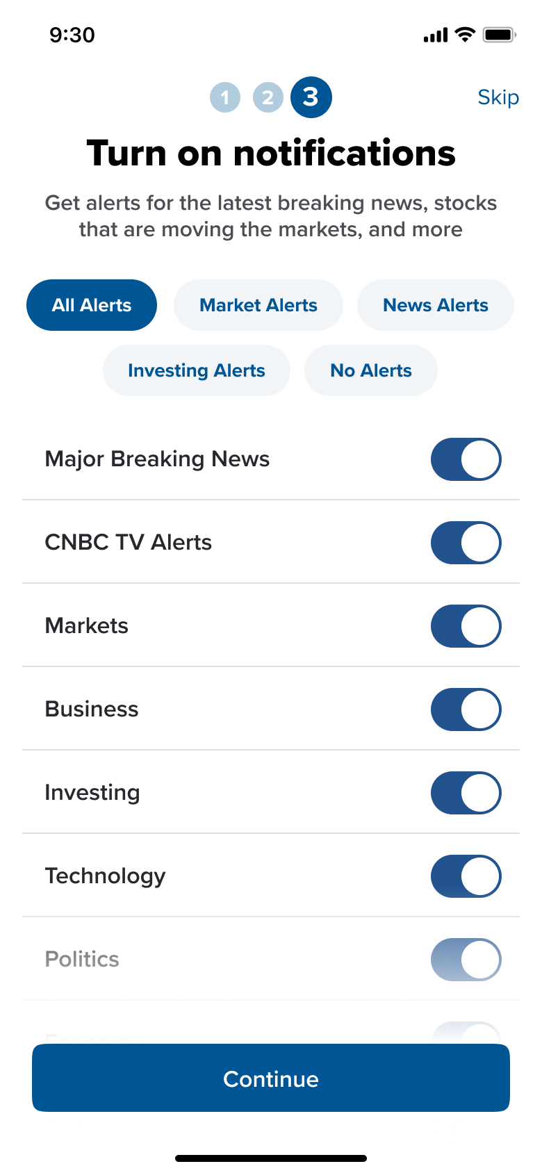
More Detailed Notifications Preferred
Users felt there would be no good way to group all the different types of notification channels together in a way that made sense and felt like it actually would make more work for them if they wanted to only have a specific few channels enabled that aren't grouped together.

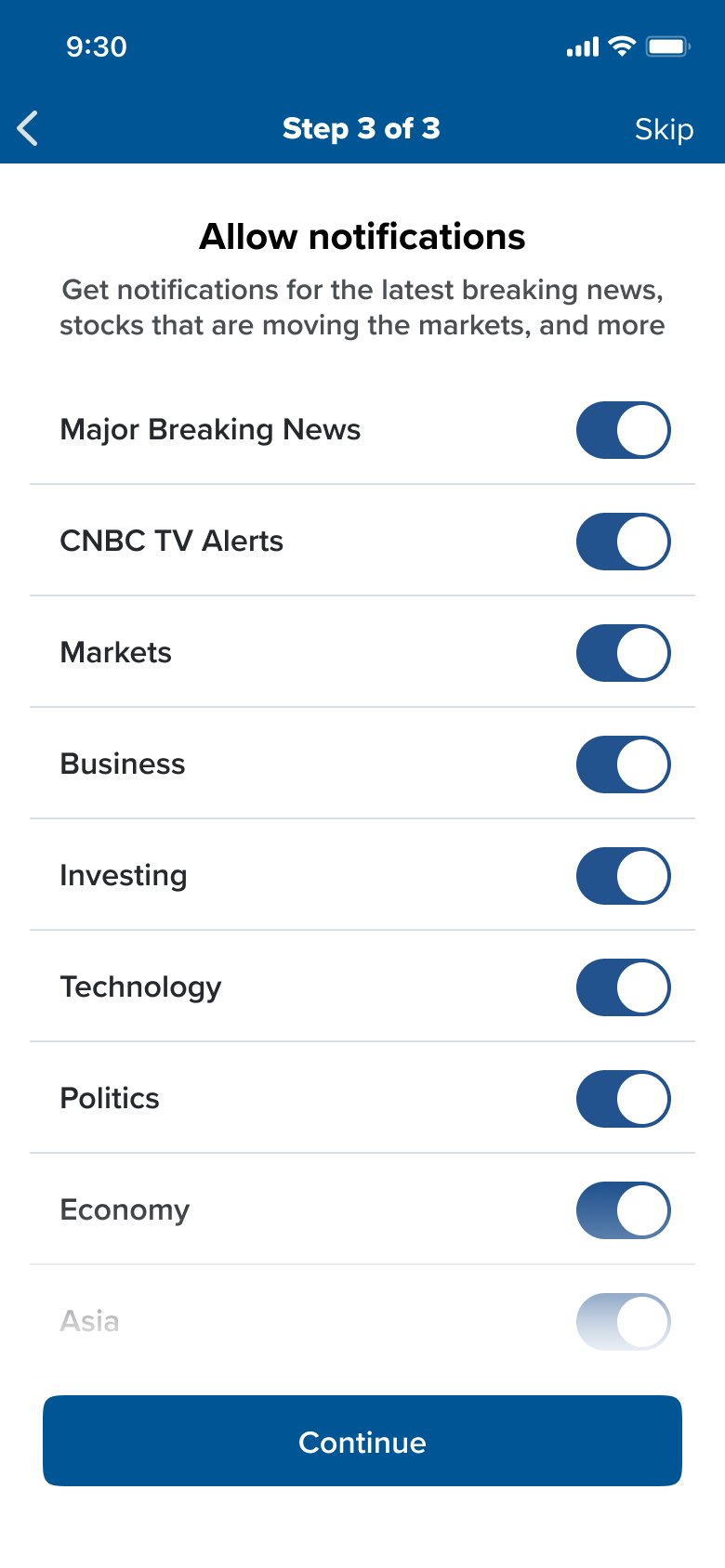
Further feedback we received about this step in general was that it was hard to understand what kind of content would be surfaced with these notifications and that it was unclear about the frequency of the notifications sent, especially considering there appears to be many channels.
Concept 1's Design and General Flow Preferred
5

Refine & Retest

and understanding user preference

Based on Concept 1 performing the best, we then started refining the flow and design

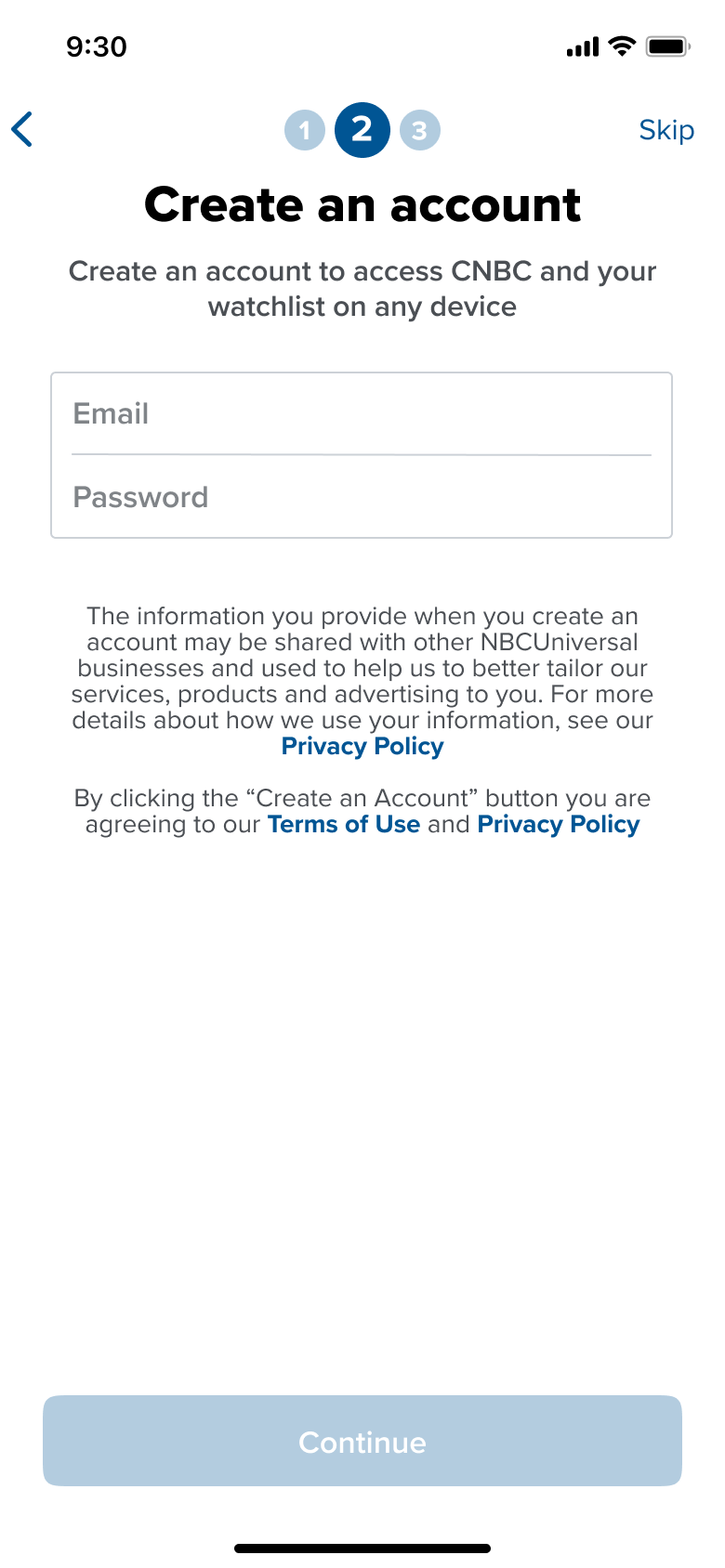
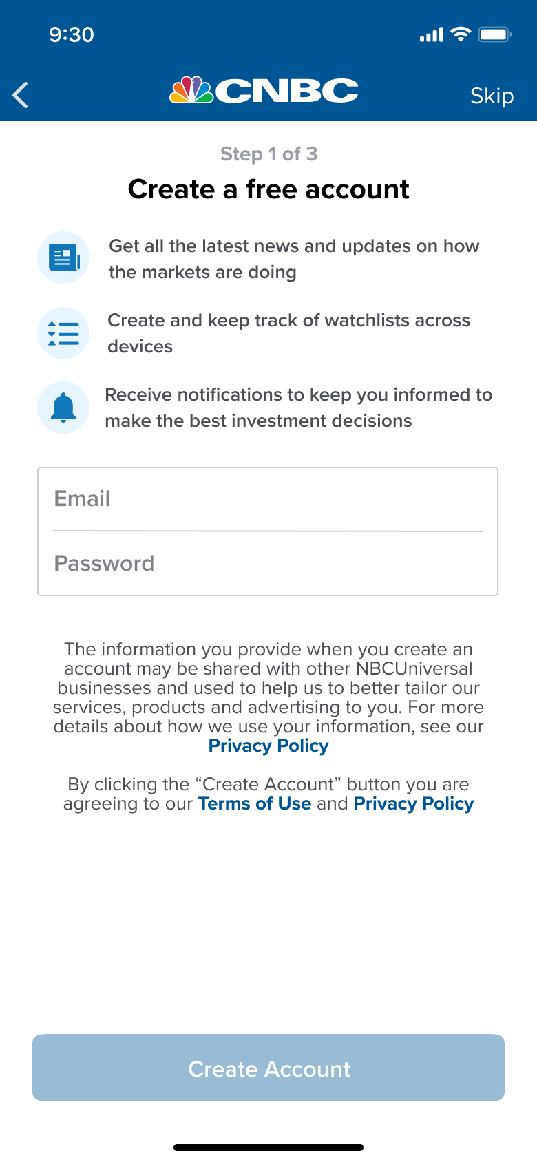
We added further details to the account creation step to provide more context

We also added more details to notifications to give users more of the specifics they’d prefer to know

We tested the refined concepts with five more users to ensure our findings and conclusions were accurate

6

Design Finalization

and creating a high quality user experience

Further refinement to the welcome screen

We created six different aesthetic styles based on an analysis of our competitors

Concept A
Full size example screenshots with real, but static data
Concept B
Focused component examples with real, but static data
Concept C
Animated stylized rough wireframe concept
Concept D
Full size wireframe versions of app screens
Concept E
Stylized, simple imagery and icons
Concept F
Animated stylized component wireframes

Ultimately we decided to choose to go with Concept F because we felt the usage of the animated hand to point out interactions would work harder to help users better understand functionality

7

User Flow

and the experience step by step

As a user interested in the CNBC app...

You download the app from the App Store and open it for the first time
You encounter the new onboarding experience with pages of animated value props to indicate what's possible using the app
You tap get started and are brought to the first step, which is creating your CNBC account
After creating your account you're brought to the second step, which is creating a watchlist
The third and final step is to customize the notifications you receive
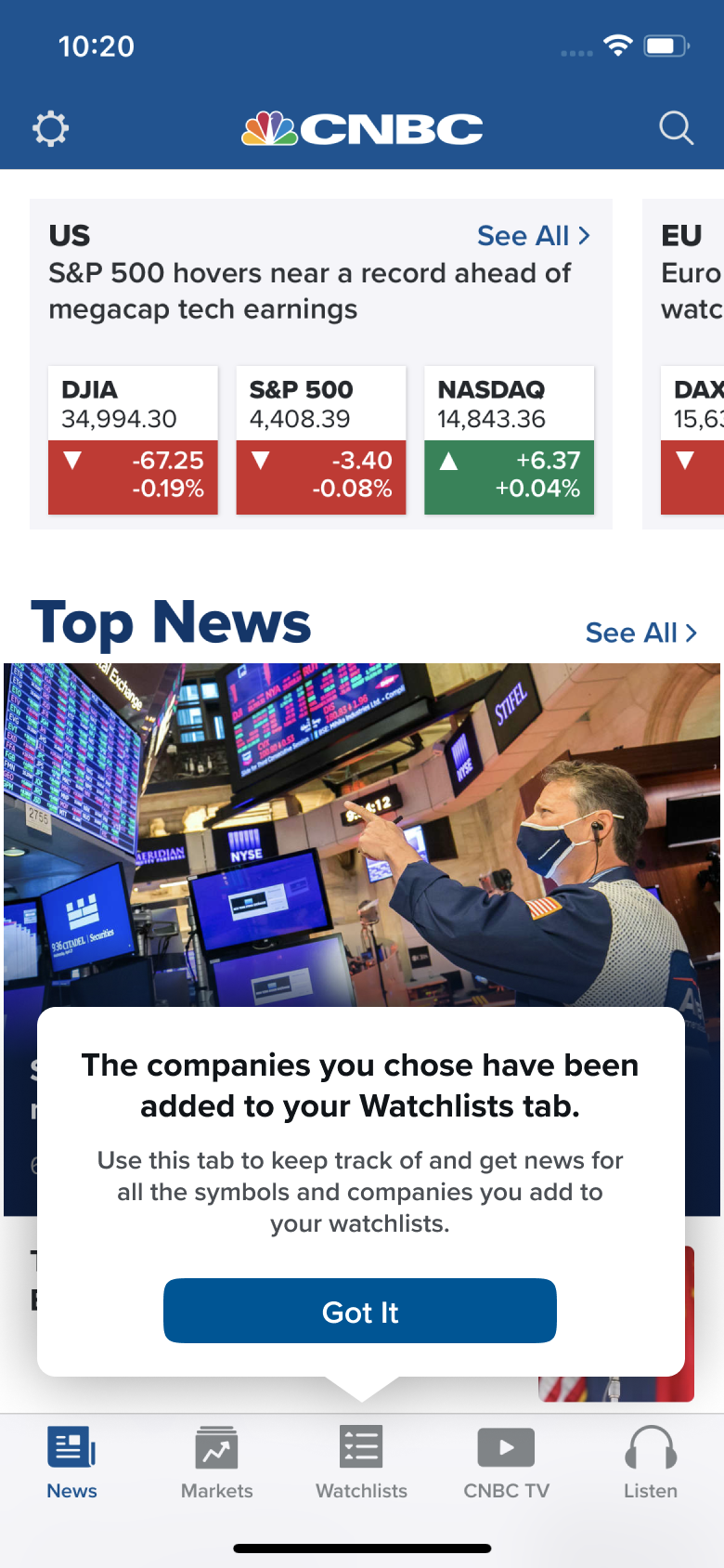
Upon finishing you're brought to the News tab in the proper app experience with a tip that indicates where you can find the watchlist you just created
Curious to learn more about my experience?
Let’s get in touch
Contact Me